Set up behavior of business card elements
- 5 minutes to read
The Customer's Canvas Template Editor can be used to create design elements as well as manage their behavior within the editor. You may occasionally need to restrict end-users from manipulating design elements to prevent them from ruining the final design. You can do this by prohibiting certain manipulations like moving, resizing, and deleting, or you can manage the behavior of image placeholders and text elements. All of these operations can be performed in the properties panel in the Behavior tab.
This subject is discussed in more detail in the How to set up item behavior section. This tutorial will help you to get some experience with that before you dive into details. We will return to our business card example in this tutorial and learn how to:
- Set up allowed manipulations with objects.
- Configure the Image Placeholder behavior.
- Manage the behavior of text elements.
- Set up variable elements.
- Save design settings and test them.
Prerequisites
You must have an account with Customer's Canvas to complete this task. If you don't have one already, please contact our support team.
You also need a design that you can manipulate. For purpose of this demo, it is assumed that you have accomplished a Creating a business card design tutorial.
Tip
You may also download a design and fonts we have prepared for this tutorial and import it to the system.
Setting permissions for design elements
We assume that you've already prepared the design and are ready to begin setting up the elements' behavior. So, let's get started!
Step 1. Set up allowed manipulations with objects.
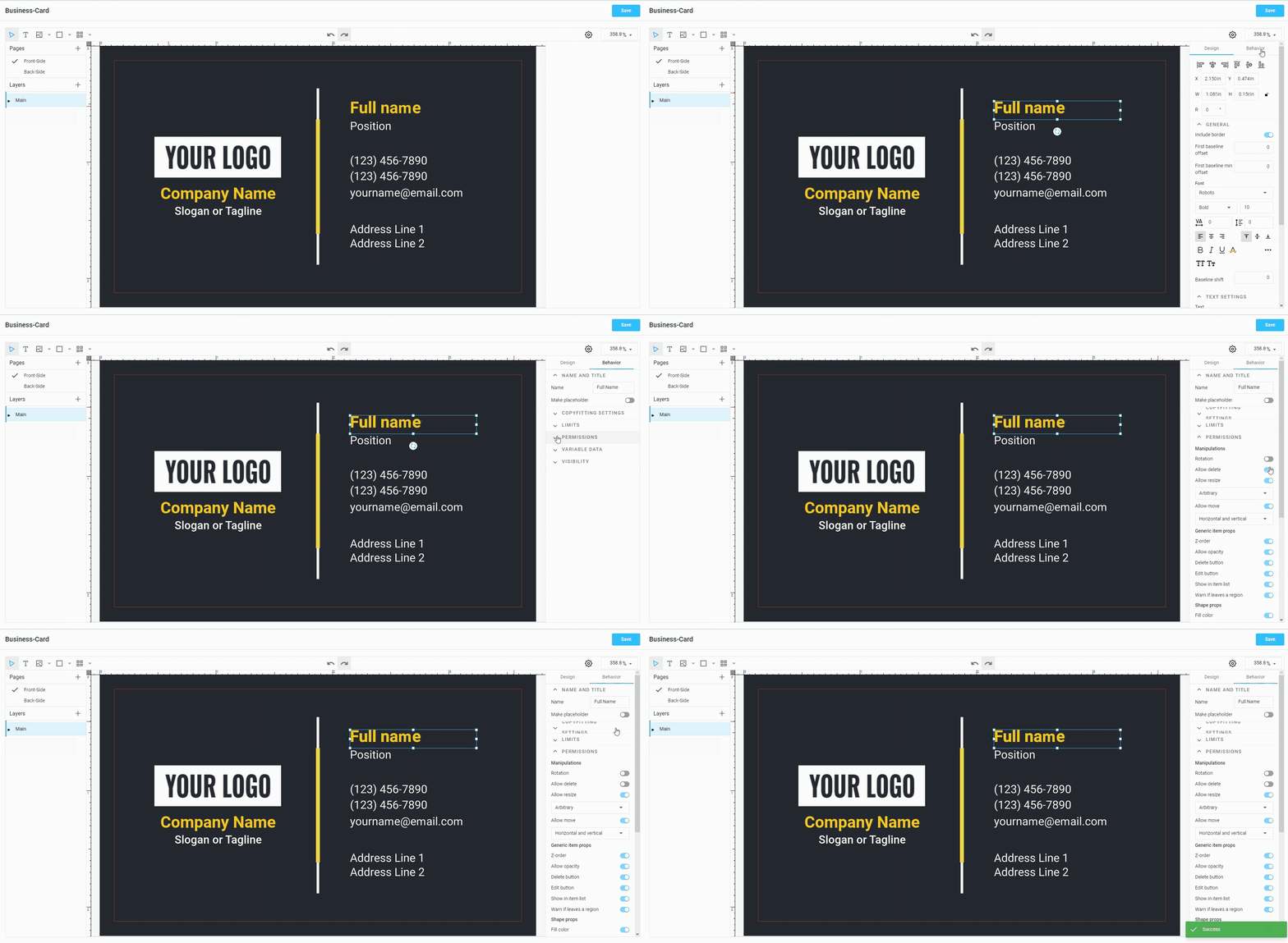
For each element, you can fine-tune the allowed behavior, such as deleting, resizing, moving, and other manipulations. To do so, select the design element > open the Behavior tab > expand the group of permissions > set up the desired properties.
For example, if you only want to allow end-users to move a design element horizontally, disable deletion and rotation. You can see it here:
If you want to completely block an element, there are two primary ways: 1) Use the Behavior tab; or 2) Select an object, open the Main Layers, and click the lock icon. Alternatively, after selecting the object, press Ctrl+Shift+L.

Step 2. Configure the Image Placeholder behavior.
A placeholder is an area on the design where end-users place their logo or image. When the user resizes or moves the image, it doesn't go outside of this box, but instead, it is zoomed and cropped according to the placeholder boundaries.
Let's look at how to manage the placeholder behavior 1) for a logo and 2) for a photo.
Logo Placeholder
Imagine that you want to make a placeholder for a company logo. Here, we expect the inserted design to fit the placeholder boundaries. Let's do the following steps for this task:
- Choose Main layer > select the Placeholder tool in the top menu bar. Create a placeholder of the necessary size > left-click on the upload icon inside the placeholder > select an image.
- Select the placeholder, expand the Placeholder section on the panel of properties.
- Choose Fit in the Initial resize.
- Set vertical and horizontal alignment to Center.
Tip
Instead of showing an empty placeholder, you can place an image encouraging users to select images for it. To do this, choose Stub image.
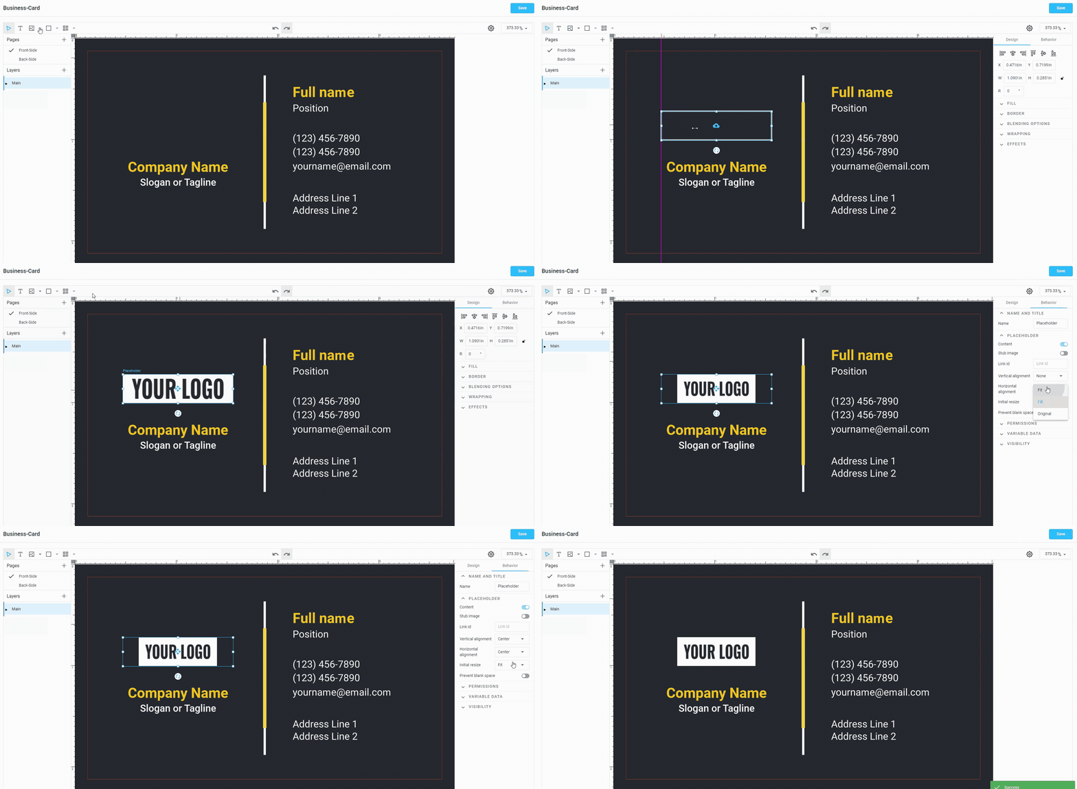
Photo Placeholder
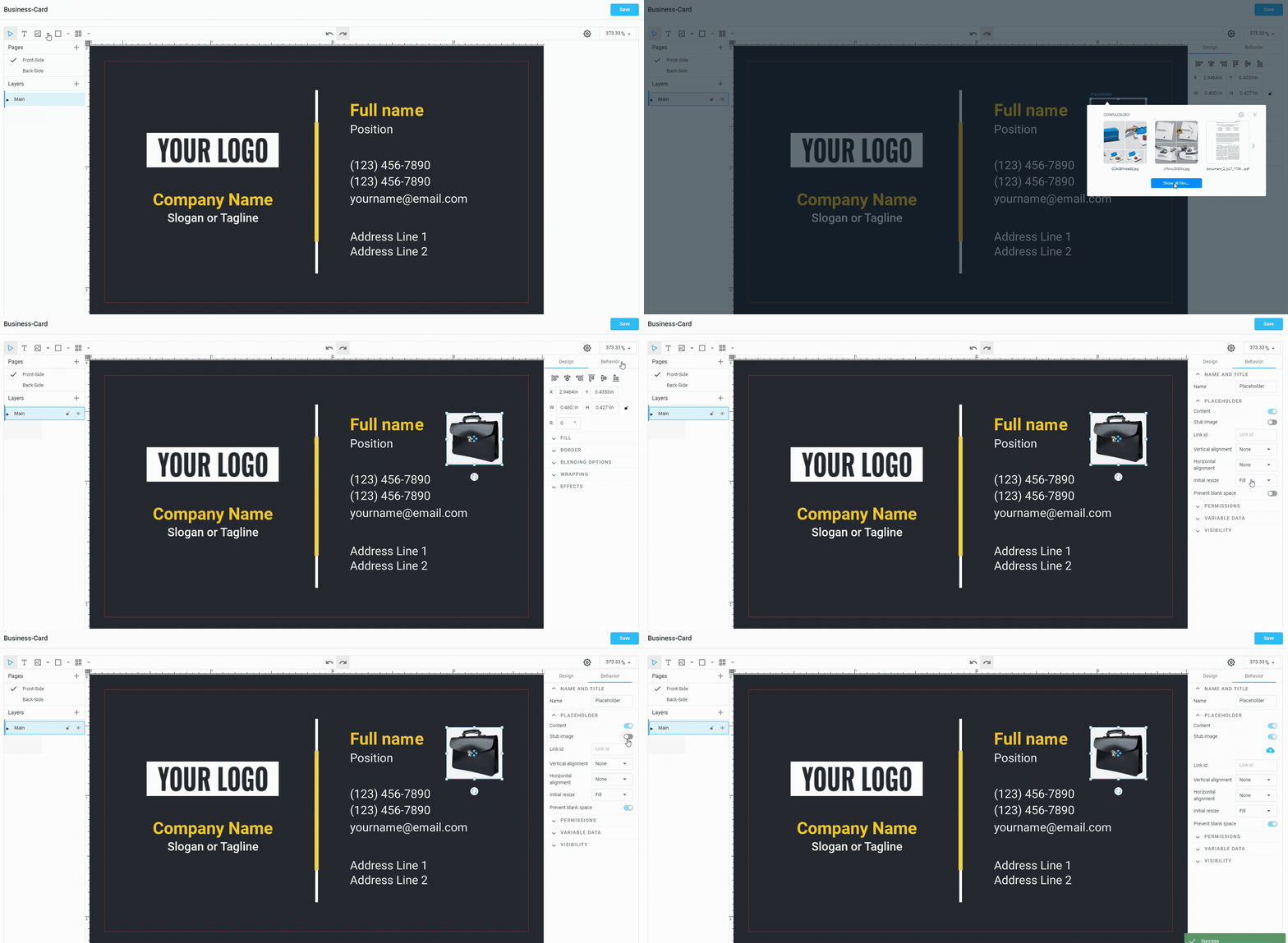
We can expect slightly different behavior for a photo. It should fill the entire placeholder, and the parts of the image that don't fit should be cropped. We also want to ensure that end-users don't resize the image, which would leave empty fields. To do so:
- Create one extra placeholder of the necessary size.
- Select the placeholder, expand the Placeholder section on the panel of properties.
- Choose Fill in the Initial resize.
- Toggle on the Prevent blank space option.
Step 3. Manage the behavior of text elements.
Copyfitting
By default, text that doesn't fit within the bounds of a text object will be cropped. If we want the font size to decrease automatically, we can configure copyfitting behavior. Let's try to add some text with copyfitting:
- Create a Bounded Text element by selecting the Text Tool and drawing a rectangle in the design area.
Important
Copyfitting only works with Bounded Text. If you create a clickable Point Text element, copyfitting won't be available.
- Select the object > go to the Behavior tab in the properties panel.
- Expand the Copyfitting settings.
- Set the Overflow Strategy to Fit to box and leave Shrink mode as default (Size).
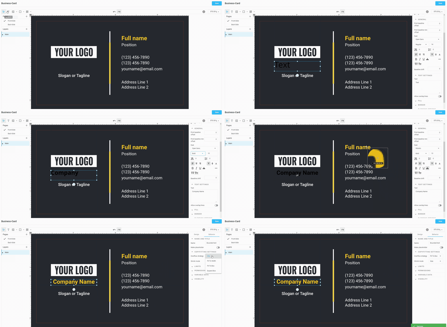
Now, by changing the text property in the Design panel, you will see that the text starts to shrink when the length of the text is exceeded.
If you want to automatically expand the height of the text box instead, set the Overflow Strategy to Expand Box.
Step 4. Set up Variable elements.
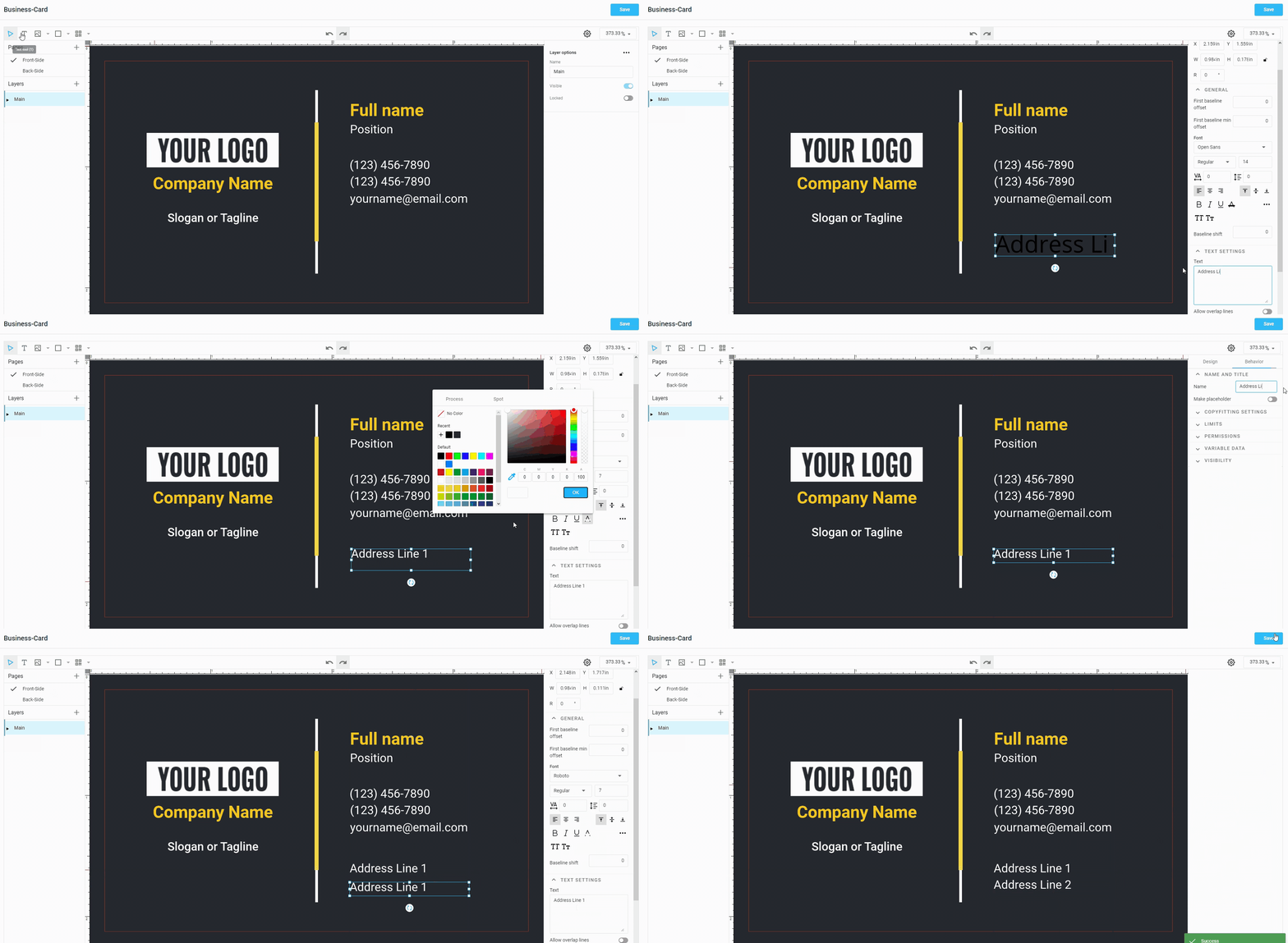
If you are setting up a template for the editor that will be used for variable data printing, then you need to configure the objects that will be variables. For example, let's add two text fields: Address Line 1 and Address Line 2, which we want to automatically fill in with data.
- Create a Text element (the type doesn't matter).
- Go to the Behavior tab in the properties panel > change the item Name to Address Line 1. Another method: right-click on the text element in the layer tree > select Rename.
- Expand the Variable Data group and toggle on Variable field.
- Duplicate the text field by right-clicking and selecting the Duplicate command or using
Ctrl+D. - Rename the text element to Address Line 2 and the standard text, as described in the second step in this list.
Step 5. Save design settings and test them.
Don't forget to save all your settings. Click Save or press Ctrl+S. You can now check how the end-user will see it by connecting your design to the editor, as described in the tutorial about connecting a template-based editor.
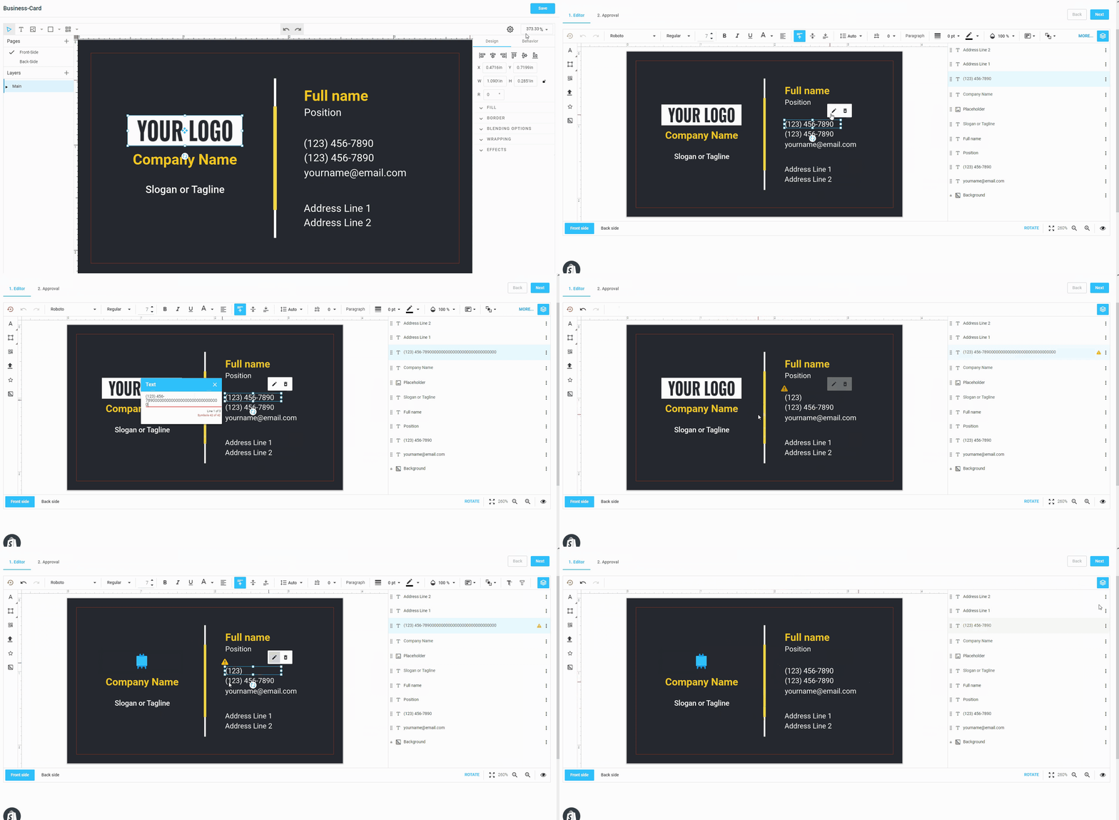
Now you have some idea about how to accomplish the most frequent tasks in a Template Editor, and it is a time to dive into more details about using the editor features.