Editor overview
- Last updated on August 1, 2024
- •
- 3 minutes to read
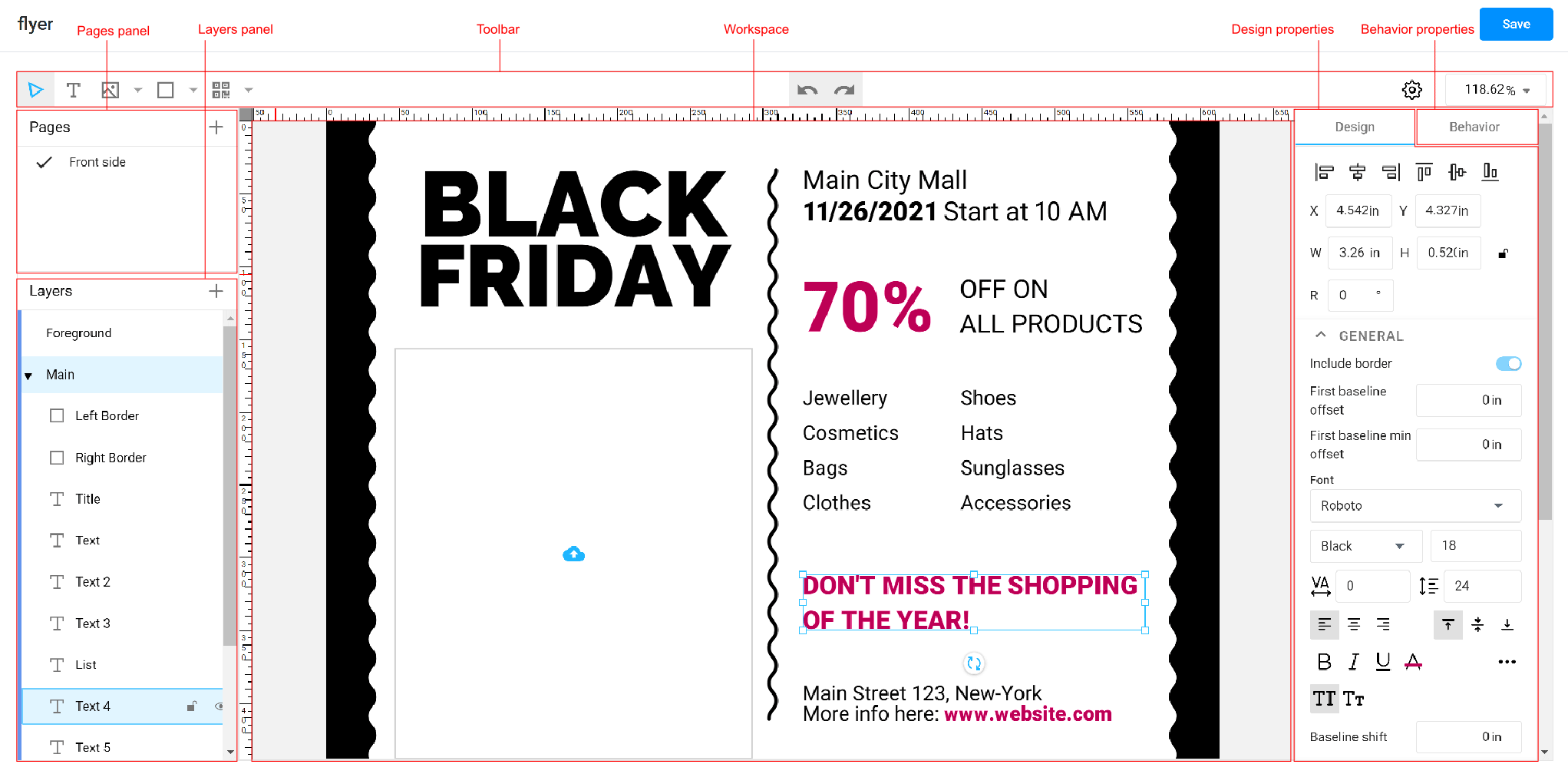
When you open Template Editor, it may look as follows:

Here, you can find the following panels:
Pages
If you are working with a multi-page document or a double-sided design, you need to use the Pages panel to manage pages. It allows for the following operations:
- Switching an active page
- Adding pages
- Duplicating pages
- Deleting pages
- Changing the page order
- Renaming pages
You may learn more about working with pages in the Pages section.
Layers
Each page contains design elements organized into one or several layers. You need to use layers when your items need to be separated into different "planes". For example, when certain elements should always be above the main design, or when you are working with print embellishments such as foiling or spot UV, and these elements should go to a separate print file.
The Layers panel displays a tree where the nodes on the first level are the layers that belong to the page and nested items are the design elements that belong to a layer. Layers are arranged in their z-order, i.e. the topmost layer overlaps the lower ones.
You may perform the following operations:
- Selecting an active layer
- Changing the z-order
- Grouping and ungrouping layers
- Deleting layers
- Duplicating layers
- Renaming layers
- Lock and/or hide layers in the Template Editor
You may learn more about working with layers in the Layers section.
Toolbar
The toolbar contains buttons for adding design elements to the canvas, zooming the canvas, changing the editor settings, and undo/redo commands.
The toolbar buttons support hotkeys.
Workspace
The workspace represents the canvas, where you can edit your designs. If you are already familiar with the Design Editor, then you may find it pretty similar and can perform the same manipulations:
- Zoom, pan, and rotate the canvas using a menu in the upper-right corner of the toolbar.
- Use snap lines and the context menu for design elements.
- Select and group design elements.
- Drag-n-drop assets.
- Edit texts directly in the workspace.
You may configure the workspace as explained in the Editor Settings section.
Design properties
The Design panel displays the properties of the selected layer. These properties may vary depending on the item type. For example, with text, it displays the font settings and other properties that make sense for text. When you work with barcodes, it displays only barcode-related properties.
If no layers are selected, then this panel displays properties of the current page or the entire document.
You can learn about different design properties and item types in the How to create designs section.
Behavior properties
You can see the Behavior tab next to Design. While the latter defines how the element will look in a design, the former configures how the element behaves in the end-user's editor. For example, it can be locked completely or partially. It can be visible in an editor but hidden in a print file (or vice versa). The text size may be automatically adjusted when the user types excessively long text (copyfitting), among many other scenarios.
To understand how these settings work and how to configure different behavior scenarios, refer to the How to set up item behavior section.
Now you have an idea about the structure of the editor. The Tutorials section will help you get familiar with the Template Editor.