Initialization
- Last updated on January 20, 2025
- •
- 6 minutes to read
In this article, you'll learn how to integrate the CC Options into your storefront and provide the initial data.
| Workflow Element | Tag | Script | Styles |
|---|---|---|---|
| CC Options | <au-cc-options> |
web-components/ |
web-components/ |
Prerequisites
- Before embedding the CC Options on a page, create a product in your Customer's Canvas tenant as described in the Creating products topic.
- Create a workflow of the Workflow Elements type as described in the Workflow Format topic.
Adding CC Options to a page
There are two methods to integrate the CC Options:
- Dynamically as described in the integration basics
- Statically as described below
1. Add links to the script and styles
Use the base URL from your tenant settings, the component name, and the script file names. To learn how to add these links dynamically, you can refer to the What are Workflow Elements.
<head>
  <script src="https://staticjs-aurigma.azureedge.net/libs/us/workflow-elements/cc-options/index.js"></script>
  <link href="https://staticjs-aurigma.azureedge.net/libs/us/workflow-elements/cc-options/styles.css" >
</head>
2. Add a tag to the page
Add an au-cc-options element as follows:
<body>
    <au-cc-options></au-cc-options>
</body>
3. Provide configuration parameters
To initialize the CC Options, use the workflowElement.init(config) method, which takes integration settings, product properties, and the workflow element settings in the following format:
{
    "configVersion": 2,
    "integration": {
        "tenantId": <yourTenantId>,
        "storefrontId": <yourStorefrontId>,
        "cchubApiGatewayUrl": "<yourCchubApiGatewayUrl>",
        "user": {
            "id": "<userId>",
            "token": "<userToken>"
        }
    },
    "product": {},
    "settings": {
        "general": {},
        "options": {
            "modifiers": []
        }
    }
}
All these objects except integration are usually taken from workflow files in your tenant. You can retrieve a workflow file specified for a product by using the endpoint GET /api/storefront/v1/products/{id}/personalization-workflow as described in Opening products for editing. In the settings, you can pass option modifiers and enable the Quantity field.
Creating the integration object
The integration object has the following properties:
tenantId: take this from the tenant's settings.storefrontId: register your integration as described in the Integrations topic.cchubApiGatewayUrl: specify eitherhttps://api.customerscanvashub.com,https://api.eu.customerscanvashub.com, orhttps://api.au.customerscanvashub.com, depending on where your tenant is hosted, in the EU or US environment.user.id: register your users as described in the Registering customers topic.user.token: generate a token as described in the Registering customers topic.
This is how the integration object may look like:
{
    "integration": {
        "tenantId": 12345,
        "storefrontId": 123456,
        "cchubApiGatewayUrl": "https://api.customerscanvashub.com/",
        "user": {
            "id": "john.wood",
            "token": "fcmVhZCIsIlN0b3JlZnJvbnRVc2Vyc19mdWxsIiwiU3R..."
        }
    }
}
Creating the product object
The product refers to a product with defined options. The CC Options allow you to use option defined in Customer's Canvas PIM products and products from e-commerce systems. Let's take a look at how you can initialize them.
External products
If you integrate Customer's Canvas with a standard e-commerce platform, like Shopify, you can load the options based on a product ID from that system. In this scenario, Customer's Canvas uses the external product ID to link the product, as described in the Product links article.
To initialize the CC Options, pass the externalProductId:
const product = {
    "externalProductId": "8255218868440"
};
To resolve this identifier, CC Options will use storefrontId and tenantId that are passed in the integration object.
PIM data
Use this approach with custom e-commerce integrations, when an external system knows the product ID from Customer's Canvas PIM module. In this case, you create products in Customer's Canvas and receive a list of products in the admin panel of your store. No product link is required here.
The product object has the following properties:
productIdis a product ID in Customer's Canvas.productLinkIdis a Cusomer's Canvas product link identifier.productVersionIdis a number of the saved product instance.
To initialize the CC Options, pass the productId and productLinkId to the product.
const product = {
    "productId": 114,
    "productLinkId": 9523,
    "productVersionId": 1011
};
Defining settings
Quantity field
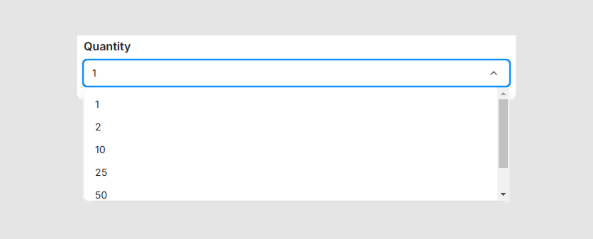
The Quantity control can be displayed as a list of predefined values or as an arbitrary number input field. To set up this control, in the general settings, set quantityEnabled to true and quantityValues to either "List" or "Any".
To provide the list of values, you first need to create a quantity custom field with its values. You can learn how to create them in the Adding custom fields section. Then, configure the Quantity field as follows:
{
    "settings": {
        "general": {
            "quantityEnabled": true,
            "quantityValues": "List"
        }
    }
}
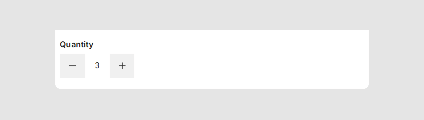
To allow your users to specify arbitrary values, you can configure the number input with increment and decrement buttons as follows:
{
    "settings": {
        "general": {
            "quantityEnabled": true,
            "quantityValues": "Any"
        }
    }
}
Appearance of options
To change option values, you need to edit the options in your products. To customize their appearance in the CC Options, use the options object. This allows you to enable the value for single-value options and apply modifiers to options by name.
showSingleValueOptions: iftrue, displays the value for all single-value options.modifiers:name: The option name used to identify the option for applying modifiers. This mandatory property can be used with any combination of the following properties.type: The display type of the option (e.g., "dropdown", "chips", etc.).visible: Iftrue, displays the option even if it has only one value andshowSingleValueOptionsisfalse.priority: The numeric priority; options with higher priority values appear higher in the list. The default value is1.preselected: A string or array of strings specifying values to be preselected when the options are loaded.description: A text description of the option.tooltip: The message that appears when clicking the (i) icon.
For example, let's display the value for all single-value options.
{
    "settings": {
        "options": {
            "showSingleValueOptions": true
        }
    }
}
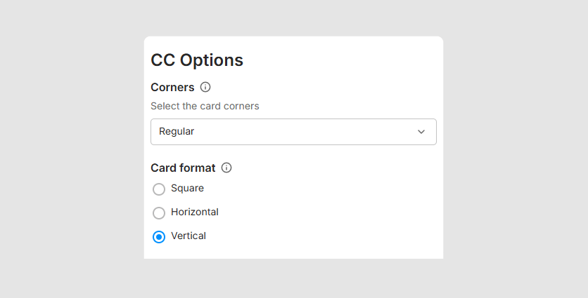
Now, let's change the appearance of the Card format option, which appears as chips by default. To change the display type to radio buttons and preselect the Vertical value, you can apply the following modifiers.
{
    "settings": {
        "options": {
            "modifiers": [{
                "name": "Card format",
                "type": "radio",
                "preselected": "Vertical"
            }]
        }
    }
}
Customer's Canvas supports the following option types: radio, dropdown, chips, checkbox, color-grid, color-list, image-grid, and image-list. To see how they appear in the user interface, refer to the Option types topic.
4. Load the CC Options
You can get the component's container through document.getElementsByTagName. Note that you can call the methods of a workflow element only after loading its script.
window.addEventListener("DOMContentLoaded", async () => {

    let ccOptions = document.getElementsByTagName("au-cc-options").item(0);

    ccOptions.init({
        "configVersion": 2,
        "integration": {
            "tenantId": 12345,
            "storefrontId": 123456,
            "cchubApiGatewayUrl": "https://api.customerscanvashub.com/",
            "user": {
                "id": "john.wood",
                "token": "fcmVhZCIsIlN0b3JlZnJvbnRVc2Vyc19mdWxsIiwiU3R..."
            }
        },
        "product": {
            "externalProductId": "8255218868440"
        },
        "settings": {
            "general": {
                "quantityEnabled": true,
                "quantityValues": "Any"
            },
            "options": {
                "modifiers": [
                    { "name": "Card format", "preselected": "Vertical" }
                ]
            }
        }
    });
});
5. Handle the output
To receive data from the component, subscribe to the changed event.
ccOptions.addEventListener("changed", event => console.log(event.detail));
To learn more about the result, refer to the Output data topic.
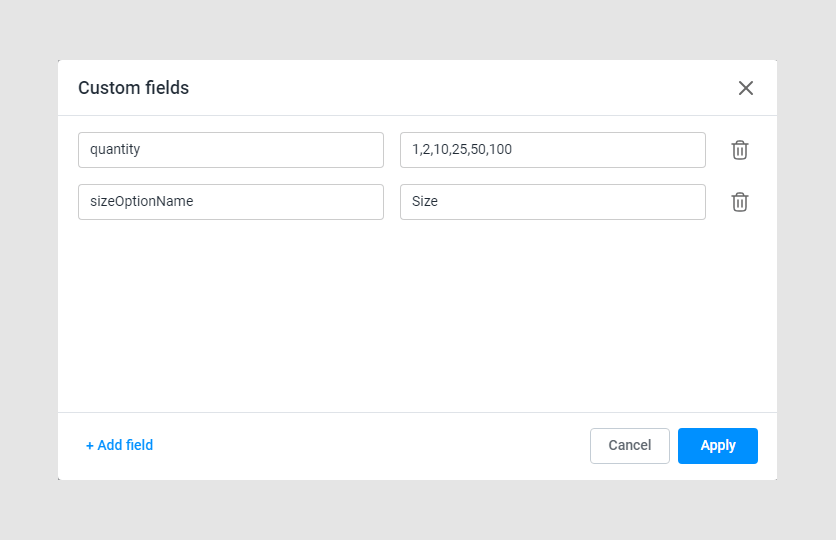
6. Add custom fields
For now, the quantity and sizeOptionName custom fields must be defined for a product to work correctly.
quantityis an array of strings, which is responsible for providing the quantity set to the CC Options. By default, this array is["1", "5", "10", "20"].sizeOptionNameis a string representing the option name responsible for the size. This is some kind of anchor required to determine which option to hide when working withcustomSizes.