Text
- Last updated on August 28, 2024
- •
- 7 minutes to read
In this topic, we will describe various aspects of working with text elements in the Template Editor. Here, we will learn how to work with markup and create two types of text objects: point text and area text. We will describe properties of text elements and provide links to articles that are useful to read when working with text in situations such as creating text placeholders, copyfitting, or combining several text blocks into auto-layouts.
Creating text elements
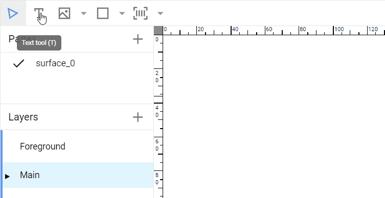
To create text objects, there is a Text Tool on the toolbar. It can be activated by pressing this button on the toolbar or using the T key on the keyboard.

In the text creation mode, you can add text objects of two types: point text and area text (aka bounded text or, in the terminology of Adobe Photoshop, paragraph text). As you know from the description of text objects in the Design Anatomy section, the difference between these text types is that point text always expands in width, while area text has rectangular bounds where, when the text reaches the right bound, it automatically wraps.
Note
Usually, you can use point text for simple one-line text objects and area text for text blocks that have strict boundaries. However, sometimes you need to use area text for single-line objects as well, for example, when you want to use copyfitting.
When you are in the text creation mode, you can click somewhere on the canvas, and a text object in the point text mode will appear there.

If you hold the mouse button and drag the mouse, you will create a rectangle that will become the bounds of the new area text.
If you have created a text object of the wrong type, you can always convert it using the toggle button Point / Area / Arched on the Design panel.

Editing text elements
To change text, just double-click the text object. The editor will enter the text editing mode, and you will be able to change it directly on the screen in the WYSIWYG mode.
In some cases, you may find that the text is not being edited. The reason for this is the fact that there are two text engines implemented in Customer's Canvas: the new WYSIWYG engine and the Classic text engine. The latter one supports more features but does not allow in-place editing.
For such text objects, a special icon appears in the workspace, and a warning appears on the Design panel. By hovering the mouse over the icon, you can find out why the text element is rendered by the Classic text engine.

There are two ways to edit such a text object:
- Click the Fix text button. In this case, all the features that prevent the use of WYSIWYG mode will be removed from the text, and after that, the text can be edited as usual.
- Edit the text in the Content field.
Here, you can see markup that looks like HTML. If formatting is not important to you, you can completely erase it and enter the text you need.
Text formatting
To work with styles, use the text properties in the Design panel.
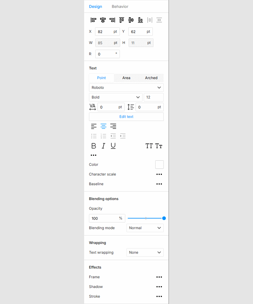
For text, you can define:
- Font properties: name, style, and size
- Letter-to-letter and line-to-line spacing
- Faux styles: bold, italic, and underline
- Text color
- OpenType features: all caps, subscript, superscript, and more
- Blending options
- Text wrapping mode
- Effects: frame, shadow, and stroke
Markup
When you click the Edit text button, you can see HTML-like markup.

You are not expected to fix it manually. However, you can use it for troubleshooting purposes if, for some reason, the markup does not work as expected.
Alignment
Alignment works differently depending on the type of text elements.
For point text, the alignment controls the direction the text will grow relative to an anchor point when you type characters into it.

For area text, horizontal alignment changes the location of the lines inside the bounds. You can also apply four types of justification: justify all, align last line left, align last line center, and align last line right. If there are several paragraphs in the text, you can change the alignment for each paragraph separately.
In addition to horizontal alignment, there is also vertical alignment for area text relative to the top, middle, or bottom of the bounds. This alignment applies to the entire text block.

Advanced text settings
In addition to the general text properties, there are also advanced properties, such as horizontal and vertical scale, baseline shift, and others. Usually, you do not need to work with them. However, when importing templates from IDML or PSD, if the text elements do not work as you expect, you can use these values for troubleshooting along with our technical support.
Other properties
In addition to text-specific properties, text elements have some properties that are common to other element types:
- Arrangement and transformation of elements
- Blending options
- Fill and stroke
- Text wrapping
- Overprint settings
Note that Fill and stroke apply to the entire text frame and not to a text fragment.
You may find Text wrapping useful if your text block is a sidebar and intersects with another element.
Important behavior scenarios for the end-user editor
Text placeholders
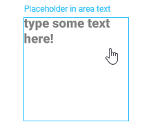
You may want to turn some fields into placeholders. If the user does not enter the text there, a semi-transparent prompt to enter a value will be displayed directly on the design. Once the user enters text, it will disappear. If they clear the content of the text element, they will see the prompt again.
If the user does not enter anything into it, then nothing will be printed.
You can enable and configure the text placeholder mode in the Behavior > Name and title section.
For more details, see how to create text placeholders.
Copyfitting
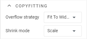
Sometimes, you may want to define an area on the design where the user can enter text but cannot enter a line that is too long for this area. If this happens, the text size should decrease so that all the text fits into the specified area.
You can configure different behaviors when the text exceeds the size of the text frame on the Behavior > Copyfitting tab.
For more details, see how to configure copyfitting.
Editing in the end-user editor
Sometimes, you may want to control whether the end-user can change the markup of the text or not. For example, for simple text elements, such as fields on business cards or an address block on an envelope, you can prefer a single style for the entire element.
To implement this, in the Behavior > Permissions > Text formatting panel, select one of three values:
- Default depends on the editor settings.
- Enabled allows changing the formatting of the selected text, regardless of the editor settings.
- Disabled disallows changing the formatting of the selected text, regardless of the editor settings.
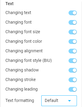
When formatting is disabled, the user can still select a background or color for the entire text object as a whole but not for a specific part of it.
Combining several texts into one element
When creating a design for products like a business card or postcard, you may often need to create a group of text blocks, for example, stacked on top of each other, like an address block or contact information. If some of these fields are not filled in, a space appears between the elements in the group.
To solve this problem, you can use a special type of group object called an Auto Layout. The editor ensures that the distance between the object's elements is always the same. If one of the elements becomes empty or is deleted, then the other elements automatically fill the empty space.
For more detail, see the Auto layouts topic.
Troubleshooting
Here is a list of the most common issues with text and guidelines on how to address them.
Font rendering artifacts in the editor
If a specific font displays visual artifacts (e.g., distorted or corrupted characters) only in the editor, while appearing correctly in proof images and print outputs. This is typically caused by rendering inconsistencies in the editor’s text engine.
Solution: Apply a shadow with zero parameters to the affected text element.