

Simple Editor
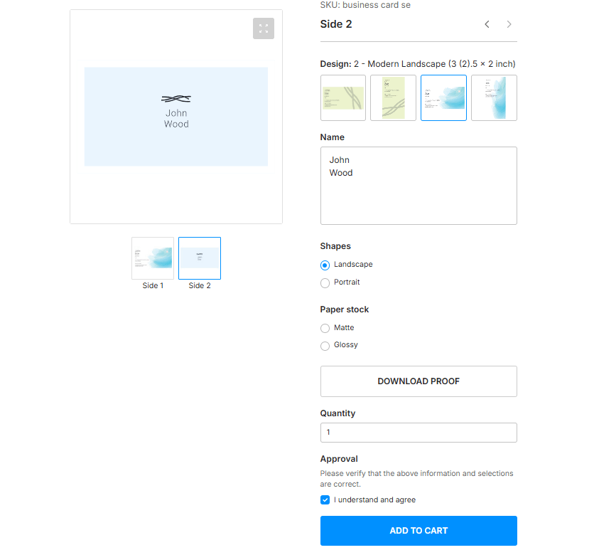
Simple Editor is a Workflow Element that customers use directly on a product page. The left side of the screen shows a preview of the product, and the right side contains input fields and product options. When customers change an option or a field, the preview updates immediately.
Use this section to configure what the editor shows: the input fields, the product options, the design variant selector, proof images, and the images in the paginator next to the preview.
What you can do
- Configure the input fields of the form, including text fields and image placeholders.
- Set up product options and the design variant selector.
- Configure proof images and the approval checkbox that customers select before they add the product to the cart.
- Provide quantity values and images for the paginator next to the preview.
- Hide the SKU and the price of the product.
Configuration format
- Component:
simple-editor - Tag name:
au-simple-editor - Actual protocol version:
2
{
  "configVersion": 2,
  "component": "simple-editor",
  "tagName": "au-simple-editor",
  "input": {},
  "settings": {},
  "resources": {},
  "localization": {}
}
See the workflow file format to learn how one file combines several element configurations.
Recommended path
If you configure the Simple Editor for the first time, follow these pages in order: