

Workflow Elements basics
Workflow Elements are web components for product customization interfaces in Customer's Canvas Hub. They share the same integration model, so the same storefront code can load different components, such as Handy Editor or Simple Editor, when the product workflow requires a different editing experience.
What a Workflow Element is
A workflow element is a browser component that receives input data, uses Customer's Canvas Hub integration data, applies configuration, and returns customization results. Each component focuses on a specific scenario: freehand editing, option-based editing, option selection, or product configuration.
<au-handy-editor></au-handy-editor><au-handy-editor-3d></au-handy-editor-3d><au-simple-editor></au-simple-editor><au-template-editor></au-template-editor><au-cc-options></au-cc-options><au-configurator></au-configurator>
The component itself runs in the browser, but it relies on Customer's Canvas Hub data. The storefront provides the tenant, storefront, and customer context. The product or design data defines what the component opens. The workflow file defines how the component behaves.
How a Workflow Element is embedded
Every embedded Workflow Element follows the same lifecycle:
- The page loads the component script from the Aurigma content delivery network (CDN).
- The page contains the custom HTML tag registered by that script, for example,
<au-handy-editor></au-handy-editor>. - The integration code waits until the custom element is available, initializes it with
init(), and handles browser events or component methods.
The same lifecycle applies when you switch between components. The component name, tag name, stylesheet, input shape, settings, resources, and output events may change.
How scripts are organized
Each Workflow Element is built and hosted on the Aurigma CDN. The script URL includes the Customer's Canvas Hub environment and the component name:
https://staticjs-aurigma.azureedge.net/libs/<environment>/workflow-elements/<component>/index.js
The environment code matches the tenant environment: us, eu, or au. For example, the Handy Editor script for the US environment is hosted under:
https://staticjs-aurigma.azureedge.net/libs/us/workflow-elements/handy-editor/index.js
Some components also publish additional files, such as styles.css, under the same component folder. The component-specific initialization pages list the exact script, style, and tag names.
How styles are organized
Workflow Elements publish their default styles as a styles.css file next to the component script. The style URL uses the same environment and component name as the script URL:
https://staticjs-aurigma.azureedge.net/libs/<environment>/workflow-elements/<component>/styles.css
When a page loads this stylesheet, the component gets its default layout, controls, and visual states. For example, a Simple Editor integration loads the Simple Editor stylesheet from the simple-editor component folder:
<link
  href="https://staticjs-aurigma.azureedge.net/libs/us/workflow-elements/simple-editor/styles.css"
  rel="stylesheet"
  type="text/css"
/>
Although Workflow Elements follow the normal CSS cascade, don't customize their appearance by overriding internal CSS classes. Use component CSS variables instead. CSS variables make the component themeable without depending on internal class names.
Each component documents its own supported variables because the available UI parts differ between editors. Find the variable list in the appropriate component documentation.
A <style> block after the <link> can override CSS variables:
<style>
  :root {
    --se-accent-color: green;
  }
</style>
JavaScript can also change CSS variables dynamically:
document.documentElement.style.setProperty("--se-accent-color", "green");
Style overrides should load after the component stylesheet. A later stylesheet or inline <style> block has higher priority in the CSS cascade, so the storefront can apply its visual theme without changing the component package.
How to initialize a Workflow Element
Each Workflow Element supports the init() method. This method accepts a configuration object with all data the element needs to start. The configuration object has the following parts:
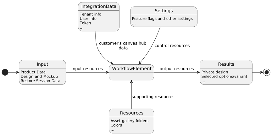
- Input describes the resources that the element processes and modifies. Typically, it includes the design file and product information.
- Settings control the customization process, such as feature toggles and other configuration.
- Integration is a special kind of control data that contains tenant and application context for Customer's Canvas APIs.
- Resources describe supporting resources that are not processed directly but are used during customization, such as asset folders for the image gallery.
- Output contains the results produced by the Workflow Element, such as a customized design, customer option choices, and other data required to put together a line item.
A minimal init() argument looks like this:
{
  "configVersion": 2,
  "input": {},
  "integration": {
    "tenantId": 1234,
    "storefrontId": 12345,
    "user": {
      "id": "<your_system_user_id>",
      "token": "<user_token>"
    }
  },
  "settings": {},
  "resources": {}
}
The configVersion value must be 2. This version identifies the configuration structure and helps Workflow Elements handle future changes to the initialization format.
In the page markup, the stylesheet, component script, custom tag, and initialization code work together like this:
<!DOCTYPE html>
<html>
  <head>
    <link href="https://staticjs-aurigma.azureedge.net/libs/us/workflow-elements/handy-editor/styles.css" rel="stylesheet" type="text/css">
    <style>
      /* Add CSS variables you would like to override */
    </style>
    ...
    <script type="module">
      await customElements.whenDefined('au-handy-editor');
      const editor = document.querySelector('au-handy-editor');
      const configuration = { /* ...*/ };
      await editor.init(configuration);
    </script>
    <script defer src="https://staticjs-aurigma.azureedge.net/libs/us/workflow-elements/handy-editor/index.js"></script>
  </head>
  <body>
    ...
    <au-handy-editor></au-handy-editor>
    ...
  </body>
</html>
Here, configuration is the object assembled from input, integration, settings, and resources.
How components return results
Workflow Elements return output through browser events. The event name and payload depend on the component, but the pattern is the same: the component emits data after the user completes the customization step, and the storefront handles that data.
await customElements.whenDefined("au-handy-editor");

const editor = document.querySelector("au-handy-editor") as WorkflowElement;
await editor.init({ /* ... */ });

editor.addEventListener("addtocart", (event) => {
  console.log(event.detail);
});
For an editor, the output usually contains the customized design and product context needed to create a cart item or continue processing. For an option selector, the output can describe selected option values. This output can become input for another Workflow Element or for a backend flow that creates projects and starts rendering.
Why the same model works for different editors
Handy Editor and Simple Editor solve different customization problems, but their integration structure is similar. Both are loaded from the Workflow Elements CDN, both use a custom HTML tag, both receive input and integration, and both use settings and resources from a workflow file.
The main difference is the component-specific meaning of these objects. Handy Editor input may open a design template or a Product Information Management (PIM) product for freehand editing. Simple Editor input usually opens a PIM product for option-based customization. Their settings and resources also differ, but the storefront can treat both as Workflow Elements with the same lifecycle: load the component, initialize it, handle its output.
Customer's Canvas Hub integration
Settings and resources can be hard-coded in JavaScript initialization code, but this approach couples product behavior to storefront code. Prefer loading configuration from workflow files associated with PIM products, together with the product ID or design template ID. This keeps the configuration editable without code changes and lets different products use different configurations or editors.
Workflow Elements workflow files have a structure similar to the init() method argument:
{
  "configVersion": 2,
  "component": "handy-editor",
  "tagName": "au-handy-editor",
  "settings": {},
  "resources": {}
}
A workflow file adds two values that make dynamic loading possible:
- The
componentvalue identifies which CDN package to load. - The
tagNamevalue identifies which custom HTML element to place on the page.
These values change when you switch from one component to another, for example, from handy-editor and au-handy-editor to simple-editor and au-simple-editor. They enable generic integration code that can load different Workflow Elements dynamically.
In a dynamic integration, the storefront usually combines data from two places. Product workflow data comes from the Storefront API, for example, from GET /api/storefront/v1/products/{id}/summary. The input and integration data come from the storefront application. The integration code merges these parts and passes the resulting object to init().