

Data-Driven Editor
You can add this widget to your workflow as a step to embed the Data-Driven Editor. The editor allows users to fill out a pre-configured form, thereby modifying the design according to the required data.
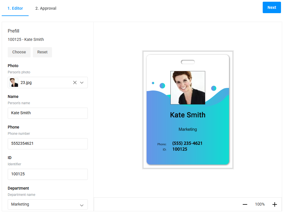
General Info
- type:
data-driven-editor
Params
The widget parameters are organized into sections and specified under the params.config object.
{
  "widgets": [
    {
      "name": "dde",
      "type": "data-driven-editor",
      "params": {
        "config": {
          "access": { ... },
          "design": { ... },
          "api": { ... },
          "settings": { ... },
          "renderer": { ... },
          "translation": { ... },
          "userInfo": { ... }
        }
      }
    }
  ]
}
Let's review them in detail.
Access section
Describes access information:
tenantId-string, tenant identifier.userId-string, user identifier.token-string, access token.
Design section
Descries the design the editor will work with:
designId-string, design ID in Asset Storage.dataSetId-string, dataset ID in Asset Storage.isPrivateDesign-boolean, flag for private design, used for returning to editing.designPath-string, path to the design file in Asset Storage. Used for debugging. If an error occurs, it is displayed to the user.mockup-object, describes the applied mockup. This configuration is optional.down-string, ID of the image from Asset Storage used as the substrate mockup. Optional.up-string, ID of the image from Asset Storage used as the overlay mockup. Optional.location-object, describes the design position relative to the mockup. Optional. Default:{ x: 0, y: 0 }.
API section
Describes the URLs of the services the editor will interact with:
designAtoms-string, URL of the Design Atoms service.assetProcessor-string, URL of the Asset Processor service.assetStorage-string, URL of the Asset Storage service.
Settings section
Describes the appearance, features, and settings of the editor:
lang-string, language used in the editor. Default:en.symbols-string[], list of symbols available for insertion. Default:["•", "○", "¤", "♥", "♦", "♣", "♠", "↑", "↓", "→", "←", "▲", "▼", "►", "◄", "©", "®", "§", "™", "¥", "€", "¢", "£"]enableSymbols-boolean, enables/disables symbol insertion. Default:true.allowManipulations-boolean, enables/disables manipulation of design elements. Default:false.makeFormFor-string, specifies whether the form is built for the current page or the entire product. Possible values:"design"or"page". Default:"design".itemsSnapLines-boolean, enables/disables snapping of design elements to other elements. Default:false.printAreaSnapLines-boolean, enables/disables snapping to print areas.regionSnapLines-boolean, enables/disables snapping to regions.safetyLinesSnapLines-boolean, enables/disables snapping to safety lines.fileUploadConfig-object, configuration for uploaded files:allowedFileFormats-string, MIME type of allowed file formats, e.g.,"image/jpeg,image/png".maxFileSizeMb-number, maximum allowed file size in MB.
violationWarningsSettings-object, configuration for editor warnings, IViolationServiceConfiguration.
Renderer section
Describes the rendering settings for the final files:
width-number, width of the file.height-number, height of the file.format-string, format of the final file ("Jpeg","Png","Tiff","Pdf").interpolationMode-string, interpolation mode of the output file ("High","Medium","Low","NearestNeighbour","Linear","Cubic","Supersampling","Lanczos","Anisotropic4","Anisotropic9","Lanczos3").safetyLinesEnabled-boolean, whether to render safety lines.watermarkEnabled-boolean, enables/disables watermark on the final file.watermarkOpacity-number, opacity of the watermark in the range [0, 1].watermarkRepeat-boolean, enables/disables watermark repetition.
Translation section
Describes the interface translation configuration. Use the language name as the key and an object containing the interface translation, for example:
{
  "be": {
    "APPLY": "Apply",
    ...
  }
}
UserInfo section
Describes user data passed to the editor for automatic filling. If the object keys match the design fields, the editor automatically fills in the required values.
For example, if the design schema describes a Name field, you can pass this object as follows:
{
  "userInfo": {
     "Name": "Sam"
  }
}
As a result, the editor will automatically fill the form and design with the value "Sam".
API
Properties
userId-string, user identifier.stateId-string, private design identifier, appears after saving.pdfUrl-string, URL to download the rendered PDF.previewUrls-string[], URLs of preview images.previewUrlLink-string, URL of the first page image.isValid-boolean, whether the form in the editor is filled out correctly.idStr-string, identification string.
Methods
createIdStr(): Promise<string>- Prepares an identification string (idStr).createPdfPreview(config: IRendererConfig): Promise<string>- Prepares a URL to download the rendered PDF (pdfUrl).- If
configis not provided, therenderervalue from the config is used. - If
configis partially specified, it is not merged withrenderer.
- If
createPreview(config: IRendererConfig): Promise<string[]>- Prepares URLs for preview images (previewUrls).getFormData(config: IFormDataConfig): Record<string, string>- Retrieves the filled-in form data.IFormDataConfigis an object with three fields:readInvalidValues-boolean, whether to include fields that failed validation in the result.readImageAs-enum, currently only"image-source-id"."image-source-id"allows reading images as a string of the image ID in the internal Design Atoms storage.readKeysAs-string, determines how to read form keys."title"reads keys as titles in the data schema,"name"reads keys as field names in the data schema.
saveProduct(asNew?: boolean): Promise<void>- Saves the user-edited design to private asset storage and creates a link to the first page image. IfasNewistrue, each save creates a new private design. Default behavior: if a private design exists, changes are saved under the old identifier.setUserInfo(userInfo: Record<string, string>): void- Passes user information to the editor, fills the form, and updates the design.validate(): boolean- Checks if the form in the editor is filled out correctly.
Events
onReady- Fires when the editor is ready, after the first initialization.
Examples
Basic Configuration
{
    "name": "dd-editor",
    "type": "data-driven-editor",
    "params": {
        "config": {
            "access": {
                "userId": "back_office_user_id",
                "token": "back_office_token",
                "tenantId": "back_office_tenant_id"
            },
            "api": {
                "designAtoms": "https://api.customerscanvashub.com/atoms",
                "assetProcessor": "https://api.customerscanvashub.com/processor/",
                "assetStorage": "https://api.customerscanvashub.com/storage/"
            },
            "design": {
                "designId": "your_design_id",
                "dataSetId": "your_dataset_id",
                "isPrivateDesign": false
            },
            "settings": {
                "lang": "en",
                "enableSymbols": true,
                "allowManipulations": false
            }
        }
    }
}
Advanced Configuration with Mockup and Snap Lines
{
    "name": "dd-editor-advanced",
    "type": "data-driven-editor",
    "params": {
        "config": {
            "access": {
                "userId": "back_office_user_id",
                "token": "back_office_token",
                "tenantId": "back_office_tenant_id"
            },
            "api": {
                "designAtoms": "https://api.customerscanvashub.com/atoms",
                "assetProcessor": "https://api.customerscanvashub.com/processor/",
                "assetStorage": "https://api.customerscanvashub.com/storage/"
            },
            "design": {
                "designId": "your_design_id",
                "dataSetId": "your_dataset_id",
                "mockup": {
                    "down": "mockup_down_id",
                    "up": "mockup_up_id",
                    "location": { "x": 10, "y": 20 }
                }
            },
            "settings": {
                "itemsSnapLines": true,
                "printAreaSnapLines": true,
                "regionSnapLines": true,
                "safetyLinesSnapLines": true,
                "symbols": ["¶", "†", "‡", "¼"]
            },
            "renderer": {
                "width": 1200,
                "height": 800,
                "format": "Pdf",
                "watermarkEnabled": true,
                "watermarkOpacity": 0.5
            }
        }
    }
}
Using User Info and Validation
{
    "name": "dd-editor-userinfo",
    "type": "data-driven-editor",
    "params": {
        "config": {
            "access": {
                "userId": "back_office_user_id",
                "token": "back_office_token",
                "tenantId": "back_office_tenant_id"
            },
            "api": {
                "designAtoms": "https://api.customerscanvashub.com/atoms",
                "assetProcessor": "https://api.customerscanvashub.com/processor/",
                "assetStorage": "https://api.customerscanvashub.com/storage/"
            },
            "design": {
                "designId": "your_design_id",
                "dataSetId": "your_dataset_id"
            },
            "settings": {
                "makeFormFor": "page",
                "violationWarningsSettings": {
                    "enabled": true,
                    "safetyLineViolationWarningEnabled": true,
                    "regionViolationWarningEnabled": true
                }
            }
        },
        "onReady": [
            "{{#function $['dd-editor-userinfo'].setUserInfo({ 'Name': 'Alex', 'Email': 'alex@example.com' }) }}",
            "{{#function $['dd-editor-userinfo'].validate() }}"
        ]
    }
}