- Introduction
- What's New?
- Features
- Getting Started
- Integration with E-commerce
- Integration with Remote Asset Sources
- Printable Files and Proof Images
- Configuring Products
- Creating Product Templates
- User Interface
- Simple and Advanced Web-to-Print Editor Modes
- Using the Image Gallery
- The Asset Manager
- The Image Editor
- Rich Text Editor
- Customizing the User Interface
- Customizing Widgets on a Per-page Basis
- Customizing the Toolbox
- Markings
- The Preflight Check
- Integration with Facebook and Instagram
- Localization of Customer's Canvas
- The Product Loading Screen
- Themes
- Watermarks
- Configuration Files
- API
- Visual Proofing Tool
- Variable Data Printing
- System Requirements
- Troubleshooting
- Licensing
- Copyright Notices
Markings
Applies to: Customer's Canvas On-Premises; Design Editor 4.4.25, 4.x (may differ) · Archived documentation
When you build an online print product designer for end users who are not computer-savvy, you want to keep the user interface as simple as possible and turn off all the elements that may confuse them. However, in many cases, it is important to give them some tools to place elements precisely.
Customer's Canvas includes three useful tools for this - rulers, grids, and snap lines.
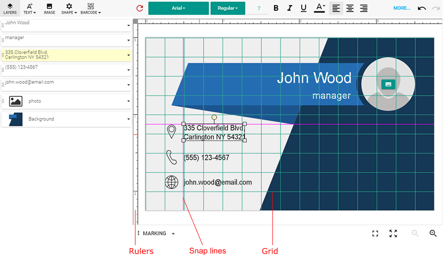
Let us see how to enable and configure them.
Rulers
To configure rulers, open the ~\Configuration\clientConfig.json file and make sure there is a block which looks like this:
"rulers": {
    "enabled": true,
    "unit": "inch",
    "origin": { "X": 0, "Y": 0 }
}
The properties are self-explanatory, but let us take a closer look at them.
Measurement Units
The standard length unit in Customer's Canvas is a point, i.e. 1/72 of an inch. However, regular users are most likely more comfortable with traditional units like inches or millimeters. You can use the unit property to switch the units to one of the following values:
-
inch -
mm -
cm -
point -
custom
If you prefer to use some other measurement unit, set this property to custom and specify the additional customUnitScale property. This property should contain a ratio allowing Customer's Canvas to convert your unit to points.
For example, imagine that you want to use picas as a unit of length. This is a traditional typography unit, which equals 1/72 of a foot (equivalent to 1/6 of an inch). In other words, 1 point = 1/12 pica (0.0833333 pica). Your rulers entry will look as follows:
 "rulers": {
    "unit": "custom",
    "customUnitScale": 0.0833333
}
A Point of Origin
You can specify the point of origin relative to the upper-left corner of the template using the origin property. It accepts the {"X": number, "Y": number} object specifying the offset in ruler measured units.
Display of Rulers
When the enabled property is true, rulers are visible; otherwise, Customer's Canvas hides both the horizontal and vertical rulers.
Override of Rulers for a Specific Product
If for some reason you want to use custom settings for rulers for a specific product, you may do this using the IConfiguration interface.
configuration = {
    canvas: {
        rulers: {
            enabled: true,
            unit: "inch",
            origin: { X: 0, Y: 0 }
        }
    }
};
If you just want to disable the rulers for a specific product, use the following configuration.
configuration = {
    canvas: {
        rulers: {
            enabled: false
        }
    }
};
Grids
Like rulers, grids are configured in clientConfig.json. Open this file to find the following object:
"grid": {
    "horizontalColor": "rgb(208, 224, 227)",
    "verticalColor": "rgb(208, 224, 227)",
    "stepX": 1,
    "stepY": 1,
    "lineWidthPx": 1,
    "enabled": true
}
This marking is enabled by default, and you can toggle it right from the editor user interface. To enable/disable a grid, on the Marking menu, click Grid.
Styling
To change the appearance of the grid, you can use the horizontalColor/verticalColor properties to change the color of horizontal and vertical lines. Correspondingly you can specify the color value in the CSS format and use lineWidthPx to set the grid line width in pixels.
Cell Size
To control the size of the grid cells, use the stepX and stepY properties to specify the horizontal and vertical distance between grid lines in ruler-measured units.
Override of Grids for a Specific Product
If for some reason you want to use custom grid settings for a specific product, you may do this using the IConfiguration interface.
configuration = {
    grid: {
        horizontalColor: "rgb(208, 224, 227)",
        verticalColor: "rgb(208, 224, 227)",
        stepX: 1,
        stepY: 1,
        lineWidthPx: 1,
        enabled: true
    }
};
If you just want to disable the grid feature for a specific product, simply use the following configuration.
configuration = {
    grid: {
        enabled: false
    }
};
Snap Lines
Like the previous markings, snap lines are also configured in the ~\Configuration\clientConfig.json file. The block corresponding to snap lines looks like this:
"snapLines": {
    "enabled": true,
    "color": "rgb(255,0,255)",
    "tolerance": 5
}
This marking is enabled by default, and you can toggle it right from the editor user interface. To enable/disable snap lines, on the Marking menu, click Snap lines.
Styling
To change the appearance of snap lines, set the color property to change their color.
Tolerance
To control the distance between an object and a snap line, starting from where the object clings to the line, specify the tolerance property. This value is measured in pixels and works independently of the current zoom level.
Override of Snap Lines for a Specific Product
If for some reason you want to use custom settings for snap lines for a specific product, you may do this using the IConfiguration interface.
configuration = {
    snapLines: {
        enabled: true,
        color: "rgb(155, 0, 0)",
        tolerance: 10
    }
};
If you just want to disable Snap Lines for a specific product, use the following configuration.
configuration = {
    snapLines: {
        enabled: false
    }
};