- Introduction
- What's New?
- Features
- Upgrading the Design Editor
- Breaking Changes in 6.0
- Getting Started
- Integration with E-commerce
- Integration with Remote Asset Sources
- Printable Files and Proof Images
- Configuring Products
- Creating Product Templates
- User Interface
- Simple and Advanced Web-to-Print Editor Modes
- The Asset Manager
- The Image Editor
- Editing Text Elements
- Rich Text Editor
- Customizing the User Interface
- Customizing Widgets on a Per-page Basis
- Customizing the Toolbox
- Color Picker
- Defining Names of Design Elements
- Markings
- The Preflight Check
- Localization of Customer's Canvas
- The Product Loading Screen
- UI Themes
- Watermarks
- Configuration Files
- APIs
- Add-ons
- System Requirements
- Troubleshooting
- Migrating Your Applications
- Licensing
- Copyright Notices
UI Themes
Applies to: Customer's Canvas On-Premises; Design Editor 6.15.0, 6.x (may differ) · Archived documentation
You may want to integrate the web-to-print editor as close as possible to the style of your site. Themes allow you to design sites in the same style.
Provided Themes
Customer's Canvas provides four basic themes:
-
MdLight, Material light. This is the default theme in the editor.

-
Md, Material design for Bootstrap.

-
BootstrapDefault, the default Bootstrap theme.

-
BootstrapEmpty, an empty Bootstrap theme.

Here, you can see how Customer's Canvas widgets look in corresponding themes. These themes are in the \src\design-editor\Themes\ folder.
To apply a theme, you need to set up the theme property in IConfiguration for a single product.
// An iframe where CustomersCanvas editor should be loaded.
var iframe = document.getElementById("editorFrame");
CustomersCanvas.IframeApi.loadEditor(
    iframe,
    {   // Specify the PSD template name for the product.
        surfaces: ['collage']
    },
    {   // In the configuration, specify the theme property.
        theme: "BootstrapDefault"
    }
);
Custom Themes
If your site is in neither Bootstrap nor Material design, you can design your own theme. To create a new theme, you need to:
- Develop styles and scripts for your theme. You can either create a theme from scratch or copy one of the basic themes and customize it.
- Create a subfolder for the theme in the
\src\design-editor\Themes\folder. - Define an order for loading the styles and scripts if yours refer to each other and/or to the Customer's Canvas files. In this case, to avoid errors, you should define the order in the
<name>.theme.jsfile. Here,<name>is the name of your theme.
This file has the following structure:
(async function () {
    const bootstrapParams = await CustomersCanvas.SimplePolygraphy.Bootstrap.waitParameters;
    __webpack_public_path__ = bootstrapParams.resourcesBaseUrl + "Generated/";

    // Includes your styles.
    require("./<name>/your.css");

    // Includes your scripts.
    require("./<name>/your.js");

})();
Also, you need to add a new entry for your theme to \src\design-editor\Themes\webpack.config.js.
...
    entry: {
        "design-editor-theme-mdlight": path.join(__dirname, "mdlight.theme.js"),
        "design-editor-theme-md": path.join(__dirname, "md.theme.js"),
        "design-editor-theme-bootstrapempty": path.join(__dirname, "bootstrapempty.theme.js"),
        "design-editor-theme-bootstrapdefault": path.join(__dirname, "bootstrapdefault.theme.js"),
        "design-editor-theme-<name>": path.join(__dirname, "<name>.theme.js")
    },
...
To build your theme, in the Command Prompt window, navigate to the \src\design-editor\ folder and run one of the following commands, depending on your configuration.
npm run build-themes-styles:dev
npm run build-themes-styles:release
To deploy this theme on your site, copy this build from \src\design-editor\build\generated\ to the ~/Resources/Generated folder on your site.
Cloud users have no access to the source code. If this is your case, you can only customize the CSS styles of predefined themes.
Theme Customization
You can alter the provided UI themes to fit Customer's Canvas styles to the styles of your site. The BootstrapEmpty theme was designed as an empty theme template which you can customize as you want.
If you have changed the basic themes, you will need to backup and restore the theme folder when upgrading Customer's Canvas.
If you customized a UI theme for earlier versions, it may become incompatible with new versions of Customer's Canvas.
If your site follows the Material design, you can alter the Md basic theme of Customer's Canvas. This theme supports the LESS preprocessor and can be easily customized with variables, whereas the BootstrapEmpty and BootstrapDefault themes don't and require changes in their CSS styles. With variables, you can alter colors, sizing, control appearance, etc. To check all predefined variables, refer to the \src\design-editor\Libs\bootstrap-material\less\_variables.less file.
Let us look at how you can change the main colors of Customer's Canvas:
- Find variables you need to change. When you open the
_variables.lessfile, you can find the following Bootstrap brand colors: @brand-primary, @brand-success, @brand-danger, @brand-warning, and @brand-info. - Find predefined values that can be set to these variables. Open the
\src\design-editor\Libs\bootstrap-material\less\_colors.lessfile to find predefined color values. - Set the variables in the
\src\design-editor\Themes\Md\md.lessfile.
So, to set light blue as the primary color, add the following line to the end of md.less.
@brand-primary: @light-blue;As a result, the Top Toolbar looks as follows:

The Theme Folder
The Customer's Canvas user interface consists of widgets. When you need to change any style, you can change styles of either a common widget container or a single widget. When you define common changes, do it in the md.less file. When you define styles for a single widget, use the corresponding LESS file. If you navigate to the \src\design-editor\Themes\Md\ folder, you will find:
-
initMaterial.js- javascript code for theme initialization. -
md.less- common style definitions of the Material design theme. -
md.theme.json- the load order of styles and scripts. -
md_Barcode.less- style definitions of the Barcode dialog box. -
md_bootstrapBundle.less- a list of definitions to be imported. -
md_BottomToolbar.less- style definitions of the Bottom Toolbar. -
md_ContextMenu.less- style definitions of context menus. -
md_FontSize.less- style definitions of the Font menus. -
md_ImageEditor.less- style definitions of the Image Editor. -
md_ObjectInspector.less- style definitions of the Object Inspector. -
md_PlaceholderButtons.less- style definitions of the Placeholder buttons. -
md_RichTextDialog.less- style definitions of the Rich text dialog. -
md_Slider.less- style definitions of sliders. -
md_Tabs.less- style definitions of tabs. -
md_TextPopup.less- style definitions of text pop-up windows. -
md_theme.js- a modifier of classes for this theme. -
md_Toolbox.less- style definitions of the Toolbox. -
md_TopToolbar.less- style definitions of the Top Toolbar. -
roboto.css- font definitions.
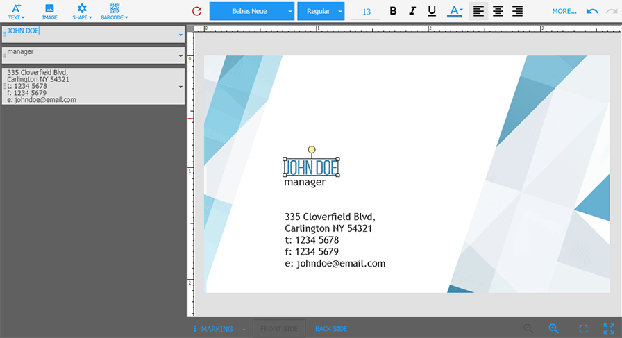
Now, let us go further and customize fonts, icons, the editor's background, and the controls' appearance in the Md theme. In the following example, we show how you can change this theme to a darker view.
Fonts and Icons
To change a font in the editor, you should specify @font-family-sans-serif in the md.less file.
@font-family-sans-serif: 'Tahoma';All icons in Customer's Canvas are implemented as characters of the Material Icons font. You can find this font in the \src\design-editor\styles\ControlStyles\fonts\ folder. So, if you need new icons, you have to integrate them into this font.
Since the icons are font characters, you can change their color as well as the text color by specifying the @mdb-text-color-primary variable.
@brand-primary: @blue;
@mdb-text-color-primary: @brand-primary;
Background Colors
Let us set the @grey-300 color as the background of the Toolbox and Top Toolbar. If you open the md_Toolbox.less file, you can find the following definition.
.toolbox, cc-top-toolbar, .toolbox::after {
    background-color: @grey-100;
}
Here, replace @grey-100 with @grey-300.
To set dark grey, the @grey-700 color, as the editor's background, add the following definition to the md.less file.
.editorRoot #mainContainer {
    background-color: @grey-700;
}
You can specify the grey background for the Image Editor, Gallery, and Rich text editor with the following definition in the md.less file.
.modal-content {
    background-color: @grey-300;
}
To specify the grey background for the editor's menus, add the following to md.less.
.dropdown-menu {
    background-color: @grey-300;
}
Note, you needn't change theme styles to change the background color of the canvas. You can do it through the containerColor property of the canvas object in IConfiguration.
configuration = {
    canvas: {
        containerColor: "rgba(224,224,224,1)"
    }
}
Controls
In the _variables.less file, you can find the @border-radius-base variable that allows for changing a view of button corners. Let us square all button corners.
@border-radius-base: 0px;Customizing the Object Inspector, let us change the default highlight of the layers to the grey background with the @brand-primary text color:
- In the
md_ObjectInspector.lessfile, find the definition of the oi-item class and add the background color style to this definition.LESSbackground-color: @grey-300; - After the oi-item class definition, add the following:
LESS
.inputs.highlight .oi-item {
    color: @brand-primary;
}
As a finishing touch, let us customize the Bottom Toolbar buttons. For example, to change the color of the disabled Front side / Back side buttons to @grey-800 and show a border, add the following definition to the md_BottomToolbar.less file.
.bottomBarBtn:disabled{
    border: 1px solid @grey-800;
    color: @grey-800;
}
The Result
So, this customization affected four files:
- In the
md.lessfileLESS@brand-primary: @blue; @mdb-text-color-primary: @brand-primary; @font-family-sans-serif: 'Tahoma'; @border-radius-base: 0px; .editorRoot #mainContainer { background-color: @grey-700; } .modal-content { background-color: @grey-300; } .dropdown-menu { background-color: @grey-300; } - In the
md_Toolbox.lessfileLESS.toolbox, cc-top-toolbar, .toolbox::after { background-color: @grey-300; } - In the
md_ObjectInspector.lessfileLESS.oi-item { border: none; box-shadow: 0 1px 6px 0 rgba(0, 0, 0, 0.12), 0 1px 6px 0 rgba(0, 0, 0, 0.12); width: calc(~'100% - 8px'); margin-left: 4px; margin-right: 4px; background-color: @grey-300; } .inputs.highlight .oi-item { color: @brand-primary; } - In the
md_BottomToolbar.lessfileLESS.bottomBarBtn:disabled{ border: 1px solid @grey-800; color: @grey-800; }
After you have done all these changes, build your theme: in the Command Prompt window, navigate to the \src\design-editor\ folder and run one of the following commands, depending on your configuration.
npm run build-themes-styles:dev
npm run build-themes-styles:release
To deploy this theme on your site, copy this build from \src\design-editor\build\generated\ to the ~/Resources/Generated folder on your site.
Now, you can open the Customer's Canvas and see the following result.
For more details about the Material design customization, refer to the site of the theme's developers.