- Introduction
- What's New?
- Features
- Upgrading the Design Editor
- Breaking Changes in 6.0
- Getting Started
- Integration with E-commerce
- Integration with Remote Asset Sources
- Printable Files and Proof Images
- Configuring Products
- Creating Product Templates
- User Interface
- Simple and Advanced Web-to-Print Editor Modes
- The Asset Manager
- The Image Editor
- Editing Text Elements
- Rich Text Editor
- Customizing the User Interface
- Customizing Widgets on a Per-page Basis
- Customizing the Toolbox
- Color Picker
- Defining Names of Design Elements
- Markings
- The Preflight Check
- Localization of Customer's Canvas
- The Product Loading Screen
- UI Themes
- Watermarks
- Configuration Files
- APIs
- Add-ons
- System Requirements
- Troubleshooting
- Migrating Your Applications
- Licensing
- Copyright Notices
Rich Text Editor
Applies to: Customer's Canvas On-Premises; Design Editor 6.15.0, 6.x (may differ) · Archived documentation
Products like books, magazines, booklets, etc. may contain large text areas. Large plain texts are boring, and they make catching the main idea at first sight difficult. So, if your users want to create eye-catching products that attract attention, they can use rich formatted text. This text type provides such formatting options as style (bold, italic, and underline), font, size, and color.
This topic dwells on how you can format text and configure the Rich text editor.
The Rich Text Editor Overview
The Classic text engine allows for creating formatted text areas using the Rich text editor. This web-to-print designer provides the text wrapping feature that allows for controlling how images are displayed in text areas, whether text wraps around them or pictures are just put above/behind text without changing its layout. This feature is discussed in the Text Wrapping topic.
Also, the Rich text editor supports spell checking, which is discussed in the Customizing the User Interface topic.
To add rich formatted text to your products:
- Switch the web-to-print designer to the advanced mode by clicking the Switch to advanced editing button. If there is no such button, then the designer is already in the advanced mode or this mode is disabled.
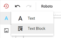
- Click the Text button and then click Text Block.
-
Enter the text, format it, and then click the Insert button.
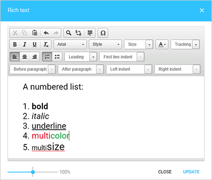
After a text area is added to a product, you can change its size. If the text is too big to be displayed in the area, it will be cropped. Formatted text elements do not resize automatically when text is being typed in.
Text Formatting Elements
In the previous screenshot, you can see that the Rich text editor interface contains the usual text formatting elements. Let us go through them:
- The first line: text editing, find and replace, and special characters.
- The second line: font style, name, size, color, and character spacing.
- The third line: text alignment, lists, leading, and first line indent.
- The fourth line: before and after paragraph spacing, left and right indents.
To change a value of a formatting element, you can select one from a drop-down list. If the element defines a numeric value, you can type it in.

Cut, Copy, Paste, Undo, and Redo
The first button group in the Rich text editor contains the following buttons (from left to right): Cut, Copy, Paste, Paste as plain text, Paste from Word, Undo, and Redo.

Also, some of these operations can be done using the following key combinations:
- Cut: Ctrl+X
- Copy: Ctrl+C
- Paste: Ctrl+V
- Undo: Ctrl+Z
- Redo: Ctrl+Y
Find, Replace, and Select All
The second button group in the Rich text editor contains the following buttons (from left to right): Find, Replace, and Select All.

Special Characters
The last button in the upper row is Insert Special Character.

It opens the Select Special Characters dialog shown in the following image.
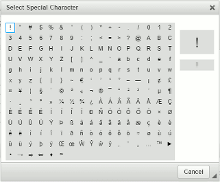
This dialog closes after you select a character.
Font Style
To emphasize some words or sentences, you can use bold, italic, and underline font styles or any combination of them. The last button in this group clears all formatting for the selected text.

Font Name
To change a font, select text, click the Font drop-down list, and then select a new font.
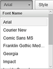
For details on how to add custom fonts to Customer's Canvas, you can refer to the Custom Fonts topic.
Font Size
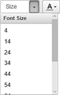
To change a font size, select text, click the Size drop-down list, and then select a value (in points). Also, you can type your own value of the font size. If you need to disable the input of custom values, use the IShowInputSettings interface.
Font Color
To change a font color of a selected text, click Text Color.
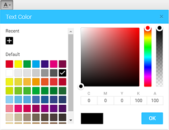
There is a palette with the predefined color set on the left side of the Text Color dialog, and the color field on the right side of the dialog box. You can select a color from the palette or directly from the color field. To find out how to set up the palette, refer to the Color Picker topic.
Tracking
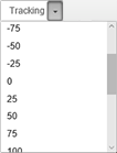
Tracking is the spacing between characters. Negative values make text narrower, positive values make it wider, and 0 is the default tracking of the font.
Text Alignment
The following text alignment options are available: Left, Center, and Right.

Text alignment is applied to all text in the Rich text editor, not to a single paragraph.
Lists
The Rich text editor allows for creating numbered and bulleted lists.

To change a list style, right-click on any element in the list. For numbered lists, you can set a number to start the list with and select a list type.
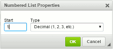
For bulleted lists, you can change the bullet style.
Nested Lists
Also, you can create lists with hierarchy:
- To demote the item to a lower numbering level (move the item to the right), press Tab.
- To promote the item to a higher numbering level (move the item to the left), press Shift+Tab.
Leading
Leading is the spacing between base lines. The leading is measured in points. You can select its value from the predefined list or type in your own value.
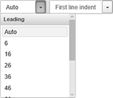
If a leading value is lesser than a font size, then the text lines will overlap.
Leading is applied to all text in the Rich text editor, not to a single paragraph.
First Line Indent
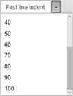
First line indent is an indentation that determines the distance of a paragraph's first line from the left margin. It is sized in points. You can select one of the predefined values or type in your own value.
Before and After Paragraph Spacing
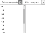
Before and after paragraph spacing is sized in points. You can select a value from the predefined list or type in another value.
Left and Right Indent
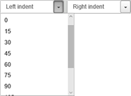
Paragraph left and right indents are sized in points. You can select a value from the predefined list or type in another value.
Configuration Parameters
Customer's Canvas allows for customizing the Rich text editor. For example, you can define the background color, zoom parameters, and text outline. Also, you can specify whether the formatted text is one-column or multicolumn, apply the format to a text selection only or to the whole rich text element, show hints or not.
To configure the Rich text editor globally, edit the ~\Configuration\clientConfig.json file. Also, you can configure the editor for a single product through the IRichTextDialogConfig interface at runtime.
The Apply-to-All Mode
The Rich text editor supports a text mode in which formatting is applied to a whole rich formatted text field despite a text selection. This is the apply-to-all text mode. If you enable this mode, then the First Line Indent, Before paragraph indent, After paragraph indent, Left indent, and Right indent drop-down lists hide in the toolbar of the Rich text editor. Set the applyToAllTextMode property to true to enable this mode.
// Define the RichTextDialog configuration.
configuration = {
    widgets: {
        RichTextDialog: {
            bgColor: "grey",
            applyToAllTextMode: true
        }
    }
}

// Load the editor with an empty product.
CustomersCanvas.IframeApi.loadEditor(
    // An iframe where CustomersCanvas editor should be loaded.
    document.getElementById("editorFrame"),
    {   // The empty product size.
        surfaces: [{ width: 720, height: 360 }]
    },
    // The editor configuration.
    configuration
);
The Character Count
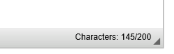
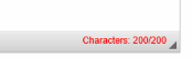
You can limit the number of characters that the user can enter in text fields. The <TCL_n> marker limits the character count for rich text layers in PSD templates. For example, <TCL_200> allows your users to enter up to 200 characters.
The character count is shown in the lower-right corner.
For more details, refer to Point and Paragraph Text.
Hints
You can define whether to show hints in drop-down lists or not. By default, the editor shows hints. If you need to disable some of them, set corresponding properties of the showHint object to false. The following example shows how you can disable hints for all drop-down lists.
configuration = {
    widgets: {
        RichTextDialog: {
            showHint: {
                font: false,
                style: false,
                size: false,
                tracking: false,
                leading: false,
                firstLineIndent: false,
                paddingTop: false,     // Before paragraph
                paddingBottom: false,  // After paragraph
                paddingLeft: false,    // Left indent
                paddingRight: false    // Right indent
            }
        }
    }
}
As a result, the values will be displayed instead of hints.

Multicolumn Text
Customer's Canvas supports multicolumn text if you set the createMultiColumnText property to true.
configuration = {
    widgets: {
        RichTextDialog: {
            bgColor: "grey",
            createMultiColumnText: true
        }
    }
}
This property enables the Columns drop-down list in the Top Toolbar for formatted text elements. So, your users can create rich formatted texts in the editor and then set the column count using this drop-down list.
The Special Character List
You can set up the Special character list defining the ckeditorConfig property.
configuration = {
    widgets: {
        RichTextDialog: {
            ckeditorConfig: {
                specialChars: [""", "’", [ "@", "Custom label" ] ]
            }
        }
    }
}
Here, the specialChars array defines three special characters: two quotation marks and the at symbol. Also, we defined the Custom label hint for the third symbol: ["@", "Custom label"].
You can add characters to this list:
- as they are ("#", "1", "G")
- using HTML names (""", "’")
- using Unicode ("Ŵ", "Ŷ")
If you define such an array, it overrides the default character list. You can find the default configuration in the API Reference.
The Toolbar Configuration
You can configure the toolbar by using the toolbarConfig array. Every element in this array represents a button group or a row separator. For button groups, specify a group name and an array of buttons. The following example demonstrates how you can set the text editing and text style buttons on the toolbar.
configuration = {
    widgets: {
        RichTextDialog: {
            toolbarConfig: [
                { name: "clipboard", items: ["Cut", "Copy", "Paste", "-", "Undo", "Redo"] },
                "/",
                { name: "basicstyles", items: ["Bold", "Italic", "Underline", "-", "RemoveFormat"] }
            ]
        }
    }
}
Here, "/" is a row separator, and "-" separates buttons in a group. In the MdLight theme, this toolbar takes available space despite the row separators. You can find the default toolbar configuration in the API Reference.
The WYSIWYG Mode
To adjust text in the Rich text editor as close as possible to the appearance on the canvas and zoom the text at the same time, you can enable the WYSIWYG mode. By default, the editor appears in the common view regardless of the content.
configuration = {
    widgets: {
        RichTextDialog: {
            wysiwygMode: true
        }
    }
}
Zoom
If your users edit texts with extremely large or small font sizes in the Rich text editor, it can become a problem. The text can either be too small to see, or too big to fit in the editor window. To improve the user experience, you can enable resizing of the content in the window.
Move the slider in the lower-left corner to change the zoom level.

You can configure the slider and enable the auto-zoom feature in the following way.
// Define the zoom configuration.
configuration = {
    widgets: {
        RichTextDialog: {
            zoom: {

                // Enables the zoom slider in the Rich text editor.
                enabled: true,
                minZoomPct: 10,
                maxZoomPct: 500,

                autoZoom: {
                    // Enables auto-zoom at opening the text editor.
                    enabled: true,
                    // Auto-zooms the text in if the text font size is less than this threshold.
                    minFontSizeThresholdPt: 12,
                    // Auto-zooms the text out if the text font size is more than this threshold.
                    maxFontSizeThresholdPt: 36
                }
            }
        }
    }
}