- Introduction
- What's New?
- Features
- Upgrading the Design Editor
- Breaking Changes in 6.0
- Getting Started
- Integration with E-commerce
- Integration with Remote Asset Sources
- Printable Files and Proof Images
- Configuring Products
- Creating Product Templates
- Creating and Editing Templates in Customer's Canvas
- Elements for Creating Designs in Customer's Canvas
- Supported Markers
- Setting Markers Outside of Templates
- Defining Marker Shortcuts
- Text Elements in Customer's Canvas
- Image Placeholders
- Specifying the Image Source Folder
- Stroke and Shadow Effects in Customer's Canvas
- In-String Placeholders and Text Validation
- Text Wrapping in Customer's Canvas
- Barcode Placeholders
- Copyfitting
- Restricting Editing Designs to Certain Regions
- Product Themes
- Product Layouts
- Group Elements in Customer's Canvas
- Photoshop Templates
- InDesign Templates
- User Interface
- Configuration Files
- APIs
- Add-ons
- System Requirements
- Troubleshooting
- Migrating Your Applications
- Licensing
- Copyright Notices
In-String Placeholders and Text Validation
Applies to: Customer's Canvas On-Premises; Design Editor 6.15.0, 6.x (may differ) · Archived documentation
We already introduced markers - text strings in a specific format added to layer names. Using these markers, you can restrict such actions as deleting and rotating objects, replacing a specific image, changing font settings and text, etc. All these restrictions help keep a design consistent after being personalized by end users. However, what if we want not only to restrict some actions, but to format user input as well? Here placeholders come into play. Image placeholders are discussed in the Image Placeholders topic. In this topic, we discuss in-string placeholders used to format a user input in text layers.
An in-string placeholder is a substring in a text element that is formatted in a special way (not a part of element names, like the markers). There are two use cases where placeholders are extremely helpful:
- You want to format text typed in by users in accordance with predefined rules (a phone number, an address, etc.).
- A product page (or pages) have multiple entries of the same text layer (e.g. a first/last name, a company name, etc.). If a user changes one of them, they may want to change the other ones automatically.
In-string Placeholders Overview
As it was said before, the in-string placeholders are specially formatted strings in text elements. Using them, you can control what portions of text are editable in layers, format user input to match a specific template, provide multi-value text elements, and populate multiple elements with the same text.
Customer's Canvas provides the following types of in-string placeholders:
- Replaceable text is a simple text that can be edited in an arbitrary way.
- Masked text is a template that specifies the length of the input text string, characters, and their positions.
- Multi-value text allows for selecting a layer value from multiple predefined options.
A text layer can contain multiple types of in-string placeholders in any combination and represent plain or rich formatted text.
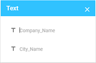
Your users can edit the content of in-string placeholders in the Object Inspector and in pop-up boxes. If a text element contains a number of in-string placeholders, they appear in a single pop-up box.
You can also populate placeholders programmatically through the Web API and userInfo.
Now that you have an idea of how in-string placeholders work, let us learn how to use them. This topic gives examples of Photoshop templates, though you can specify in-string placeholders in InDesign in the same way.
Using In-string Placeholders
To demonstrate all ways of using in-string placeholders, let us create a business card template and add different types of placeholders to it.
Replaceable Text
Replaceable text is the simplest type of placeholders: you just enclose a part of the text with brackets, and the user can edit this text in an arbitrary way. The text in the brackets is a hint explaining what the text layer stands for, so it is better to make the text as informative as possible.
Business cards usually contain an owner's name, position, and email. The owner's name can contain any character, so let us make it fully editable. The hint for the name will be Your_Name. The position element will contain the Position fixed word and the editable part of the actual position name. The email element will consist of the editable alias and two fixed parts, E: and @your_company_domain.com.
Now, let us start creating a template for such a business card.
- In Photoshop, create a new file and add a background layer and three text layers to it. Put the
[#Your_Name]text into the first layer,Position: [#Your_Position]into the second one, andE: [#Email_Alias]@your_company_domain.cominto the third layer. Save the template. The result should look as follows: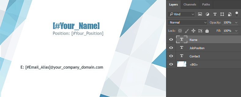
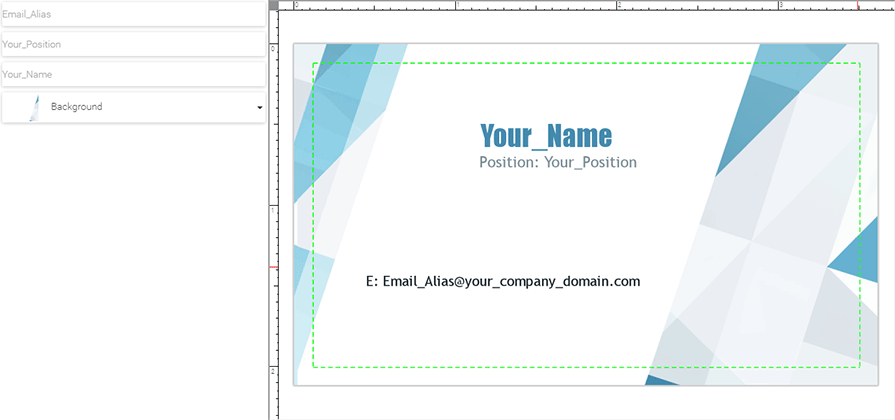
- Load the template in the web-to-print editor. You can see that the Object Inspector on the left contains three text fields corresponding to the three placeholders you created in the previous step.
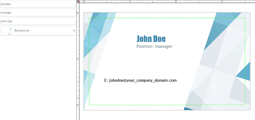
- Next, fill out the fields.
Populate Several Elements With a Single Value
As mentioned above, Customer's Canvas allows for populating several elements with the same value. To use this feature, put the same placeholder into multiple positions in a template. When the template is loaded, there will be only one field in the Object Inspector in the "Single" mode. Whatever the user types in this field, it is copied to the multiple locations in the template. To demonstrate this feature:
- Create another template with the same background as the previous one. This template will be the back side of the business card. Add two text layers to the new template. Put
[#Your_Name]into the first text layer and[#Your_Position]into the second one. The placeholders should be exactly the same as we placed in the first template. Save the template.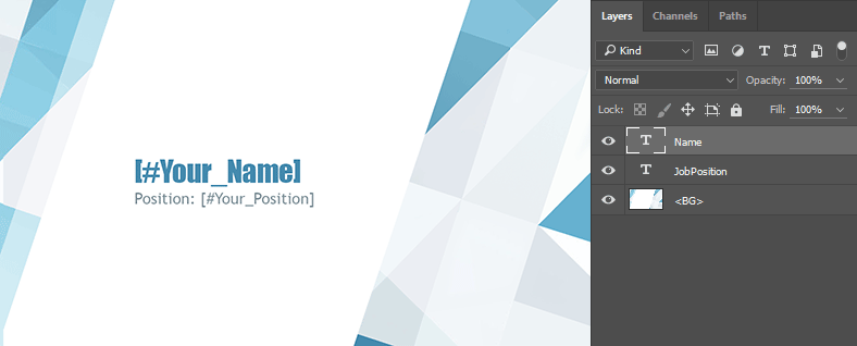
- Load both of the templates as a multipage product in the web-to-print designer. Now, you can see that the Object Inspector displays the same three text fields as we had in the previous example. Fill out the fields.
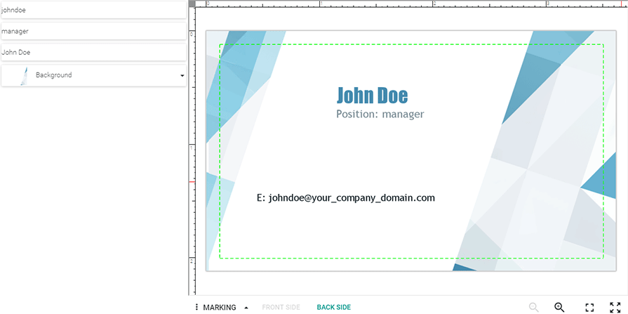
- Switch to the back side of the business card. You can see that the Name and Position elements are already filled with the text you have entered in the previous step.
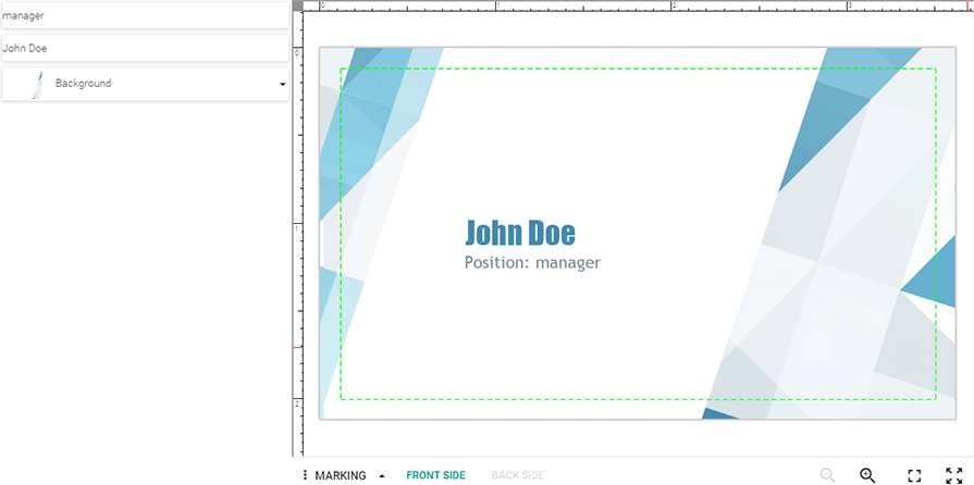
Masked Text
Masked text placeholders have the following format: [#Mask_Name#Mask]. The Mask_Name part is a hint that is shown to a user, and the Mask part is a text template. The following symbols are treated as special and are replaced by user input in masks:
-
ais replaced with a character. -
9is replaced with a number. -
*is replaced with either a character or a number.
One of the most popular use cases for masks is phone numbers. So, let us add phone and fax numbers to the business card.
- In Photoshop, open the front side template. Add two additional text layers to the template. Put the
T: [#Phone#999-999-9999]text into the first layer; it is the phone number. PutF: [#Fax#999-999-9999]into the second layer; it is the fax number. Save the template. The result should look as follows: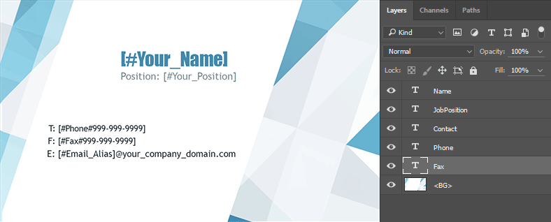
- Load the template in the web-to-print designer. You can see that the Object Inspector contains the Phone and Fax fields.
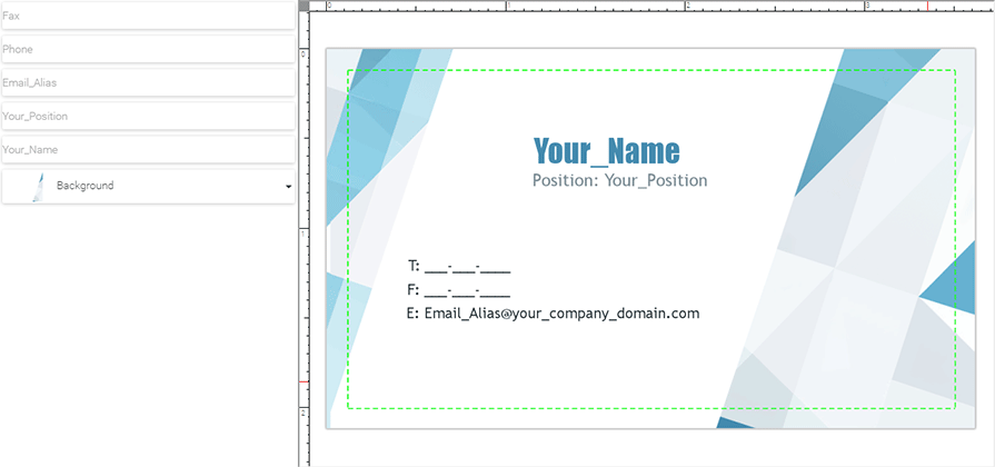
Note that when the template is loaded, the nines (
9) are replaced with underscores because9is a placeholder symbol. However, the hyphens (-) remain unchanged because a hyphen is not a special symbol. - Fill out the fields. Try to enter non-decimal symbols in the Phone and Fax fields - they will be ignored by the editor.
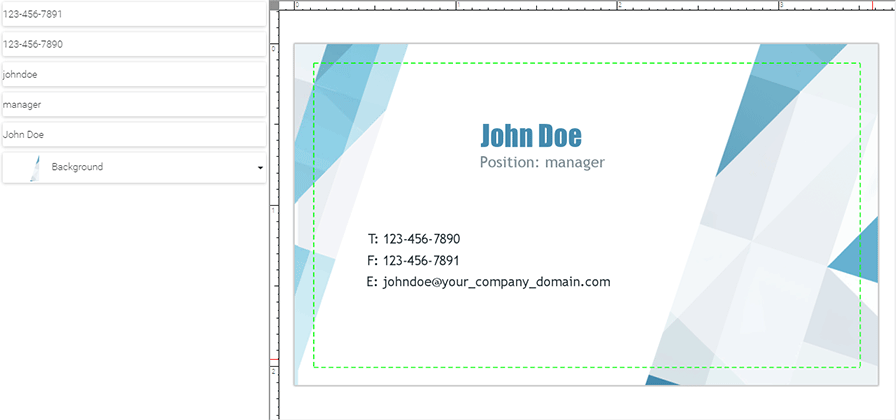
If you want to load some user info into masked in-string placeholders, a value in the userInfo dictionary should be formatted according to the mask, otherwise, the value is not applied to the placeholder. For example, for the [#Phone#999-999-9999] placeholder, the userInfo dictionary should look like this: {"Phone": "123-456-7890"}.
Multi-value Text
One more type of in-string placeholders supported by Customer's Canvas is the multi-value text placeholder. In the web-to-print designer, they are represented by drop-down lists. The format of multi-value text placeholders is [#Placeholder_Name|value1;value2;value3], where Placeholder_Name is a hint that is displayed in the Object Inspector, and value1, value2, and value3 are possible options. You can add any number of options to a multi-value text placeholder. All options should be separated by a semicolon (;).
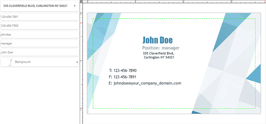
Let us put the address element, having two addresses to choose from, into the business card.
- In Photoshop, open the front side template you created in the previous step. Add a new text layer to the template. Put the following text in the layer:
[#Address|335 Cloverfield Blvd, Carlington NY 54321;336 Cloverfield Blvd,Carlington NY 54321]. Save the template. The result should look as follows: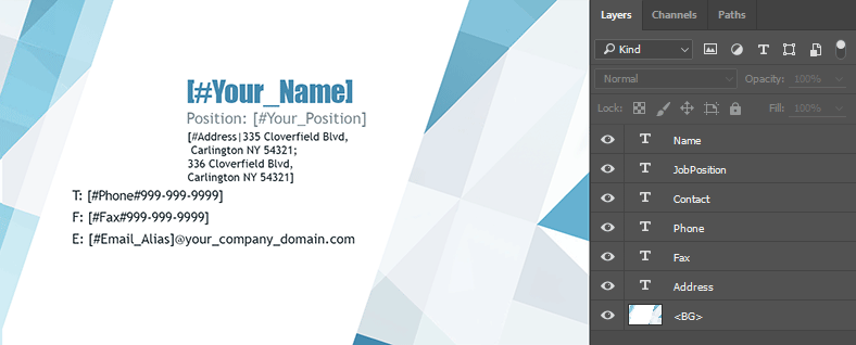
- Load the template in the web-to-print designer. You can see that the Object Inspector contains the field where a user can select the address.
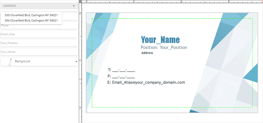
- Select an address. Note that the Address hint is replaced by the selected value.
If a multi-value text placeholder is automatically populated, then the value that will populate the placeholder should be one of the values listed in the template. Otherwise, the value from the userInfo dictionary is ignored. For example, for the [#HonorificForm|Mr.;Mrs.] placeholder, the userInfo dictionary should be either {"HonorificForm": "Mr."} or {"HonorificForm": "Mrs."}.
As an alternative to multi-value text placeholders, you can use multi-value elements defined through the <MVI> marker. For more details, refer to the Setting up Fields with Predefined Values topic.
The Display Mode of In-string Placeholders
The Object Inspector supports two display modes of linked in-string placeholders: Single and Multiple. As an example, let us open a template containing the following layers.
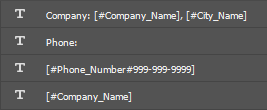
Here, the content of text layers corresponds to their names. This template has three in-string placeholders. The first layer contains two of them, [#Company_Name] and [#City_Name]. Also, [#Company_Name] is in the fourth layer.
The Single Mode
In this mode, every in-string placeholder appears only once in the Object Inspector despite that you can use it several times on different pages of your product. They always appear at the top of the list of design elements. For the previous example, the Object Inspector looks as follows:
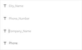
To enable this mode, set the inStringPlaceholderMode property of the Object Inspector to "Single" in clientConfig.json.
The Multiple Mode
In this mode, the Object Inspector keeps the same order of design elements as defined in Photoshop. Also, the Object Inspector displays an in-string placeholder as many times as it appears in a template. If a text layer contains several in-string placeholders or a text with an in-string placeholder, then they appear as a group of elements. In the Multiple mode, in-string placeholders display violation warnings, if any, and allow for changing the z-order. For the previous example, the Object Inspector looks as follows:
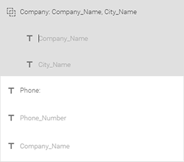
Customer's Canvas enables this mode by default.
See Also
Manual
- Supported Markers
- Setting up Fields with Predefined Values
- Working with User Data
- Web API for personalized rendering