- Introduction
- What's New?
- Features
- Upgrading the Design Editor
- Breaking Changes in 6.0
- Getting Started
- Integration with E-commerce
- Integration with Remote Asset Sources
- Printable Files and Proof Images
- Configuring Products
- Creating Product Templates
- Creating and Editing Templates in Customer's Canvas
- Elements for Creating Designs in Customer's Canvas
- Supported Markers
- Setting Markers Outside of Templates
- Defining Marker Shortcuts
- Text Elements in Customer's Canvas
- Image Placeholders
- Specifying the Image Source Folder
- Stroke and Shadow Effects in Customer's Canvas
- In-String Placeholders and Text Validation
- Text Wrapping in Customer's Canvas
- Barcode Placeholders
- Copyfitting
- Restricting Editing Designs to Certain Regions
- Product Themes
- Product Layouts
- Group Elements in Customer's Canvas
- Photoshop Templates
- InDesign Templates
- User Interface
- Configuration Files
- APIs
- Add-ons
- System Requirements
- Troubleshooting
- Migrating Your Applications
- Licensing
- Copyright Notices
Stroke and Shadow Effects in Customer's Canvas
Applies to: Customer's Canvas On-Premises; Design Editor 6.15.0, 6.x (may differ) · Archived documentation
You can decorate text with stroke and shadow effects.
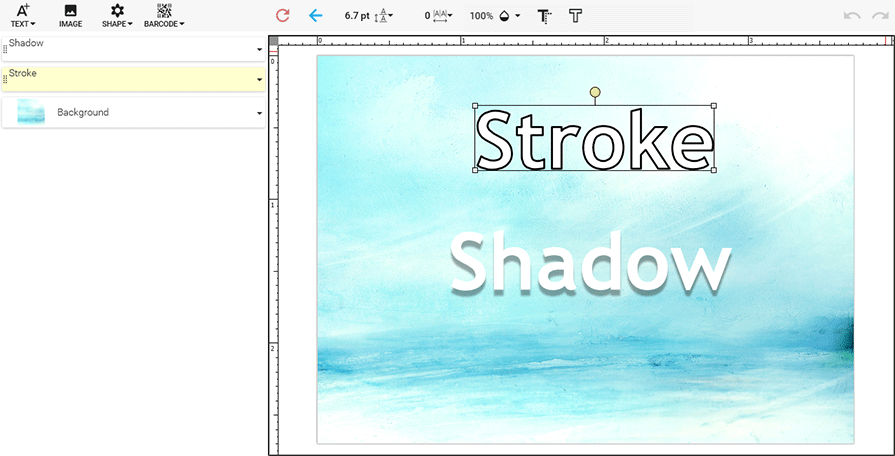
Customer's Canvas provides three ways to create these effects:
- In Adobe InDesign
- In Adobe Photoshop
- In the web-to-print editor
To add a text stroke in InDesign, you can specify the Stroke for the Type Tool.
In Photoshop, you can specify the stroke and shadow effects by adding a layer style.
By using the Stroke and Shadow buttons of the Top Toolbar, you can add and edit these effects right in Customer's Canvas.
You may want to disallow your users from editing strokes or shadows in loaded templates. To turn stroke editing off, add the <TAEST_f> marker to a layer name. The <TAESH_f> marker disables shadow editing. Using these markers, you remove corresponding buttons from the Top Toolbar.
To remove the Stroke and Shadow buttons for all products, set the textStrokeButtonEnabled and textShadowButtonEnabled properties of TopToolbar to false in clientConfig.json. For more details about the Top Toolbar customization, refer to the Customizing the User Interface topic.
Stroke Dialog Box
In Customer's Canvas, you can control the width and color of a text stroke. To see the settings, click the Stroke button on the Top Toolbar.
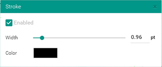
To change the width, move the slider or type in a value next to it. This value is measured in points. To change the color, click the color box. You can set up the range in which the width can be changed through the textStroke property.
Shadow Dialog Box
In Customer's Canvas, you can control the angle, distance, size, and color of a text's shadow. To see the settings, click the Shadow button on the Top Toolbar.
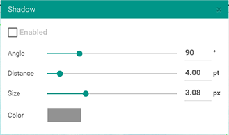
To set up a numeric value, just move a slider or type in a value next to it. Shadow angles are measured in degrees. Distances, the shadow's offsets, are in points. Shadow size is in pixels here. To change the color, click the color box. You can set up the ranges in which the angle, distance, and size can be changed through the textShadow property.