When customers walk into a brick-and-mortar store, they can take a product off a shelf and hold it in their hands before checking out. If a print shop has samples, they can examine the paper, feel its texture, and compare different products the paper is used in, like a bifold brochure vs. a trifold one.
How can online buyers be sure that the final product will meet their expectations? How can they know that their design will look best on craft or linen paper? You can help them get a clearer idea of how their products will appear when printed by visualizing product options.
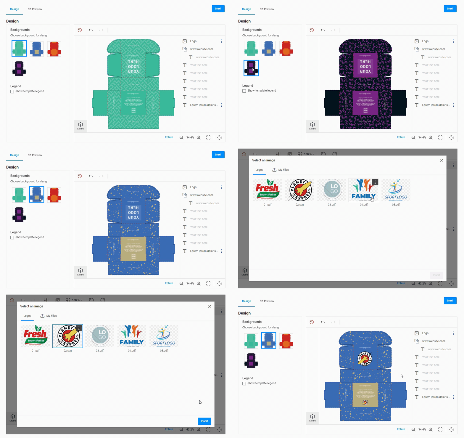
Give your customers the chance to compare different product options by applying them to a design and seeing the final variant on a realistic surface in real-time. Consider an online store that specializes in selling packaging products. The owner can build an editor that allows end-users to choose the necessary packaging backgrounds and personalize it:
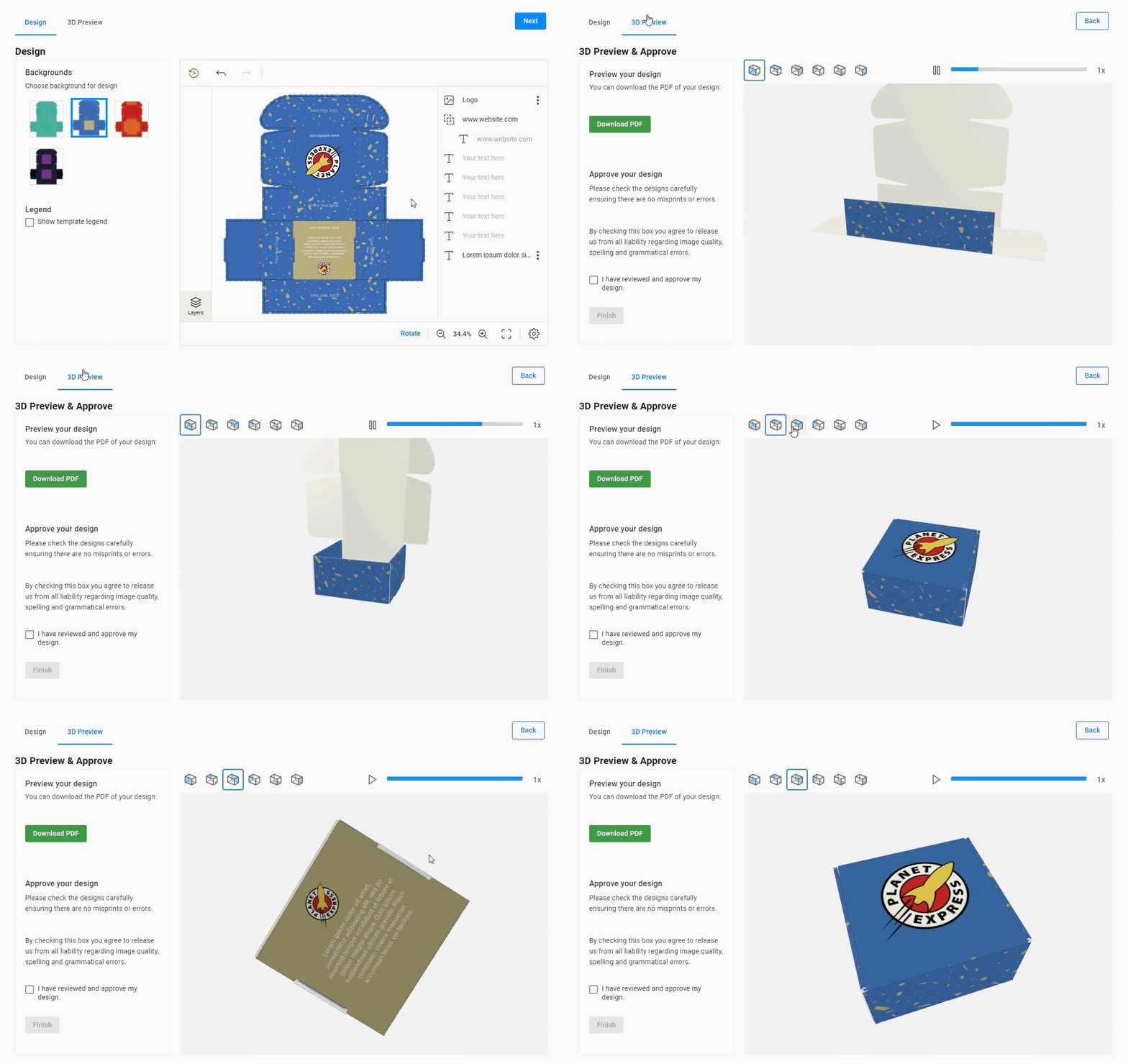
The company can also add a realistic 3D preview to help its customers better understand what the future product will look like:
We will look at these and other techniques for visualizing product options in greater detail. First, let’s learn how your customers and your business can benefit from product visualization.
Why do you need to visualize product options?
Brochures and other products are made up of a set of options that distinguish them and add value. Details like foiling or a type of paper can affect the appearance and the price. When planning a web-to-print integration for your store, take some time to carefully plan your clients’ path through all the options your products have.
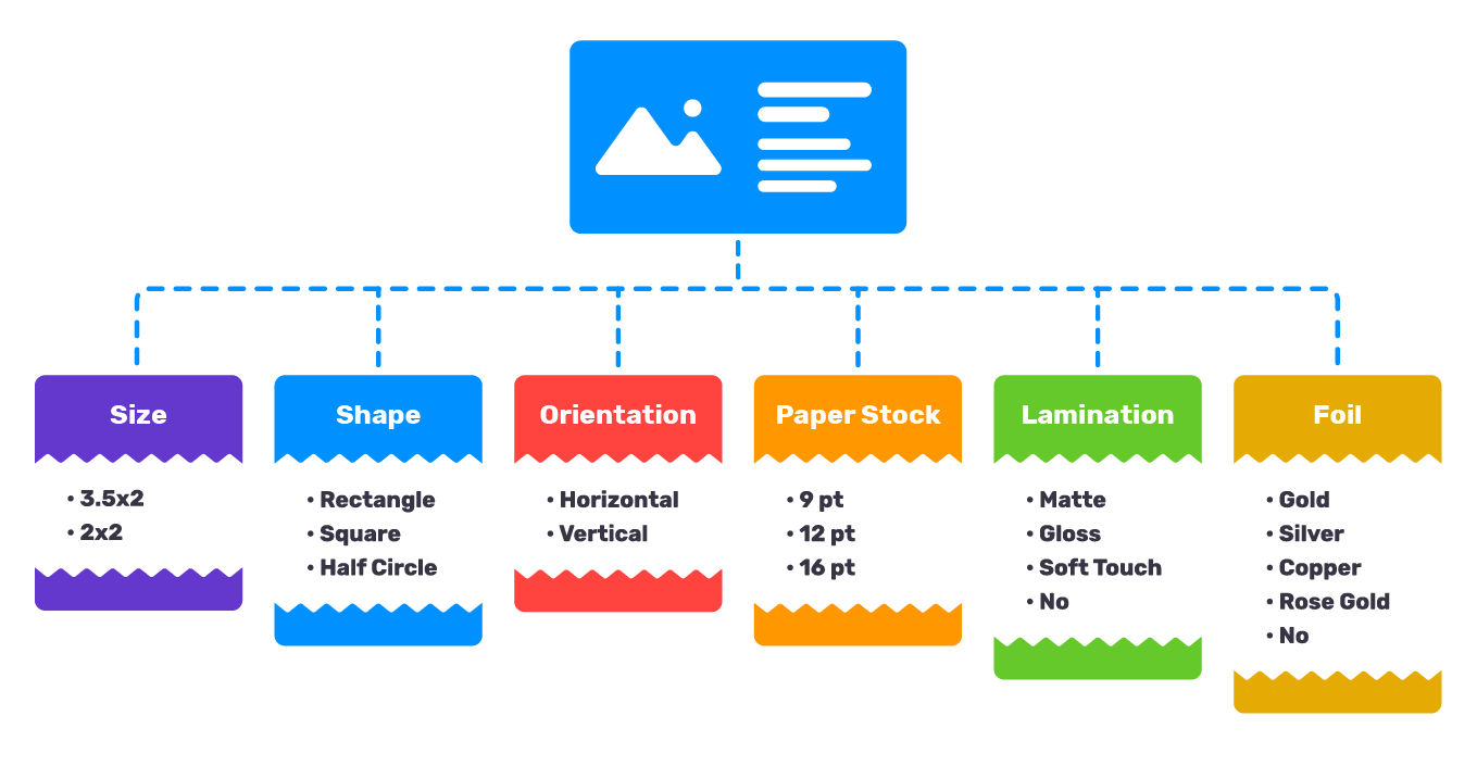
Visualizing product options is a great way to help your clients down the path to the checkout button. A single printed product could have as many as ten or more options that affect its appearance. You can see a set of typical business card options below (this is just a small part):
Various visualization techniques simplify the ordering process for end-users and help companies capture customer attention while increasing trust and boosting conversion rates. These techniques also allow your company to avoid additional costs during production and save time when accepting the order.
Paper products and promo items — what’s the difference?
The latest advancements in web-to-print allow you to visualize any product you sell. However, there are some differences between visualizing paper products and promotional items.
When working with printed products like business cards, brochures, or greeting cards, you should provide your customers with the ability to apply different options to the product directly in the editor. A blank list or lack of options may send the wrong impression that you don’t offer your customers any choice.
Promo products like branded pens are a common, effective way for your customers to increase their brand recognition. When working with tangible goods, you can increase the chances of a purchase by enabling your customers to see how their design will look in a 3D preview. If they feel confident that they know what they’re getting, they are much likelier to click the order button.
How to visualize your products
Using mockups
Whenever end-users see round edges, paper texture, or T-shirts with different colors in the design editor, they are actually looking at mockups. A mockup is just the image that visualizes the product inside the design editor and at the preview step. It can be created in Photoshop or with other editors.
We divide mockups into two types:
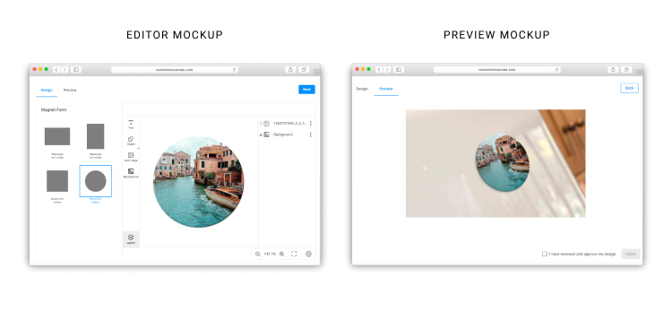
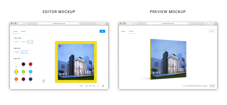
- Editor mockups: images that are displayed when end-users edit designs (round or square magnet shapes).
- Preview mockups: images that are shown after users finish editing, for example, at the approval step (magnet on a fridge).
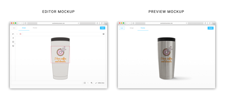
Editor mockups tend to be more schematic and should be convenient for visualizing a flat version of a design. Preview mockups are usually more photo-realistic, and if a product surface is not flat, the design wraps around it. Below, you can see how an editor mockup and a preview mockup appears for the same product.
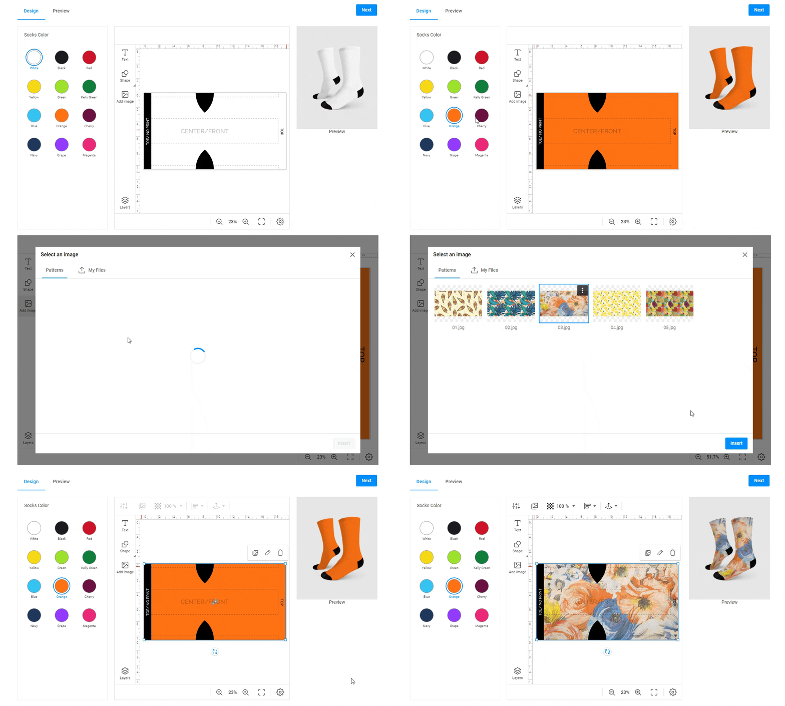
For certain products like socks, the editor can display both editor and preview mockups at the design stage. The customer has a decent idea of how their images or text will appear on the product in real-time.
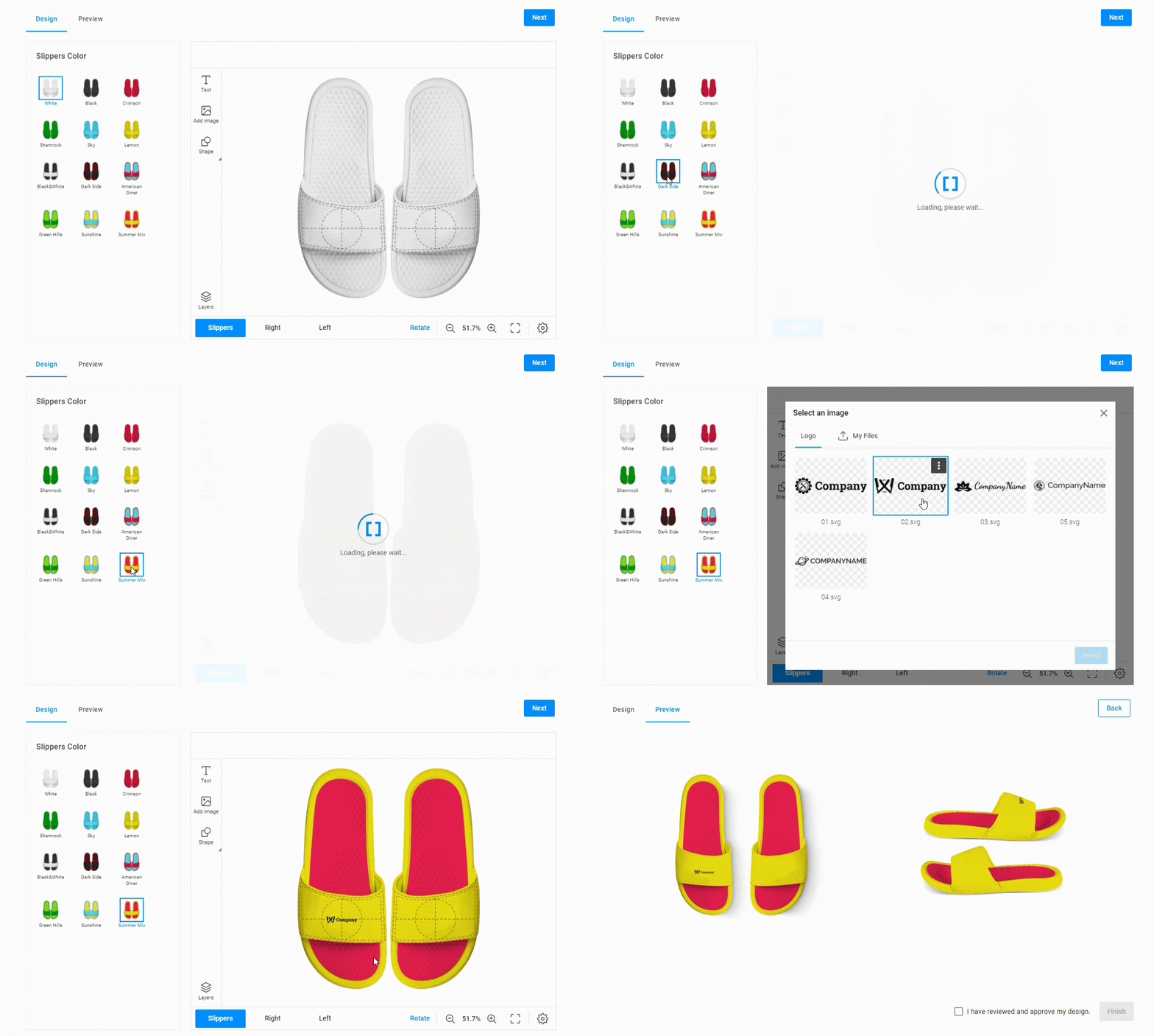
Editor mockups are often used to visualize designs on garments. You can make these mockups for any garment: caps, socks, slippers, and other products.
A MIS system will receive information about both the client's design and the color or shape of the selected garment in separate files.
Watch our video tutorial on how to create a garment mockup in Photoshop.
In some cases, product visualization allows you to sell additional products. For example, when you create an ID card editor, you can add a ribbon mockup and enable color selection. Customers can personalize their ID cards and also pick up a ribbon directly in the editor.
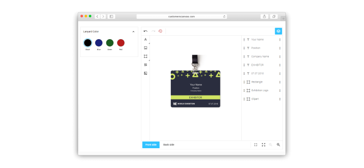
There are many different scenarios for visualizing a product and its options with mockups. The best method will depend on your specific needs and the features of your product. You can see other cases of product visualization in our online demos.
Using a static 3D preview
Although a static preview is a great way to increase conversion rates, it may be time-consuming for your designer to set up. The Customer’s Canvas team has made this process easier to help you reduce labor hours while maintaining the same high level of preview quality. Now, it’s easier to align warped images on objects like mugs or bottles, freeing your designers up to put their time to better use elsewhere.
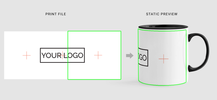
Using dynamic 3D previews
A pseudo-3D preview is an effective way to show how a physical object will actually appear once it’s printed. But why not give your customers the real deal? What if your customers could view an online preview from different angles and even fold objects in real-time? Real 3D previews can take the presentation of your packaging products or trifold brochures to the next level, along with your conversion rates.
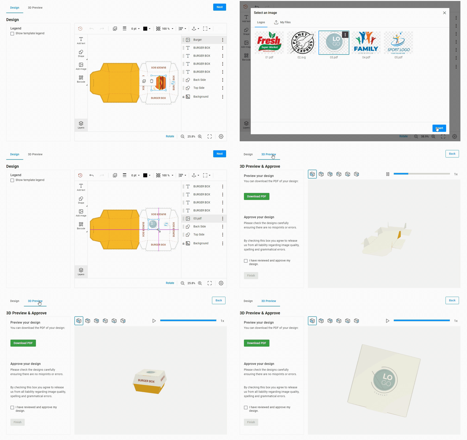
Elevate your products using unique visualization capabilities
Visualizing product options doesn’t just look nice – it’s a tool that can bring in more orders and take customer satisfaction to new heights. Visualization simplifies the client’s path on your site, but can also complicate the process of setting up the editor and generating templates. It’s not easy to display all the options in the editor. As we saw with the business card example, there may be dozens or even hundreds of options. The Customer’s Canvas team is ready to help you run or optimize your web-to-print project and set up the visualization process.

