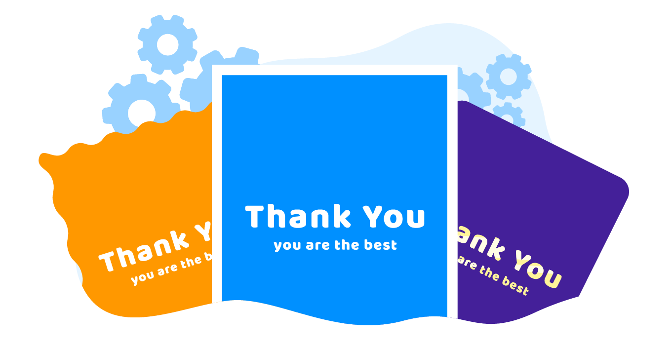
Take a look at the greeting card below. What makes it stand out? The luxe foiling inserts, high-quality craft paper, and wavy edges set it above a generic greeting card.
Try out the greeting card web-to-print editor in action in our online demo.

Greeting cards and other print products are made up of a set of options that distinguish them and add value. Details like foiling can change the appearance and the price. When planning a web-to-print integration for your store, take some time to carefully plan your clients’ path through all the options your products have.
Otherwise, something could go wrong…
Imagine an online store that sells custom greeting cards. A customer visits the product page and selects options like size, paper type, and shape. After they click the «Personalize» button, the editor opens and they start working on their custom design.
They add text and pictures, then suddenly realize they want a greeting card with rounded edges instead of the typical rectangular edges. The end-user must leave the editor and return to the product page to change the shape. To their ire, when they go back to the editor, the design has been completely reset! How frustrating!
The owner of the online shop in this example dropped the ball at effectively planning out the client’s path. Throughout this post, we will take a look at these potential pitfalls and help you prevent them from happening in your online storefront.
How to define what options you have
Product options can be divided into two types:
Options that affect the appearance
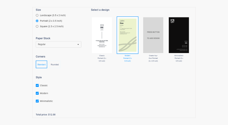
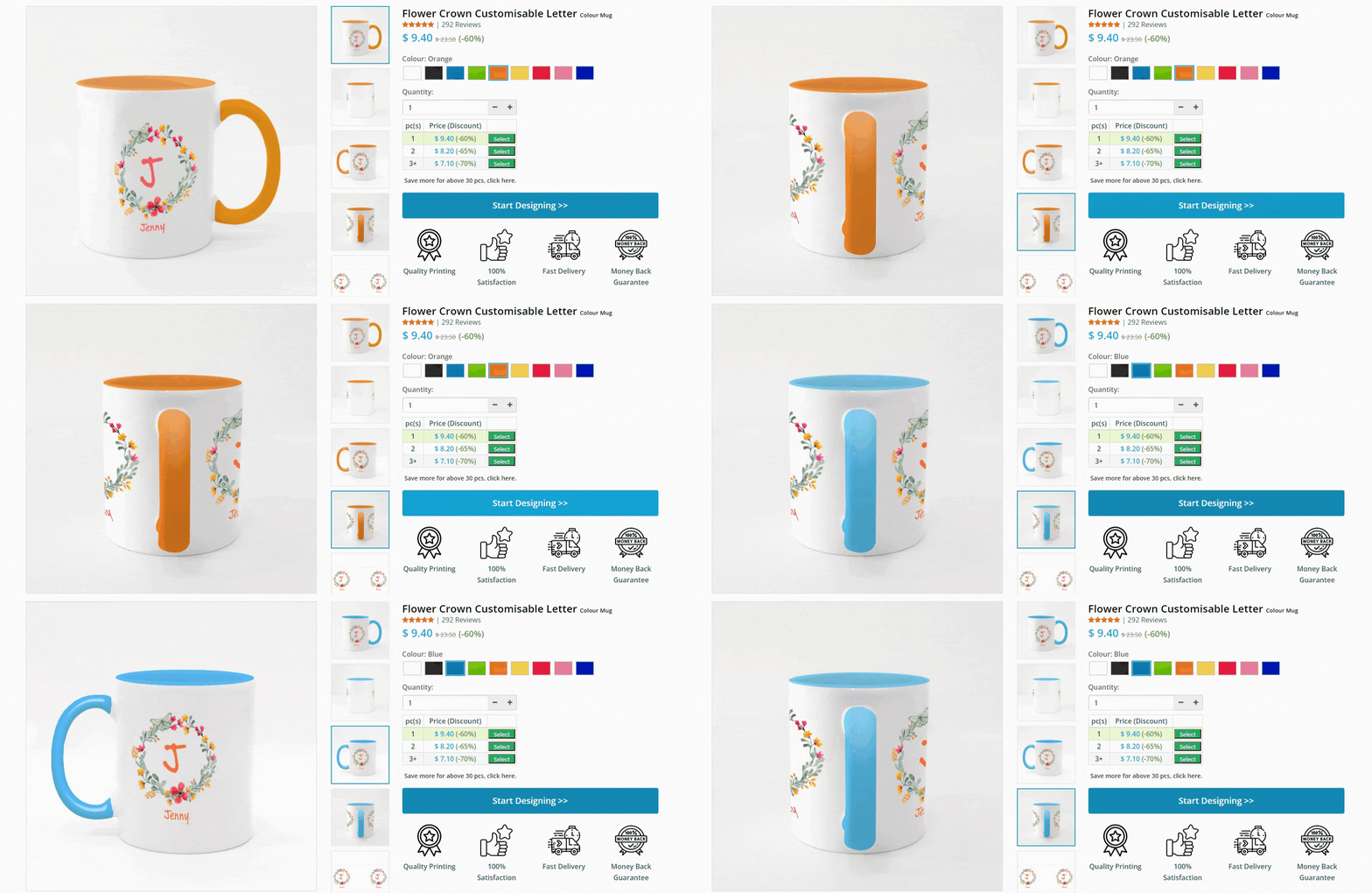
Size, orientation, style, fold type, color, and many other options affect a product’s appearance. Your client may want to see how the final product will look if they toggle between square and rounded edges. The software can achieve this by adding and automatically changing the image on the product page. Another method is to provide customers with a preview step before they place their order.
Some platforms like Shopify offer only three options for a particular subscription package (e.g., color, size, shape). To expand the types of options you can add to a product, you may need to pay an additional fee.
Options that affect the price
These options can affect the final price of a product. Such information passes to the e-commerce platform, which is critical to maintaining price transparency in your online store. If end-users see one price on the product page and a different price in their shopping cart, they may feel they are being scammed and move on to a competitor’s store.
The price should change dynamically based on the selected options. Paper type is a common product option that can shift the price one way or another. For example, linen paper is usually more expensive than coated paper. Special metal finishes can also cost more.
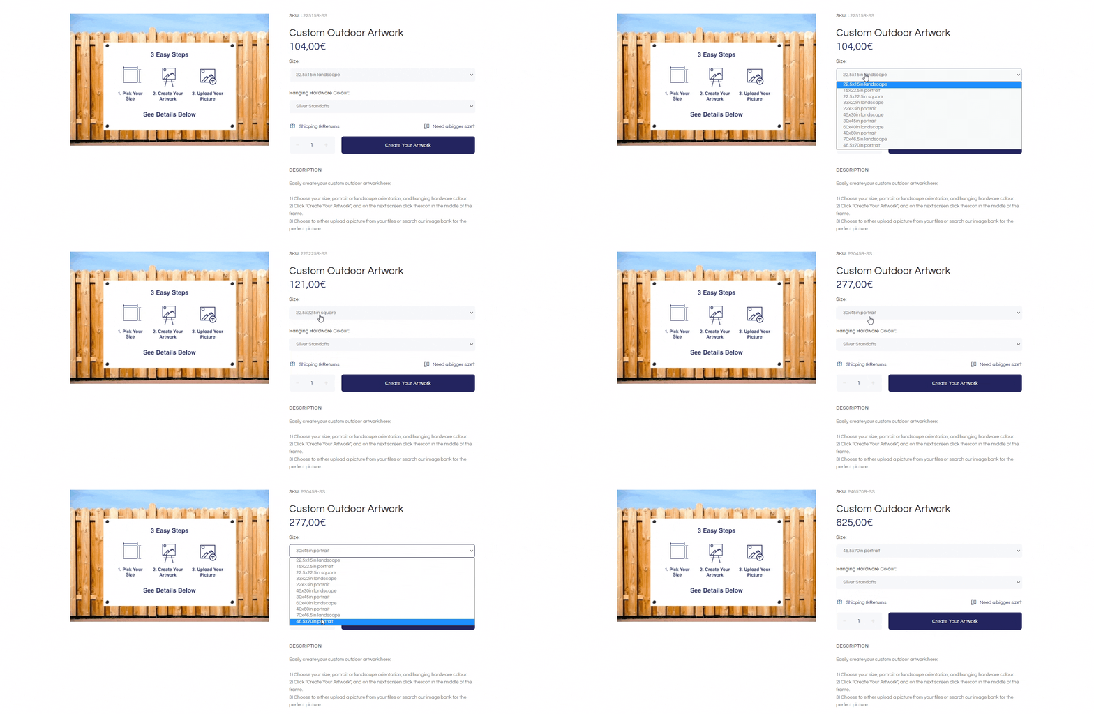
Options that affect the size and shape of the product can also affect the price. How you charge will depend on your production costs. If you spend more resources on production for a non-standard business card, you are likelier to charge more. The main idea is to make any change in price as transparent as possible to the customer.
How to navigate customers through options
Using greeting cards as an example, we will map out a path for your clients to navigate through the options.
Plan your clients' journey
Any project starts with a plan, and web-to-print is no exception. We recommend planning the client's path on your site and deciding on the options that will be displayed on the product page and in the editor.
You can find a template for a customer’s journey map online – there are many variants to choose from. The main principle is to build a path from the moment your customer visits the site to the moment they place an order. Planning this path carefully will reduce hiccups down the road.
Provide customers with a classification of the main menu
If you divide your greeting cards into categories like original, cotton, gold foil, and silver foil, you can simplify the client’s path at their first encounter with your products. This system will also allow you to segment your target audience via categories.
Create a product catalog and set up filtering
Customers can use the product catalog to narrow down a wide variety of products to what they want. Allow them to filter by style (modern, minimalist, floral) or by shape, color, or edges. Helping customers find what they need quickly increases the chances of them clicking the order button.

Set up an intuitive editing process
Let’s return to the frustrating situation when the client’s personalized design was reset after going back to choose a product option.
What went wrong and how to deal with it:
1. The editor didn’t save the client's artwork automatically and reset the data.
Don’t forget to set up automatic saving of the client’s design for situations when they need to go back to the previous step. You should also configure the editor to react to clients changing product options. For example, if the customer changes the greeting card shape, the design adapts to the new option.
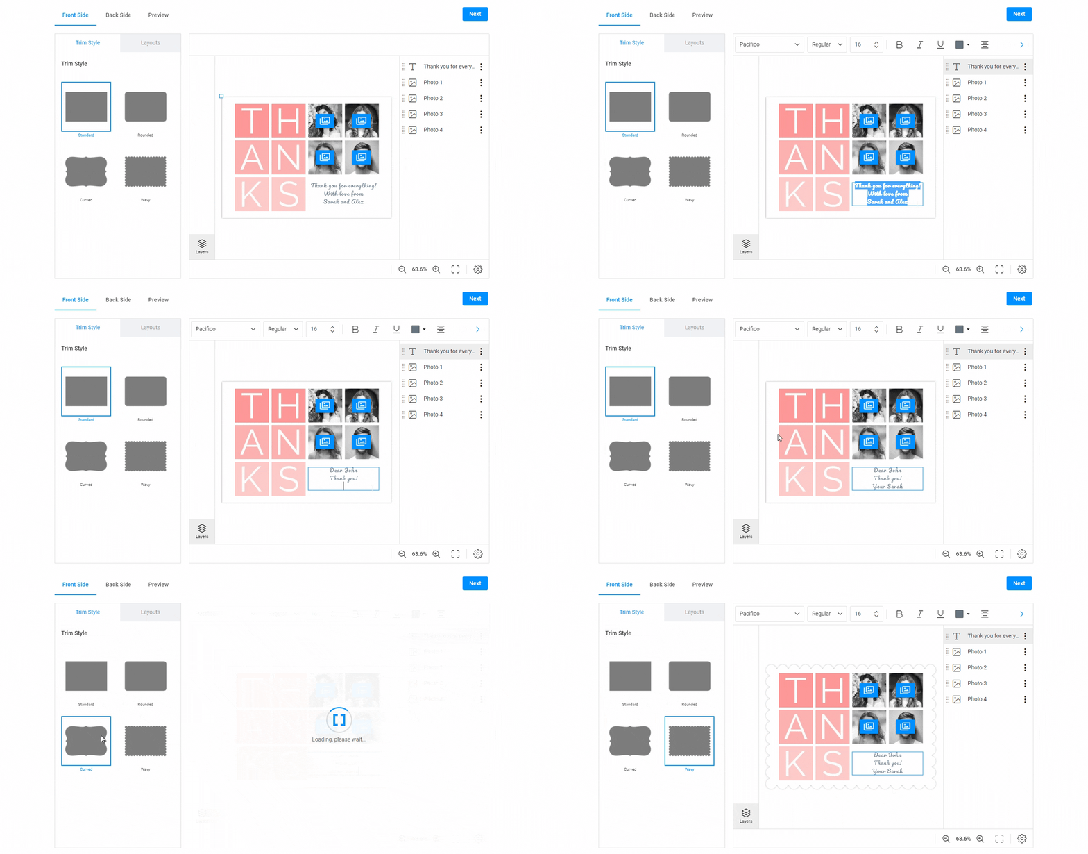
2. There was no functionality for changing options in the design editor.
If you don’t have these features set up, it’s not always the end of the world. This frustrating scenario is less likely to arise if your products only have one or two options. Imagine that you are selling standard-sized wall paintings of various shapes. Customers can only choose the shape and upload images. The upload-based editor may be enough for this case with a simple workflow.
However, if your product has many options or you have a complex workflow, it’s crucial to build an intuitive and non-confusing editing process.
Multi-step workflows
Every web-to-print project is unique. Before launching a W2P solution on your site, plan the client's path wisely. Look at some examples of building multi-step workflows for various cases.
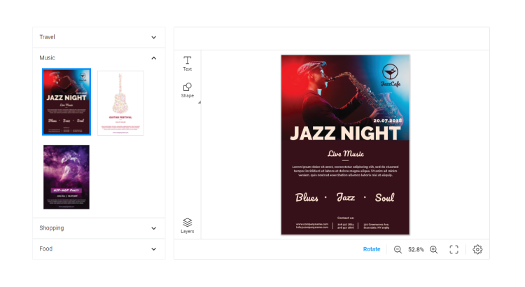
- The flyer editor with a template selection step. Customers can choose a theme directly in the editor – for example, travel, music, shopping – and start editing.
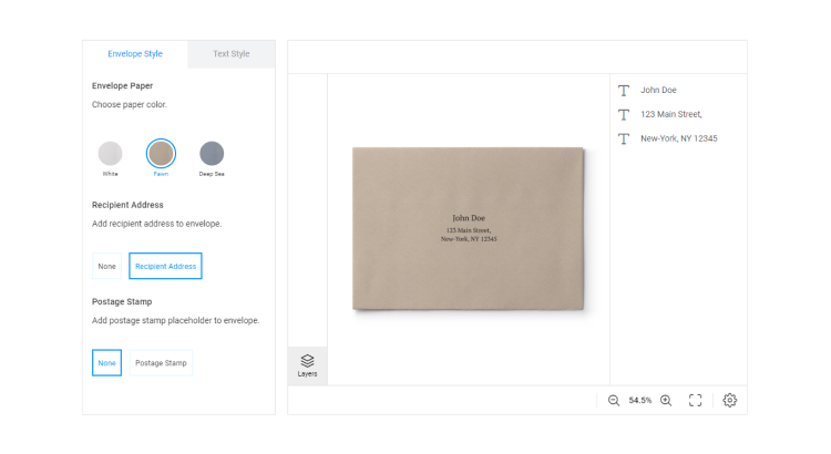
- The envelope editor with a variable data workaround. This editor allows users to choose the paper color and different variables like the postage stamp or the recipient’s address.
- The place card editor with a foiling and paper color option. An additional panel allows users to edit the base and foil separately.
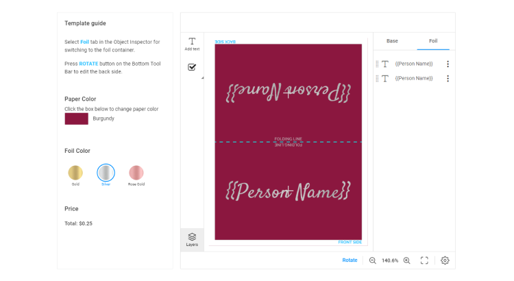
- The business card editor with a complex workflow. This method is one example of how you can navigate customers through all the options your products have in the design editor. The price changes and the design reflects the necessary changes. This process is transparent and intuitive.
Running into trouble along the way?
We are here to help you organize an intuitive path for your clients to follow through all of your product options. Don’t hesitate to send us a message or call our office to discuss your web-to-print project in detail!
If you are planning a web-to-print integration, you may want to check out our complete guide, where we explain all the steps toward a successful integration.
