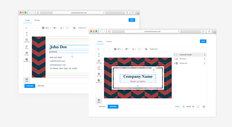
In addition to the sleek new design, we’ve slightly modernized the navigation for working in the mobile version of the editors:
End-users can now scroll through the top toolbar without using a button "More".
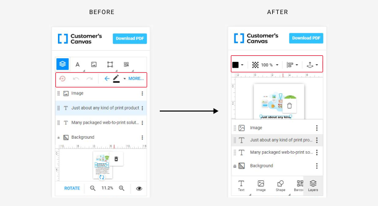
The pop-up menu in the toolbar doesn’t move out of the screen view.
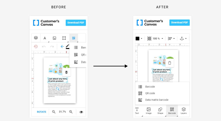
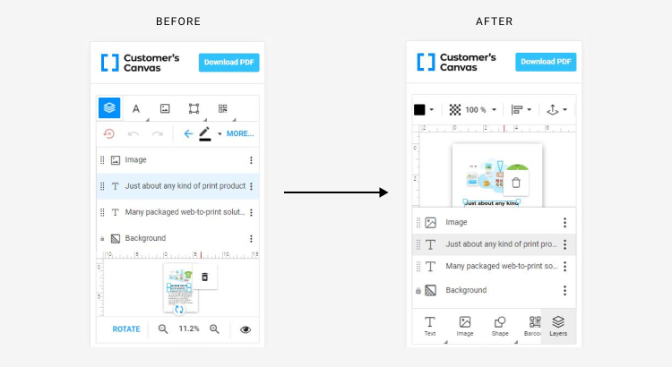
The item list (the object inspector component) doesn’t affect the size of the design area on small screens.
We have also improved the buttons used for color selection. If a user changes the text color, fill, or border, their color selections will be more visible. We have added some new useful captions that help guide users as they edit.
The process for creating personalized products just got even more enjoyable for your users! You can see how the new theme looks applied to the editor interface in our online demos.
Please contact us if you would like to activate this new theme. Our specialists are ready to help you. You also can open a support case or enable the new editor theme yourself in the settings.
