What is an online product catalog?
Online catalogs help you showcase your products in your online store. Traditional retail businesses send their customers a paper version filled with eye-catching images to attract the buyers’ attention and give them information like product descriptions, pricing, and more. A print catalog generally consists of carefully selected products that you have or can source.
Online product catalogs can leverage some of these same elements, along with other attention-grabbing features like 3D animation. Such catalogs allow you to publish every product you have without additional expense. On the one hand, this is a great advantage because you can store, display, and quickly update all of your product information. On the other hand, you can compromise usability if you don’t organize how customers navigate these products and options in an intuitive way.
How to organize a product catalog in the most convenient and intuitive way
Know your customers
An online catalog should focus on a specific audience. To make a convenient catalog, you need to understand what will be convenient for your customers rather than the average print buyer.
Try to answer the following questions:
- Who is the end-user of your online store?
- Will your customer buy for personal needs?
- Or do you serve companies that order large print runs for business purposes?
- Should your online store cover different audiences?
B2B buyers (companies) look for specific products and probably need more details in the product descriptions. B2C customers (ordinary buyers) search for different options and are easily influenced by promotions.
Plan the customer's journey through your products
With your audience in mind, try to answer the next question: Which path should your client take from the main page to the checkout button?
This path should be straightforward and simple. Make a map with possible avenues to get to the shopping cart without encountering obstacles. Businesses sometimes lose clients because they forget to add a «Start designing» button. Or, they don’t make this button obvious to the client.
Read our special article to learn how to organize a successful customer's journey on your website.
Try using a click map to understand how end-users navigate the page to improve usability. A click map displays the buttons users usually click and the pages they visit. This approach helps optimize the client’s path in your store.

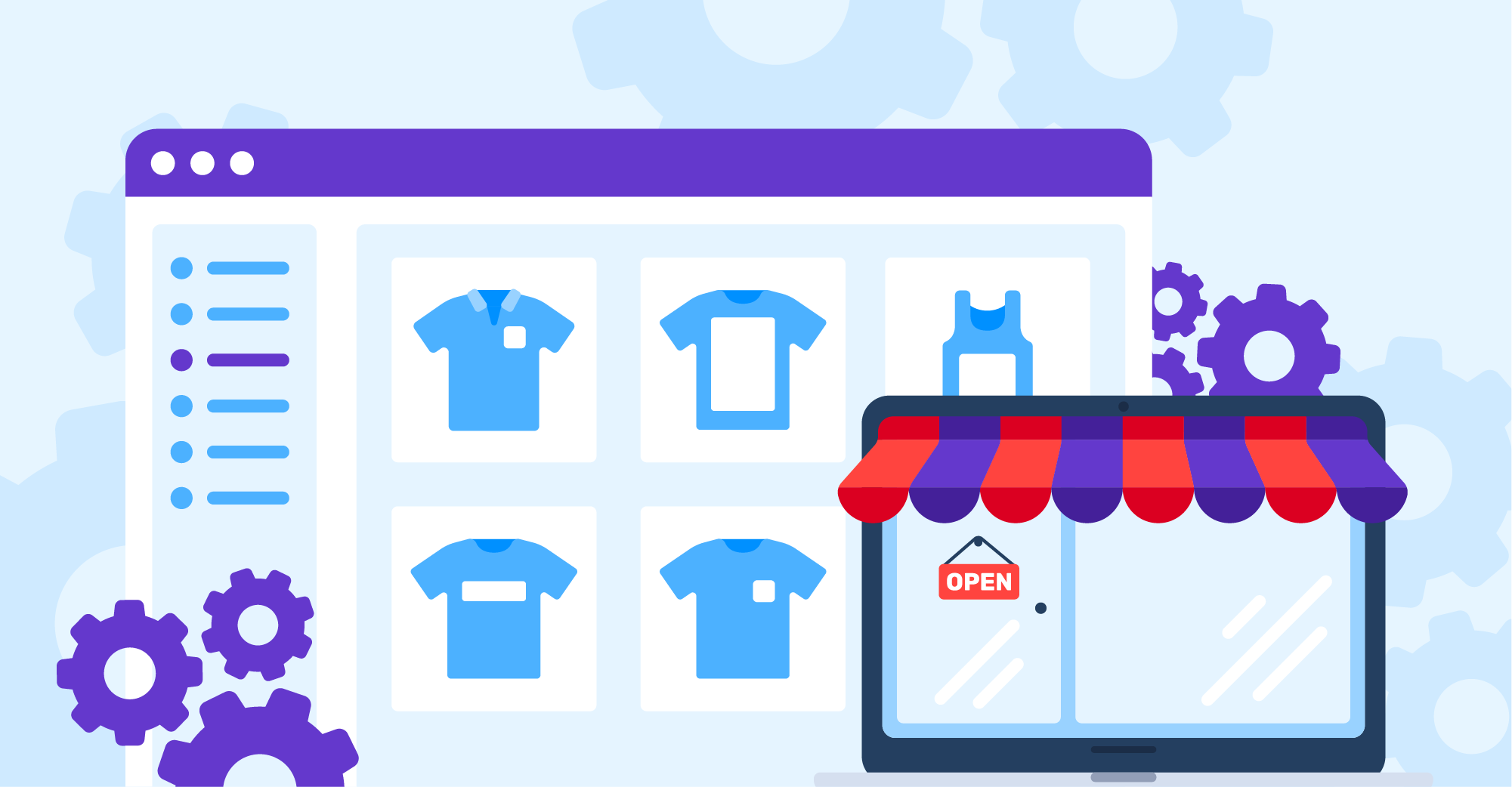
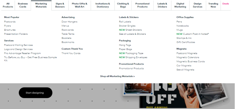
Organize your product categories
If you sell a lot of assorted products, it makes sense to divide them into categories and publish each category on a separate page (e.g., apparel, business printing, stickers & labels, packaging, etc.) If you sell one type of product for various occasions – like invitations for weddings, religious events, or birth announcements – then it also makes sense to create categories.
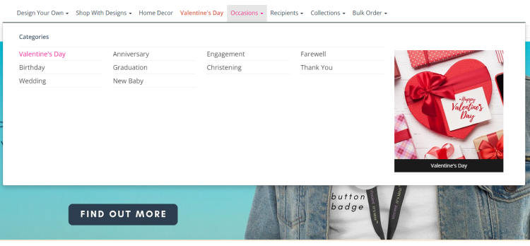
Categorization helps segment your audience and lead them to the most relevant products to their needs. In the process, you increase the chance of final purchases and optimize your store for search engines.
Use the following tips for improving product categories
Store all product data in a centralized place. It’s like storing your clothes in a wardrobe. You can always sort out and review what you need, lay out the items you want to feature, and throw out the unnecessary items. There are different PIM (product information management) systems that help store and collect all the product information and set up product catalogs in the most efficient way.
Don’t offer too many categories. Otherwise, your navigation menu may become cluttered and overcomplicated. Clients have trouble absorbing 15 or more categories. You can avoid overwhelming them by eliminating redundant categories
Name categories and subcategories in a simple and straightforward way for your customers, with words that end-users are most likely to search. For example, “pens” is a clear category name for customers and doesn’t take up much space on the main menu. “Pens with blue ink digital full-color wrap” is not a suitable category name, even if you only sell this type of pen. The category name should be concise and easy to read.
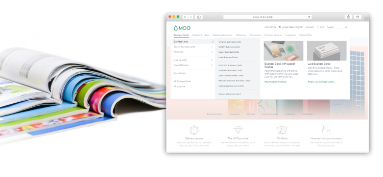
Search for a similar product that another merchant may be selling if you encounter problems with naming. Use other companies from your industry as a source of inspiration (Amazon, Vistaprint, Moo)
Ensure naming conventions for categories, subcategories, options, and others are consistent. Name consistency is also necessary when implementing a web-to-print solution, designing templates, and creating mockups. If your product categories and options vary in distinct locations, this may cause integration issues.
Decide how to capitalize your category names (for example: black, BLACK, or Black) and check your categories for any repeats and errors.
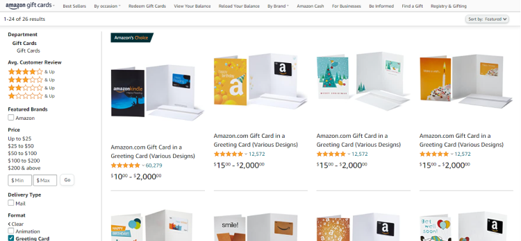
Think about how customers can filter products
A lack of coherent filtering design can drive customers away from your online store before they make a purchase. Filtering is useful even for online stores with a small product range. Filters organize products in the most convenient way.
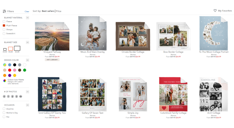
Here are some tips to help make your filtering more efficient:
- Allow customers to select a category first, then filter results. Print buyers that visit brick-and-mortar stores usually check the shop window or open a paper catalog to see all the categories first, then turn to the desired page.
- Determine the best filter’s location: sidebars, horizontal bars, or somewhere else? Most users are familiar with filtering in a sidebar. It might be better to give them a predictable location. On the other hand, horizontal bars help focus the end-user’s attention in one place.
- Allow multiple selections. Limited filters can negatively impact site usability and customer satisfaction. Printed products can consist of dozens of options, so you should give print buyers a broad range of choices. We discuss the variety of product options and how to navigate them in more detail in our special article.
- Avoid the "Nothing found" result. Otherwise, end-users may be disappointed that they wasted time filtering without getting the desired result.
In a nutshell
A well-planned and organized online product catalog is a big step towards building a successful online business with effective web-to-print integration. If you don’t have an e-commerce catalog or want to improve the usability of your current catalog, consider some of our basic recommendations:
- Determine who uses or will use your online catalog: businesses or ordinary customers? This is your jumping-off point.
- Create a customer’s journey map to eliminate obstacles in a visitor’s path.
- Ensure your product categories are easy to read, concise, and familiar to customers.
- Create intuitive filtering to drive print buyers to place orders.
Have trouble along the way? The Customer’s Canvas team is here to help!