Template editor
This year, we launched the brand-new template editor, which now helps companies create and set up web-to-print templates with ease. We’ve recently added some useful updates this feature:
New "Test" button
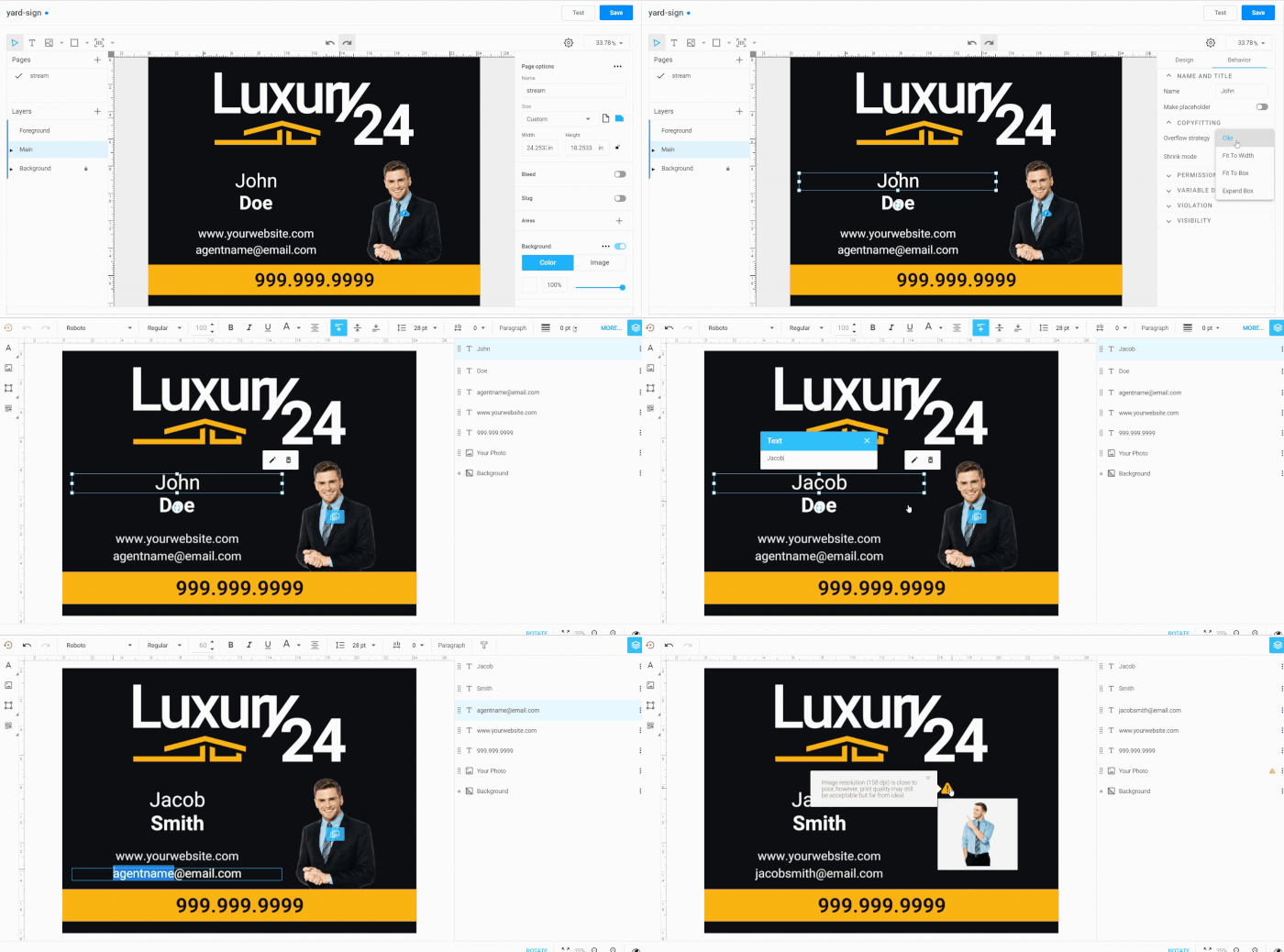
Now you can not only configure the behavior of design elements - but also check whether the settings are set up correctly with one click. Just press the "Test" button, and try the saved design in the same editor your customers will see it.
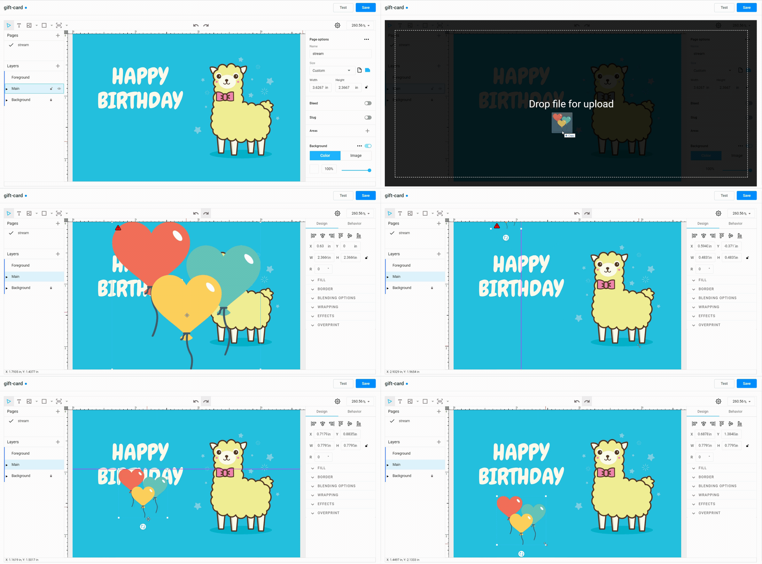
Drag and drop images from the desktop to the template
This feature is useful when you need to upload images quickly. You can easily drag images from the desktop instead of spending time opening folders.
Status bar
This is an indicator in the lower left corner that displays various types of status information, such as loading and save statuses as well as mouse coordinates.

Support for the slug area
The slug area usually contains a registration mark and other printing instructions for the printer. Now, you can define the parameters for the slug area directly within the built-in template editor.

Interface
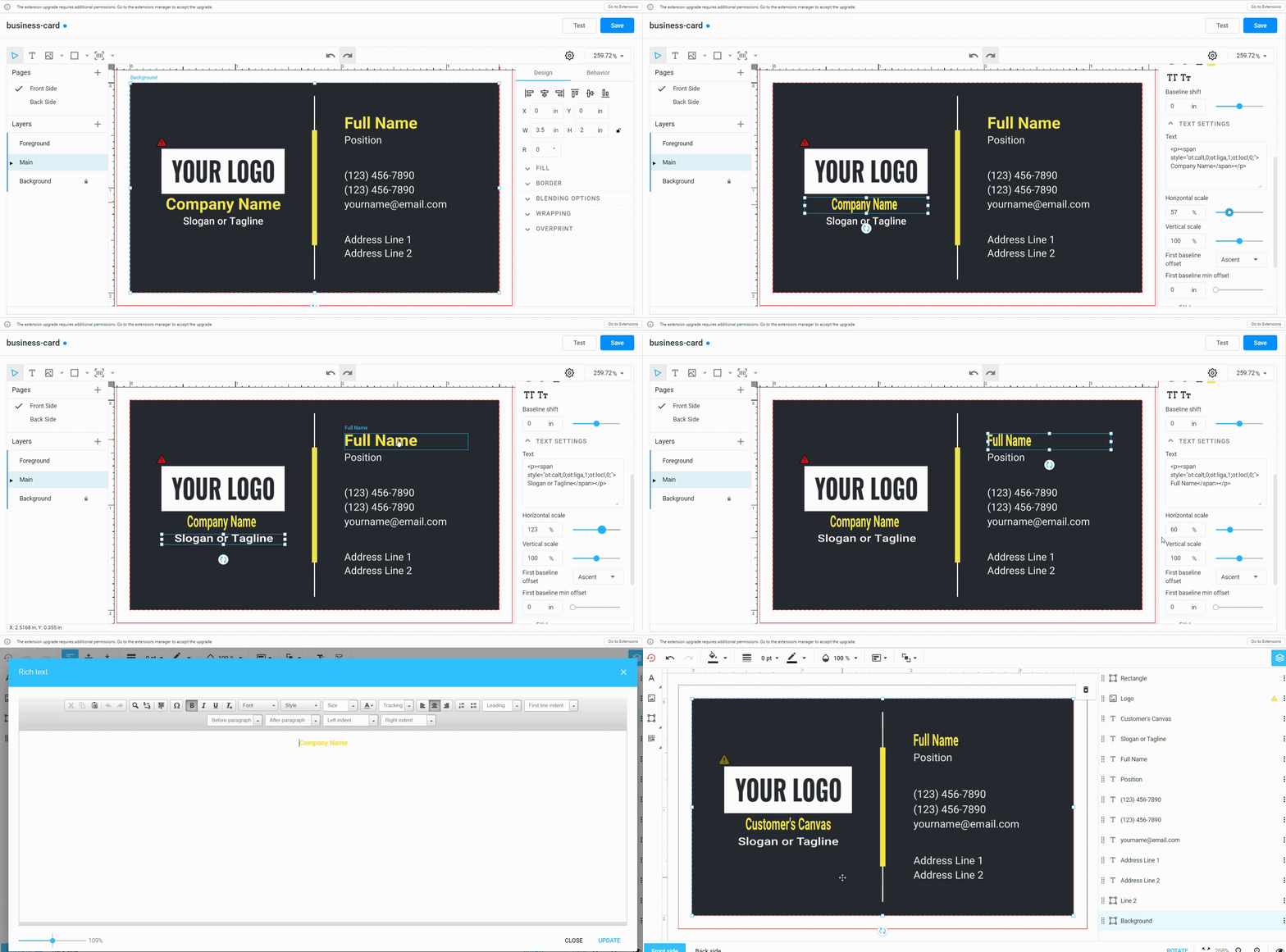
Support for vertical and horizontal scaling for text
You can use this feature when you want to make a design more harmonious or creative. Below, you can see how to configure the scaling feature in the built-in template editor. This is how the feature will be visible from the end-user’s perspective in the WYSIWYG editor.
New zoom options
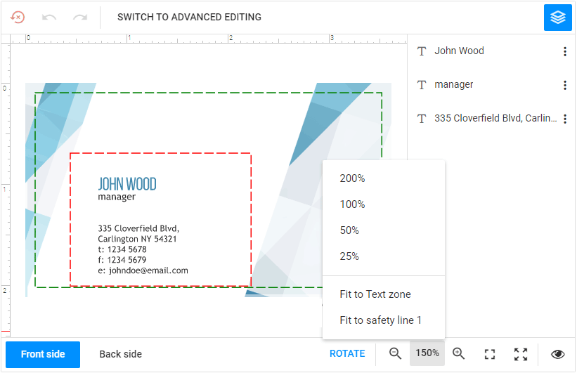
In the Design Editor, you can now zoom in and out of the canvas to fit the predefined safety lines. This allows your customers to zoom in and edit, for example, only the text zone without being distracted by other design elements.
Decimal CMYK values support
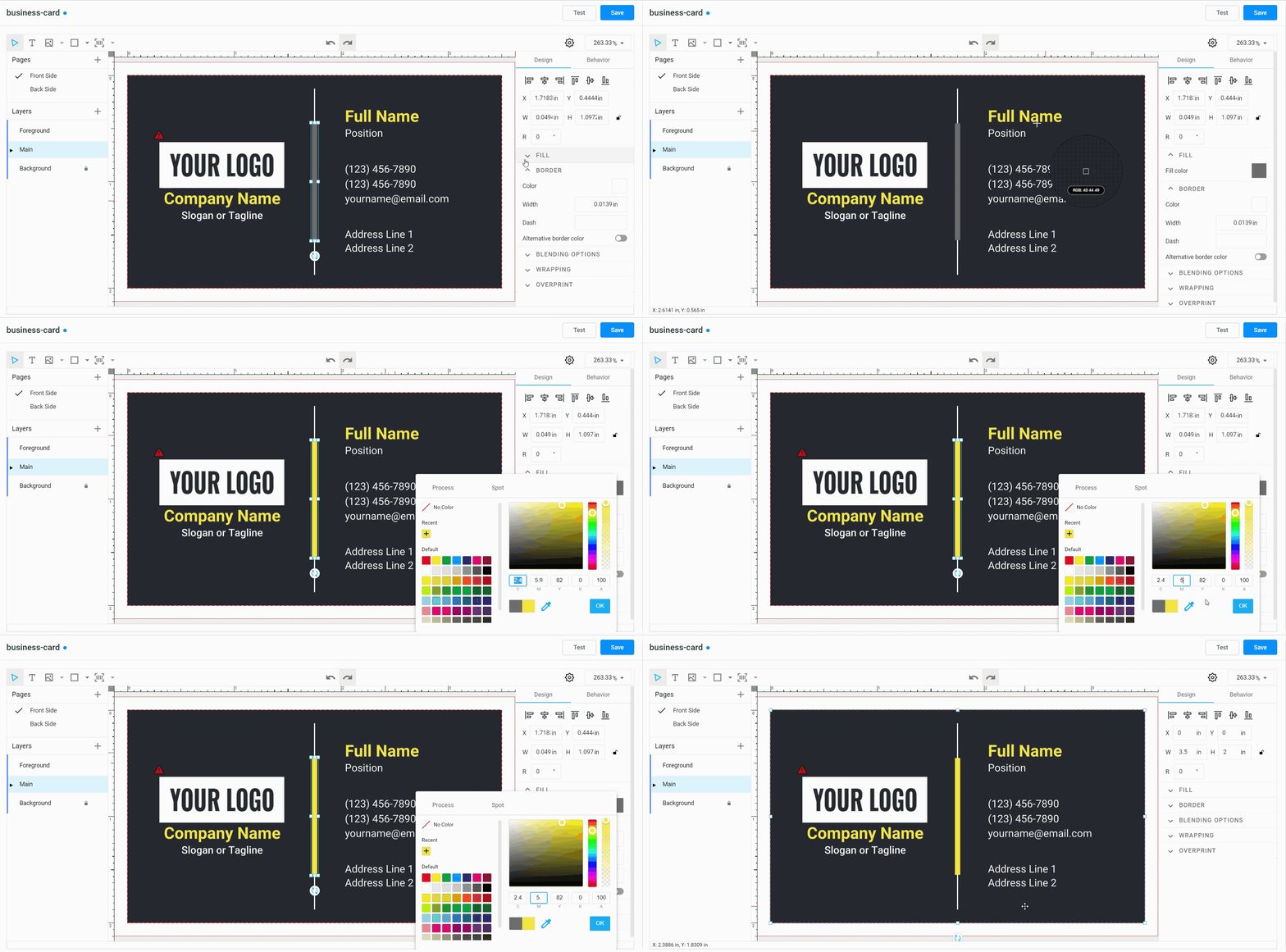
We added the option to specify CMYK values with decimals in the color picker. This feature expands the preciseness of the CMYK color values in the built-in template editor (as shown in the image below) and the design editor.
General improvements
You can define a primary theme color and an image for the preloader.
Warnings about safety line violations have been improved. You can define what warnings should be displayed:
- when design elements intersect a safety line.
- when they don’t fit into any safety zone.
- when they don’t fit into the zone and don’t intersect the lines.
Added the ability to move design elements to an area bounded by safety lines. Let’s imagine that you sell T-shirts and your customers can change their design in the editor. The T-shirts have pockets that can also be edited, for example, by placing images there, such as a company logo. You can enable the Place in button in the Top Toolbar to allow your users to put selected elements in the center of the rectangle (a pocket).
This is only a brief snapshot of all the improvements we’ve made. Stay tuned to keep up to date with all the new features we roll out and how they can benefit your business!
