

Button
This widget displays a button. You can define button text, select the button style, and set the actions to be performed when the button is clicked. By clicking the button, you can implement code or manage other widgets.
As for the appearance, the button widget shows text and has several color styles.
{
  "name": "my-button",
  "type": "button",
  "params": {...}
}
Text
This is a button without functions added to a main panel.
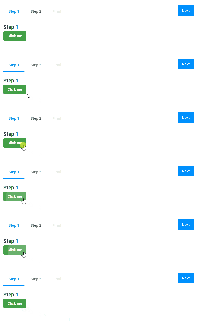
{
  "name": "my-button",
  "type": "button",
  "params": {
    "text": "Click me"
  }
}
Button styles
You can select one of the predefined button styles that mostly differ in their color. By default, buttons are displayed in the colors of the primary UI theme. You can also select a color corresponding to a successful action or a secondary color set. Just use the success and secondary values in the classStyle param.
Success style
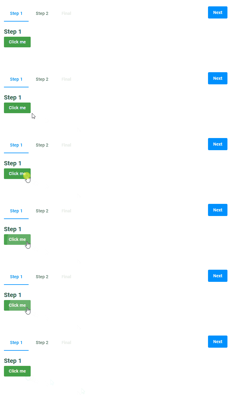
{
  "name": "my-button",
  "type": "button",
  "params": {
    "text": "Click me",
    "classStyle": "success"
  }
}
Secondary style
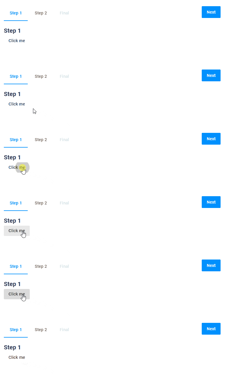
{
  "name": "my-button",
  "type": "button",
  "params": {
    "text": "Click me",
    "classStyle": "secondary"
  }
}
Enabled
The enabled property defines if the button is clickable or not. In this example, we make the button clickable depending on the checkbox value. If selected, the button will be clickable. Here, we use a dynamic expression returning the checkbox value.
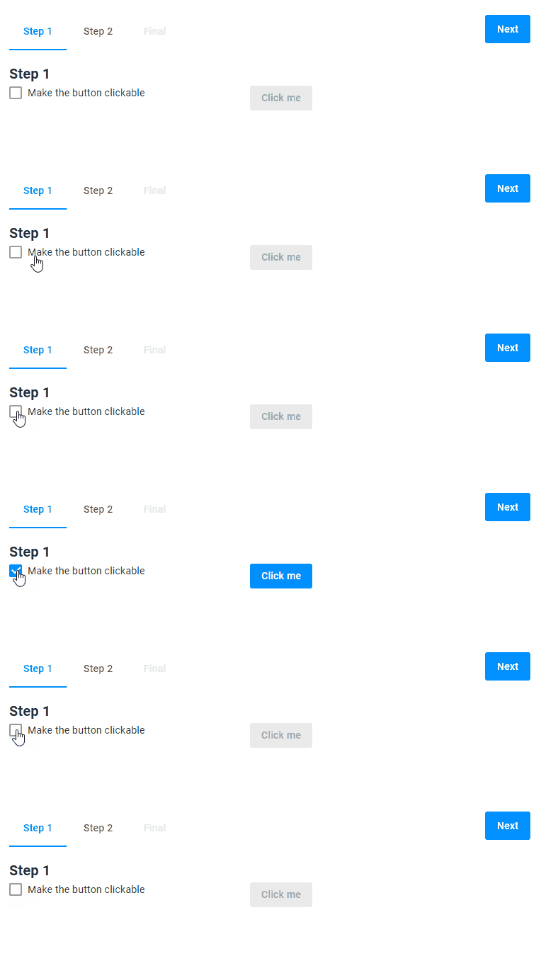
{
  "name": "my-button",
  "type": "button",
  "params": {
    "text": "Click me",
    "classStyle": "primary",
    "enabled": "{{$['checkbox']._ }}"
  }
}
Visible
The visible property defines the button visibility in the user interface.
In this example, we will also display the button depending on the checkbox value. In the dynamic expression for the visible param, we invert the checkbox value. This expression means that the button will be visible if the checkbox isn't selected and vice versa.
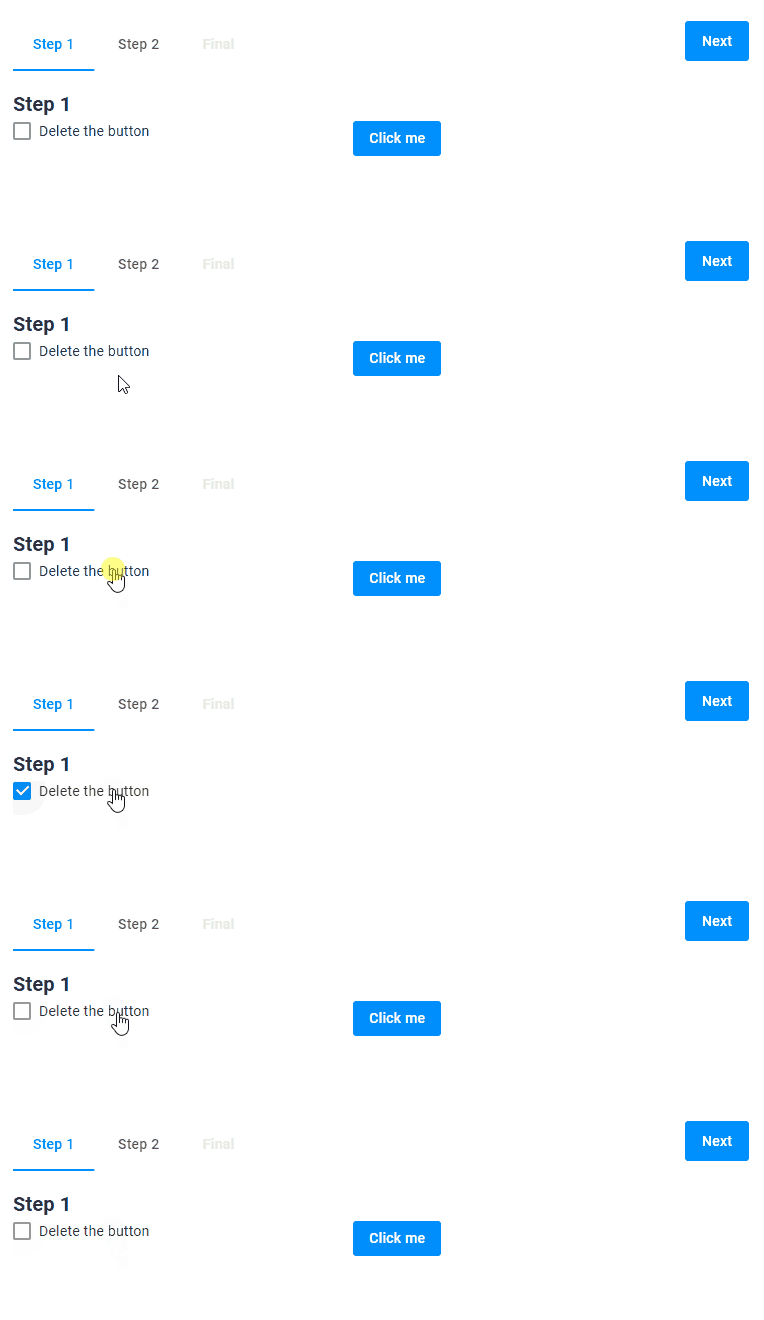
{
  "name": "my-button",
  "type": "button",
  "params": {
    "text": "Click me",
    "classStyle": "primary",
    "visible": "{{!$['checkbox']._ }}"
  }
}
Events
A button allows you to handle the onClick event. You can define one or more functions to be performed when the user clicks the button.
In this example, the checkbox is selected on the button click.
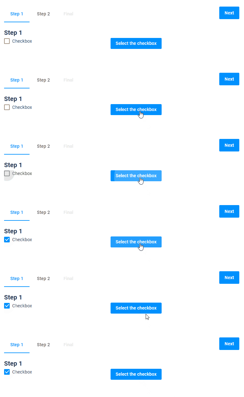
{
  "name": "my-button",
  "type": "button",
  "params": {
    "text": "Select the checkbox",
    "onClick":"{{#function $['checkbox'].value = true}}"
  }
}
Params
| Name | Type | Description | Default meaning |
|---|---|---|---|
classStyle | "primary"|"success"|"secondary" | defining a button color | "primary" |
text | string | adding text to a button | empty string |
enabled | boolean | making a button clickable | true |
visible | boolean | making a button visible | true |
onClick | a function "{{#function ...}}" or array of functions ["{{#function ...}}","{{#function ...}}", ...] | calling a function | undefined |