

Steps
The steps widget is a non-visual widget, which controls the availability of the steps for a customer by making tabs and buttons in the Navigation panel active or inactive.
Although this widget is defined as a regular widget, you don't need to add it to the step panels or to the group widget.
{
    "name": "my-steps",
    "type": "steps",
    "params": {
        "steps": {
            "Step 1": {...},
            "Step 2": {...}
        }
    }
}
Availability of steps
By default, when you don't use the steps widget in your workflow file, all the steps will be available in any order.
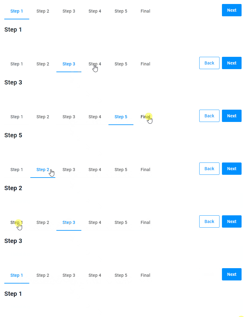
To change this behavior for all defined steps, set the availabilityMode property to visited or previous.
Visited
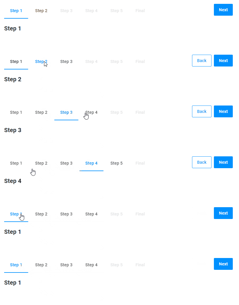
The visited mode makes all the steps you've visited, as well as the following step, active. If you go back to the previous steps, all the steps visited will stay available.
For example, let's assume that you visit the workflow steps in the following order: Step 1, Step 2, Step 3, and Step 4. At Step 4, all the already visited steps and the following one will be available. Now, if you go back to Step 1, all the steps visited will still be available.
{
    "name": "steps",
    "type": "steps",
    "params": {
        "availabilityMode": "visited"
    }
}
Previous
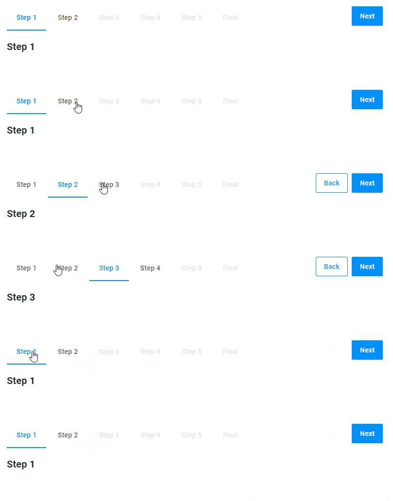
The previous mode makes the previous steps and only the following step.
For example, you start from Step 1. At this moment, only Step 2 is available. When you go to Step 2, the previous Step 1 and the following Step 3 will be available. Then, you go to Step 3, and all the previous steps you've visited and the following Step 4 will be available. Finally, go back to Step 1. Now only the following "Step 2" is available, and "Step 3" and "Step 4" become unavailable.
{
    "name": "steps",
    "type": "steps",
    "params": {
        "availabilityMode": "previous"
    }
}
Managing a step
You can also control the availability of a single step regardless of the general availabilityMode. To do so, add a steps object to params and redefine the behavior for the specified step.
Enabled
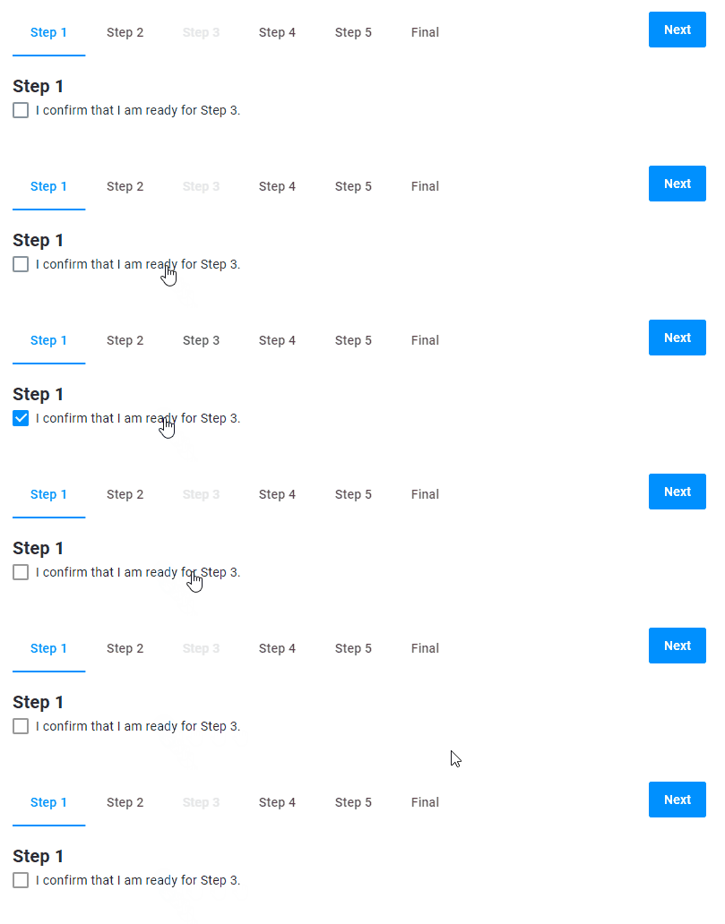
The enabled property controls the availability of a step. In this example, the availability of Step 3 depends on the checkbox from Step 1.
{
    "name": "steps",
    "type": "steps",
    "params": {
        "steps": {
            "Step 3": {
                "enabled": "{{$s['confirmation-checkbox']._}}"
            }
        }
    }
}
Hidden
The hidden property can hide a step. In this example, it hides a step depending on a checkbox value.
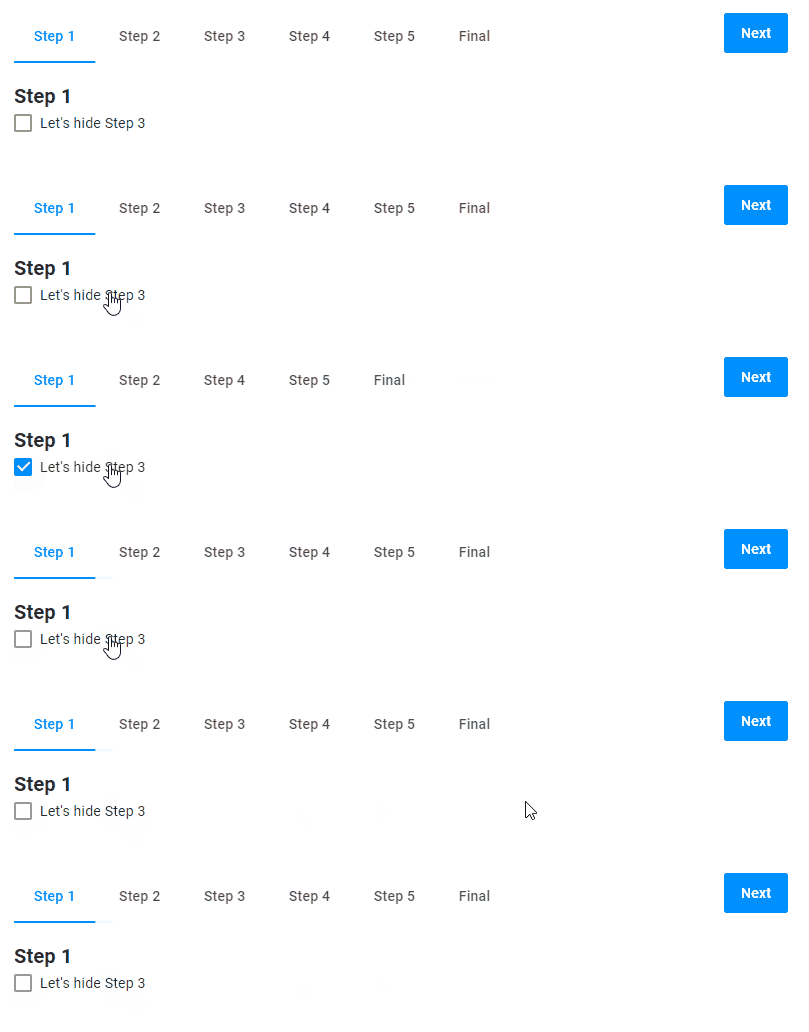
{
    "name": "steps",
    "type": "steps",
    "params": {
        "availabilityMode": "visited",
        "steps": {
            "Step 3": {
                "hidden": "{{$['confirmation-checkbox']._}}"
            }
        }
    }
}
Back to product
You can add the Back to product button to your workflow. This button redirects your customers back to a product page.
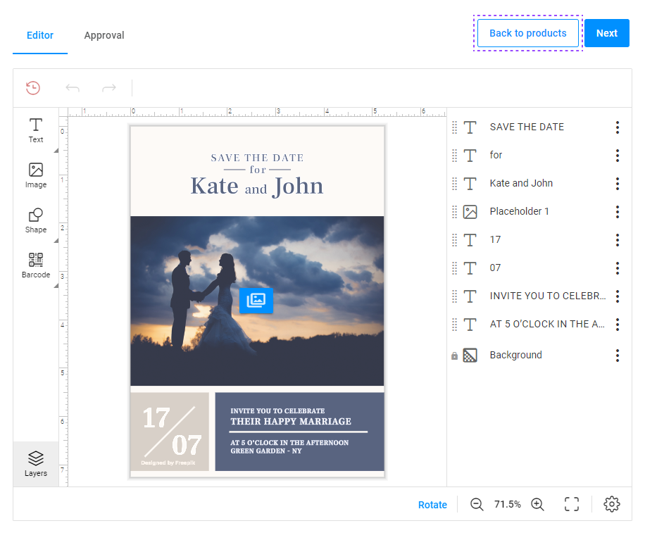
The Back to product button can only be displayed on the first step of the personalization workflow.
{
    "name": "steps",
    "type": "steps",
    "params": {
        "availabilityMode": "visited",
        "backToProductButton": {
            "title": "Back to product"
        }
    }
}
Finish button
The Finish button appears on the final step of personalization, where customers approve their personalization result.
You can define the Finish button in this widget by using the finishButton property. This property replaces the deprecated widget finish-button.
When the user approves the personalization result by using the confirmation checkbox, the Finish button is enabled.
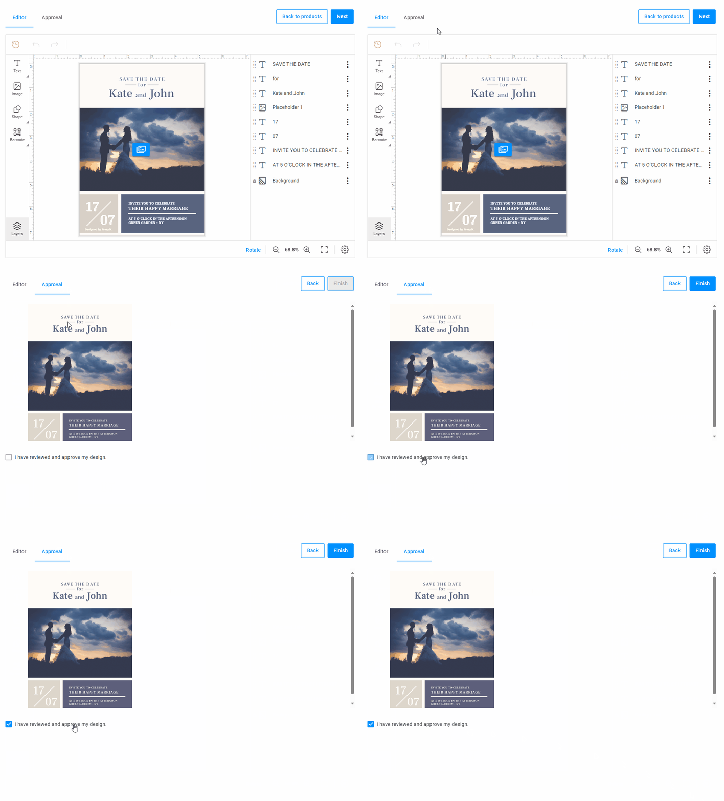
{
    "widgets": [
        {
            "name": "steps",
            "type": "steps",
            "params": {
                "availabilityMode": "visited",
                "backToProductButton": {
                    "title": "Back to products",
                    "visible": "true"
                },
                "finishButton": {
                    "visible": "true",
                    "enabled": "{{$['agree-checkbox']._}}",
                    "onClick": [...]
                }
            }
        },
        {
            "name": "agree-checkbox",
            "type": "checkbox",
            "params": {
                "prompt": "I approve the design.",
                "value": false
            }
        }
    ],
    "steps": [
        {
            "name": "Approval",
            "mainPanel": {
                "name": "preview-slider"
            },
            "bottomPanel": {
                "name": "agree-checkbox"
            },
            "onActivate": [
                "{{ #function $['agree-checkbox'].value = false }}"
            ]
        }
    ]
}
Params
| Name | Type | Description | Default value |
|---|---|---|---|
availabilityMode | visited | previous | manages the behavior for all the steps | undefined |
steps | dictionary of steps and their appearance | defines behavior for a specific step, referenced by the name or ID | undefined |
backToProductButton | object | definition of the Back to product button | undefined |
finishButton | object | definition the Finish button | undefined |
backToProductButton
| Name | Type | Description | Default value |
|---|---|---|---|
title | string | the button title | undefined |
visible | boolean | displays the button | true |
url | string | click-through link | undefined |
onClick | a function or array of functions | calls the functions. Note: if you use onClick, then url won't work. | undefined |
finishButton
| Name | Type | Description | Default value |
|---|---|---|---|
visible | boolean | displays the button | true |
enabled | boolean | enables the button | true |
onClick | a function or array of functions | calls the functions | undefined |
Step
| Name | Type | Description | Default value |
|---|---|---|---|
hidden | boolean | hides a step in the Navigation Panel | false |
enabled | boolean | makes a step clickable in the Navigation Panel | true |