

Slider
This widget shows images. They appear as one or in groups on screen. You can look at them closer and scroll through them.
{
  "name": "my-slider",
  "type": "slider",
  "params": {
    "images": [
      {
        "title": "...",
        "url": "..."
      },
      {
        "title": "...",
        "url": "..."
      }
    ]
  }
}
In the following example, you can see how this widget works with default settings.
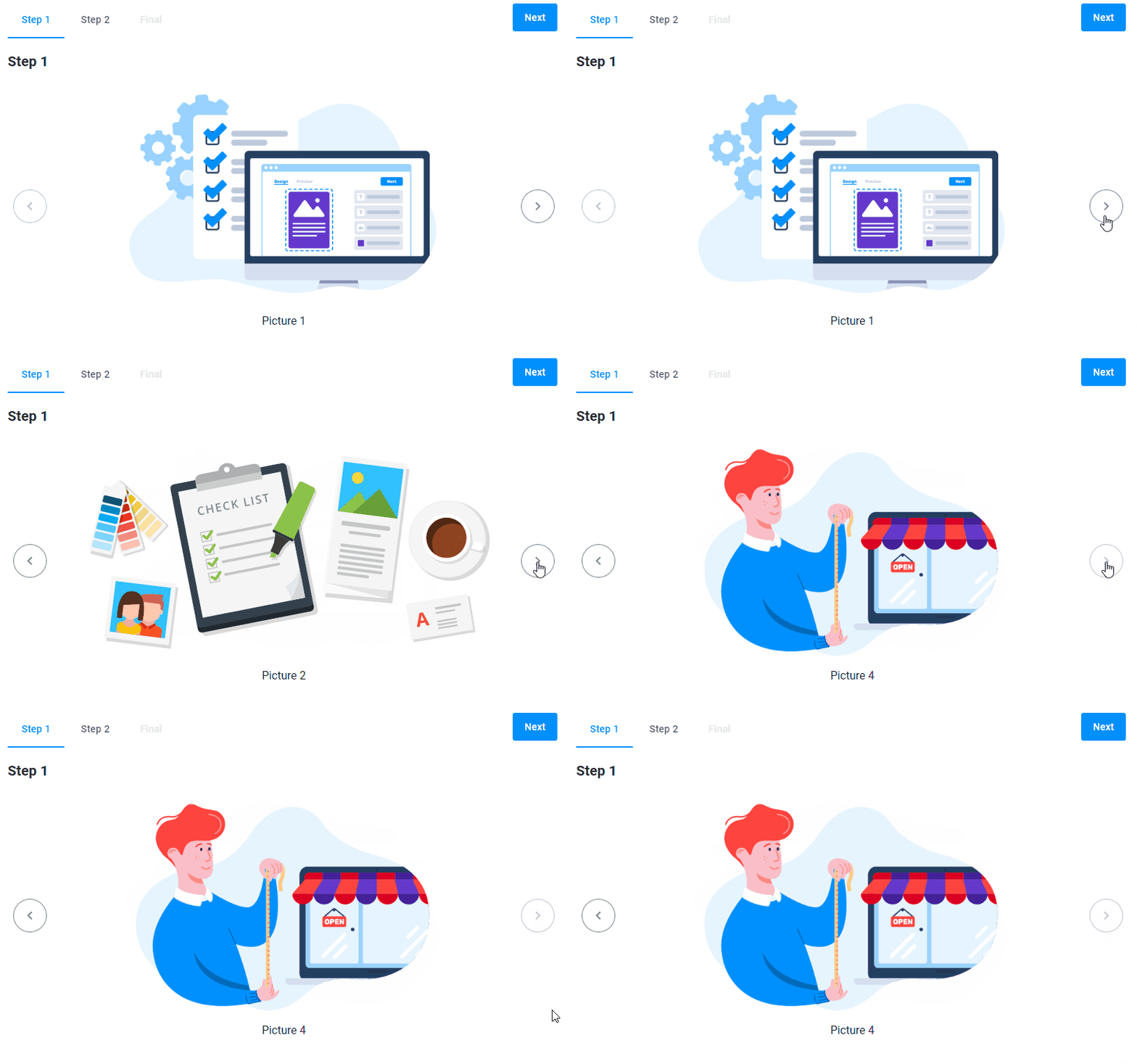
{
  "name": "slider-pic",
  "type": "slider",
  "params": {
    "images": [
      {
        "title": "Picture 1",
        "url": "https://example.com/1.png"
      },
      {
        "title": "Picture 2",
        "url": "https://example.com/2.png"
      },
      {
        "title": "Picture 3",
        "url": "https://example.com/3.png"
      },
      {
        "title": "Picture 4",
        "url": "https://example.com/4.png"
      }
    ]
  }
}
Let's add the direction property to define the arrangement of images on the screen.
There are three types of the direction properties:
Vertical
In this example, you can see three images in a vertical arrangement. The quantity property describes how many images will appear in one screen.
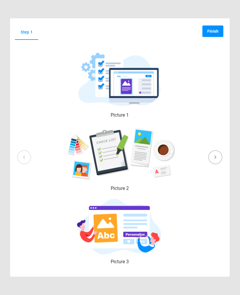
{
  "name": "my-slider",
  "type": "slider",
  "params": {
    "direction": "vertical",
    "quantity": 3,
    "images": [
      {
        "title": "Picture 1",
        "url": "https://example.com/1.png"
      },
      {
        "title": "Picture 2",
        "url": "https://example.com/2.png"
      },
      {
        "title": "Picture 3",
        "url": "https://example.com/3.png"
      }
    ]
  }
}
The increment property defines how many images will be scrolled by clicking an arrow. In the following example, you scroll three images at once.
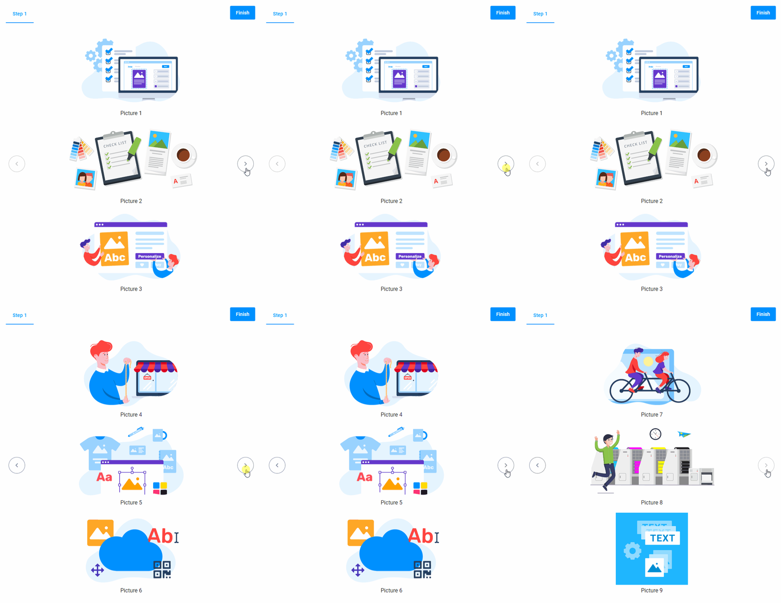
{
  "name": "my-slider",
  "type": "slider",
  "params": {
    "direction": "vertical",
    "quantity": 3,
    "increment": 3,
    "images": [
      {
        "title": "Picture 1",
        "url": "https://example.com/1.png"
      },
      {
        "title": "Picture 2",
        "url": "https://example.com/2.png"
      },
      {
        "title": "Picture 3",
        "url": "https://example.com/3.png"
      },
      {
        "title": "Picture 4",
        "url": "https://example.com/4.png"
      },
      {
        "title": "Picture 5",
        "url": "https://example.com/5.png"
      },
      {
        "title": "Picture 6",
        "url": "https://example.com/6.png"
      },
      {
        "title": "Picture 7",
        "url": "https://example.com/7.png"
      },
      {
        "title": "Picture 8",
        "url": "https://example.com/8.png"
      },
      {
        "title": "Picture 9",
        "url": "https://example.com/9.png"
      }
    ]
  }
}
Horizontal
You can arrange images horizontally by the horizontal property.
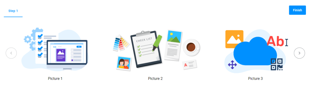
{
  "name": "my-slider",
  "type": "slider",
  "params": {
    "direction": "horizontal",
    "quantity": 3,
    "images": [
      {
        "title": "Picture 1",
        "url": "https://example.com/1.png"
      },
      {
        "title": "Picture 2",
        "url": "https://example.com/2.png"
      },
      {
        "title": "Picture 3",
        "url": "https://example.com/3.png"
      }
    ]
  }
}
The increment property scrolls three images by clicking an arrow.
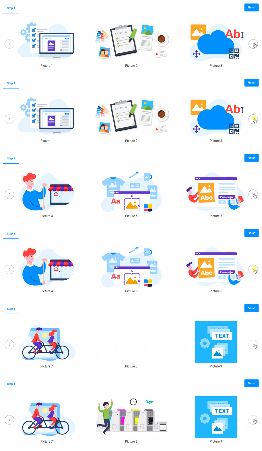
{
  "name": "my-slider",
  "type": "slider",
  "params": {
    "direction": "horizontal",
    "quantity": 3,
    "increment": 3,
    "images": [
      {
        "title": "Picture 1",
        "url": "https://example.com/1.png"
      },
      {
        "title": "Picture 2",
        "url": "https://example.com/2.png"
      },
      {
        "title": "Picture 3",
        "url": "https://example.com/3.png"
      },
      {
        "title": "Picture 4",
        "url": "https://example.com/4.png"
      },
      {
        "title": "Picture 5",
        "url": "https://example.com/5.png"
      },
      {
        "title": "Picture 6",
        "url": "https://example.com/6.png"
      },
      {
        "title": "Picture 7",
        "url": "https://example.com/7.png"
      },
      {
        "title": "Picture 8",
        "url": "https://example.com/8.png"
      },
      {
        "title": "Picture 9",
        "url": "https://example.com/9.png"
      }
    ]
  }
}
Tile
The tile property divides the screen by rows and columns.
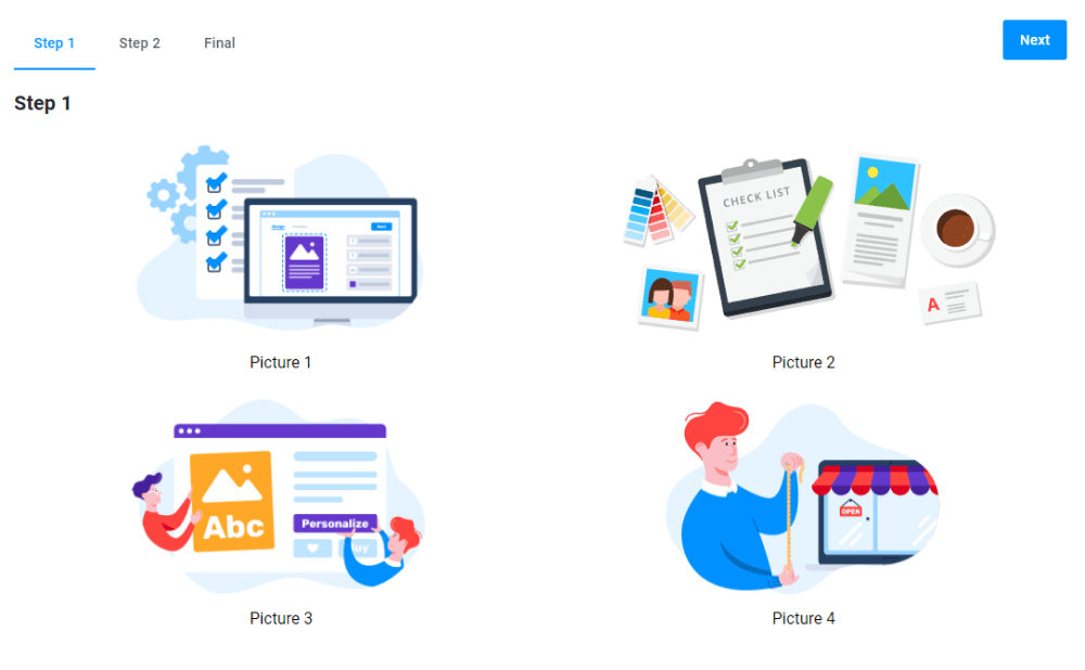
{
  "name": "my-slider",
  "type": "slider",
  "params": {
    "direction": "tile",
    "rows": 2,
    "columns": 2,
    "images": [
      {
        "title": "Picture 1",
        "url": "https://example.com/1.png"
      },
      {
        "title": "Picture 2",
        "url": "https://example.com/2.png"
      },
      {
        "title": "Picture 3",
        "url": "https://example.com/3.png"
      },
      {
        "title": "Picture 4",
        "url": "https://example.com/4.png"
      }
    ]
  }
}
The following example illustrates how to scroll four images at once by using the increment property.
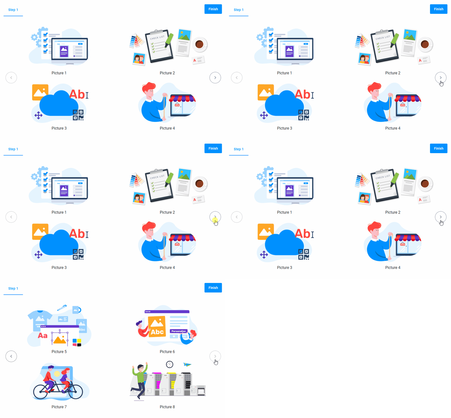
{
  "name": "my-slider",
  "type": "slider",
  "params": {
    "direction": "tile",
    "rows": 2,
    "columns": 2,
    "increment": 4,
    "images": [
      {
        "title": "Picture 1",
        "url": "https://example.com/1.png"
      },
      {
        "title": "Picture 2",
        "url": "https://example.com/2.png"
      },
      {
        "title": "Picture 3",
        "url": "https://example.com/3.png"
      },
      {
        "title": "Picture 4",
        "url": "https://example.com/4.png"
      }
    ]
  }
}
Zooming images
You can zoom an image and display it in a lightbox. To do so, set the lightbox parameter to true for any direction: horizontal, vertical, or tile.
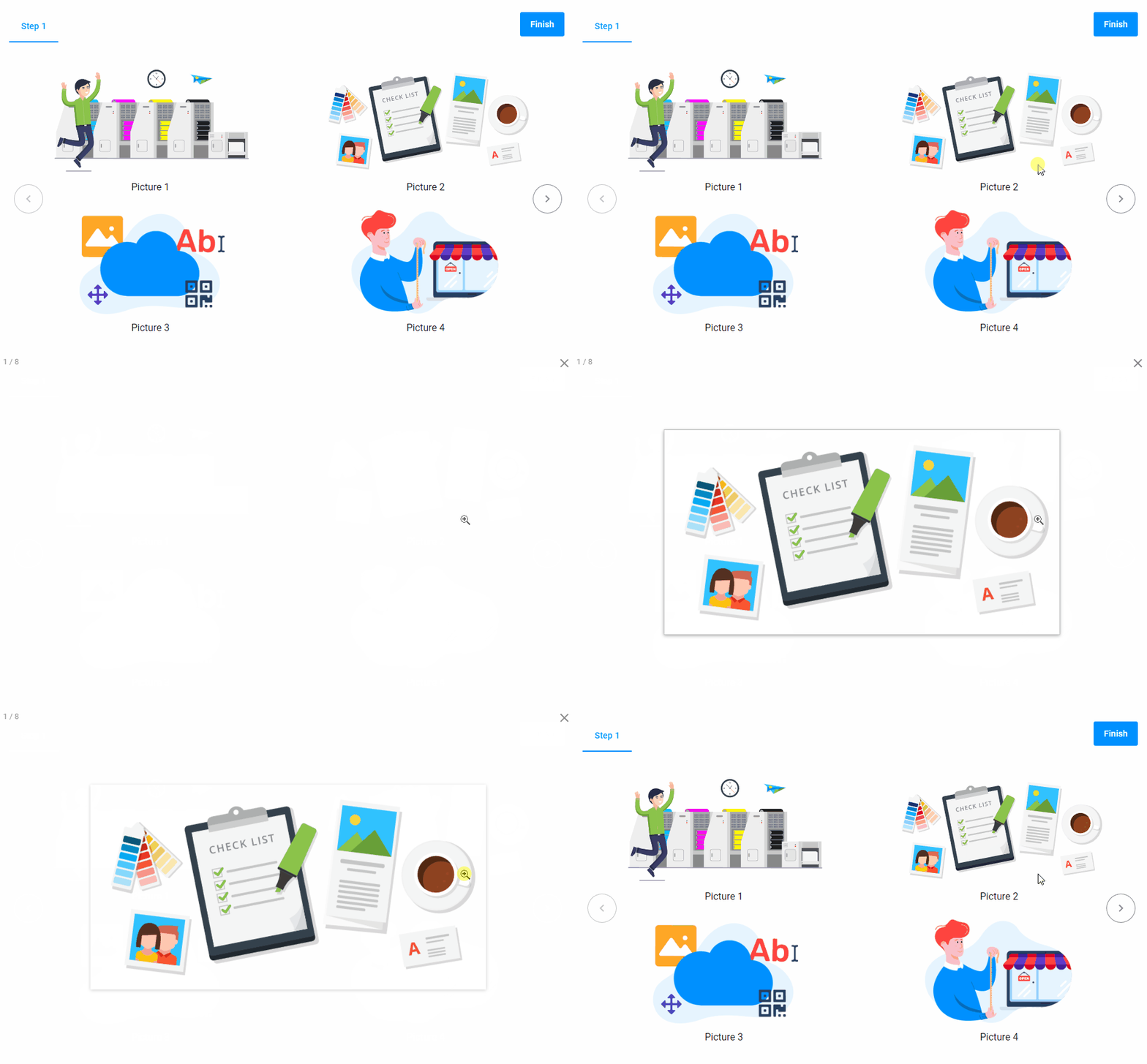
{
  "name": "my-slider",
  "type": "slider",
  "params": {
    "direction": "tile",
    "quantity": 2,
    "increment": 2,
    "lightbox": true,
    "images": [
      {
        "title": "Picture 1",
        "url": "https://example.com/1.png"
      },
      {
        "title": "Picture 2",
        "url": "https://example.com/2.png"
      },
      {
        "title": "Picture 3",
        "url": "https://example.com/3.png"
      },
      {
        "title": "Picture 4",
        "url": "https://example.com/4.png"
      }
    ]
  }
}
Style
You can add the following styling elements in this widget.
Background
The --au-widget-background property defines the background color of images.
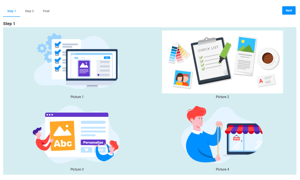
{
  "name": "my-slider",
  "type": "slider",
  "params": {
    "direction": "tile",
    "columns": 2,
    "rows": 2,
    "lightbox": true,
    "style": {
      "--au-widget-background": "#e9f6f7"
    },
    "images": [
      {
        "title": "Picture 1",
        "url": "https://example.com/1.png"
      },
      {
        "title": "Picture 2",
        "url": "https://example.com/2.png"
      },
      {
        "title": "Picture 3",
        "url": "https://example.com/3.png"
      },
      {
        "title": "Picture 4",
        "url": "https://example.com/4.png"
      }
    ]
  }
}
Widget height
The --au-widget-height parameter manages the height of the slider. For example, let's define a height of 480 pixels. This is how the height will be applied to the widget.
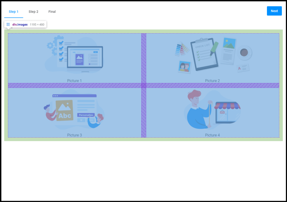
The result will look like this:
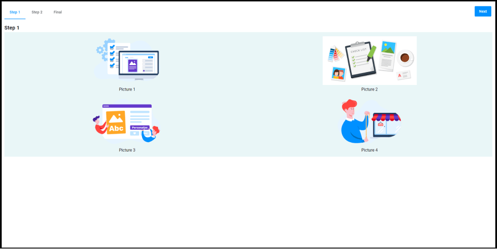
{
  "name": "my-slider",
  "type": "slider",
  "params": {
    "direction": "tile",
    "columns": 2,
    "rows": 2,
    "lightbox": true,
    "style": {
      "--au-widget-background": "#e9f6f7",
      "--au-widget-height": "480px"
    },
    "images": [
      {
        "title": "Picture 1",
        "url": "https://example.com/1.png"
      },
      {
        "title": "Picture 2",
        "url": "https://example.com/2.png"
      },
      {
        "title": "Picture 3",
        "url": "https://example.com/3.png"
      },
      {
        "title": "Picture 4",
        "url": "https://example.com/4.png"
      }
    ]
  }
}
The border for an image with a title
The --au-widget-image-border property defines how the border around the image with its title will look.
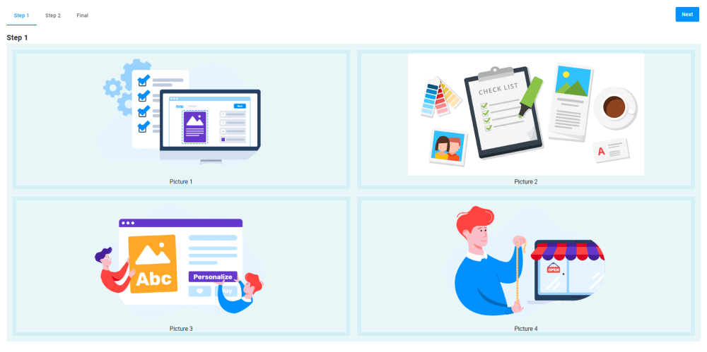
{
  "name": "my-slider",
  "type": "slider",
  "params": {
    "direction": "tile",
    "columns": 2,
    "rows": 2,
    "lightbox": true,
    "style": {
      "--au-widget-background": "#e9f6f7",
      "--au-widget-image-border": "10px solid #d2eff7"
    },
    "images": [
      {
        "title": "Picture 1",
        "url": "https://example.com/1.png"
      },
      {
        "title": "Picture 2",
        "url": "https://example.com/2.png"
      },
      {
        "title": "Picture 3",
        "url": "https://example.com/3.png"
      },
      {
        "title": "Picture 4",
        "url": "https://example.com/4.png"
      }
    ]
  }
}
Paddings
In the following example, we use the --au-widget-padding property to add padding of 100 pixels.
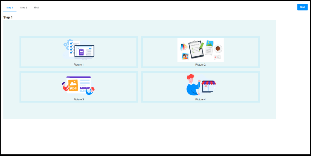
{
  "name": "my-slider",
  "type": "slider",
  "params": {
    "direction": "tile",
    "columns": 2,
    "rows": 2,
    "lightbox": true,
    "style": {
      "--au-widget-background": "#e9f6f7",
      "--au-widget-image-border": "10px solid #d2eff7",
      "--au-widget-padding": "100px"
    },
    "images": [
      {
        "title": "Picture 1",
        "url": "https://example.com/1.png"
      },
      {
        "title": "Picture 2",
        "url": "https://example.com/2.png"
      },
      {
        "title": "Picture 3",
        "url": "https://example.com/3.png"
      },
      {
        "title": "Picture 4",
        "url": "https://example.com/4.png"
      }
    ]
  }
}
Distance between images
To add distance between images, use --au-widget-images-gap.
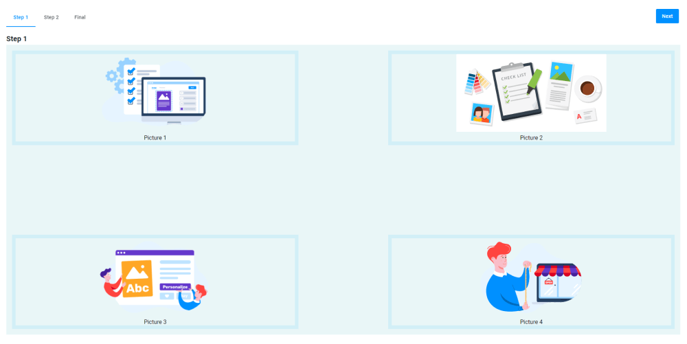
{
  "name": "my-slider",
  "type": "slider",
  "params": {
    "direction": "tile",
    "columns": 2,
    "rows": 2,
    "lightbox": true,
    "style": {
      "--au-widget-background": "#e9f6f7",
      "--au-widget-image-border": "10px solid #d2eff7",
      "--au-widget-images-gap": "300px"
    },
    "images": [
      {
        "title": "Picture 1",
        "url": "https://example.com/1.png"
      },
      {
        "title": "Picture 2",
        "url": "https://example.com/2.png"
      },
      {
        "title": "Picture 3",
        "url": "https://example.com/3.png"
      },
      {
        "title": "Picture 4",
        "url": "https://example.com/4.png"
      }
    ]
  }
}
Borders for images
You can add borders to images by the --aurigma-responsive-image-border parameter. Its value is a string containing three parameters: the size, solid or dashed line type, and color.
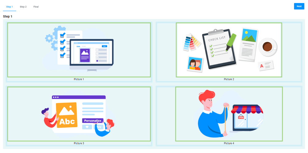
{
  "name": "my-slider",
  "type": "slider",
  "params": {
    "direction": "tile",
    "columns": 2,
    "rows": 2,
    "lightbox": true,
    "style": {
      "--au-widget-background":"#e9f6f7",
      "--au-widget-image-border":"10px solid #d2eff7",
      "--aurigma-responsive-image-border":"10px solid ##9dd47b"
    },
    "images": [
      {
        "title": "Picture 1",
        "url": "https://example.com/1.png"
      },
      {
        "title": "Picture 2",
        "url": "https://example.com/2.png"
      },
      {
        "title": "Picture 3",
        "url": "https://example.com/3.png"
      },
      {
        "title": "Picture 4",
        "url": "https://example.com/4.png"
      }
    ]
  }
}
Title margins
This parameter defines margins of image titles. In this example, we added the top and bottom margins of 20px.
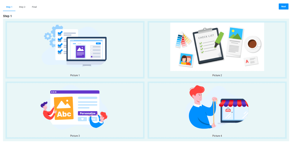
{
  "name": "my-slider",
  "type": "slider",
  "params": {
    "direction": "tile",
    "columns": 2,
    "rows": 2,
    "lightbox": true,
    "style": {
      "--au-widget-background": "#e9f6f7",
      "--au-widget-image-border": "10px solid #d2eff7",
      "--au-widget-title-margin-top": "20px",
      "--au-widget-title-margin-bottom": "20px"
    },
    "images": [
      {
        "title": "Picture 1",
        "url": "https://example.com/1.png"
      },
      {
        "title": "Picture 2",
        "url": "https://example.com/2.png"
      },
      {
        "title": "Picture 3",
        "url": "https://example.com/3.png"
      },
      {
        "title": "Picture 4",
        "url": "https://example.com/4.png"
      }
    ]
  }
}
Params
| Name | Type | Description | Default meaning |
|---|---|---|---|
images | array of Images | define images in a widget - it can be URLs that link to images on the Internet or a local cache with rendering results | undefined |
direction | vertical | horizontal | tile | defines the locations of images on screen | vertical |
lightbox | boolean | allows zooming images | false |
quantity | number | the image quantity on the screen for vertical and horizontal sliders | 1 |
columns | number | the number of columns for tile sliders | 1 |
rows | number | the number of rows for tile sliders | 1 |
increment | number | defines the number of images to be scrolled by clicking arrows | 1 |
Images
| Name | Type | Description | Default meaning |
|---|---|---|---|
title | string | name of an image displayed under an image | empty |
URL | string | a URL linking to an image | empty |
urlHD | string | a URL linking to full-size image | empty |