

Group
As you may know from the Widgets article, you can add only one widget to a panel. However, you may want to place more widgets into one container. To do so, you need a group widget that allows you to combine multiple widgets. Once you define it, you can add that group to the panel.
{
  "name": "my-group",
  "type": "group",
  "params": {...}
}
The group widget embeds widgets in tabs. Let's consider the types of these tabs.
Vertical tabs
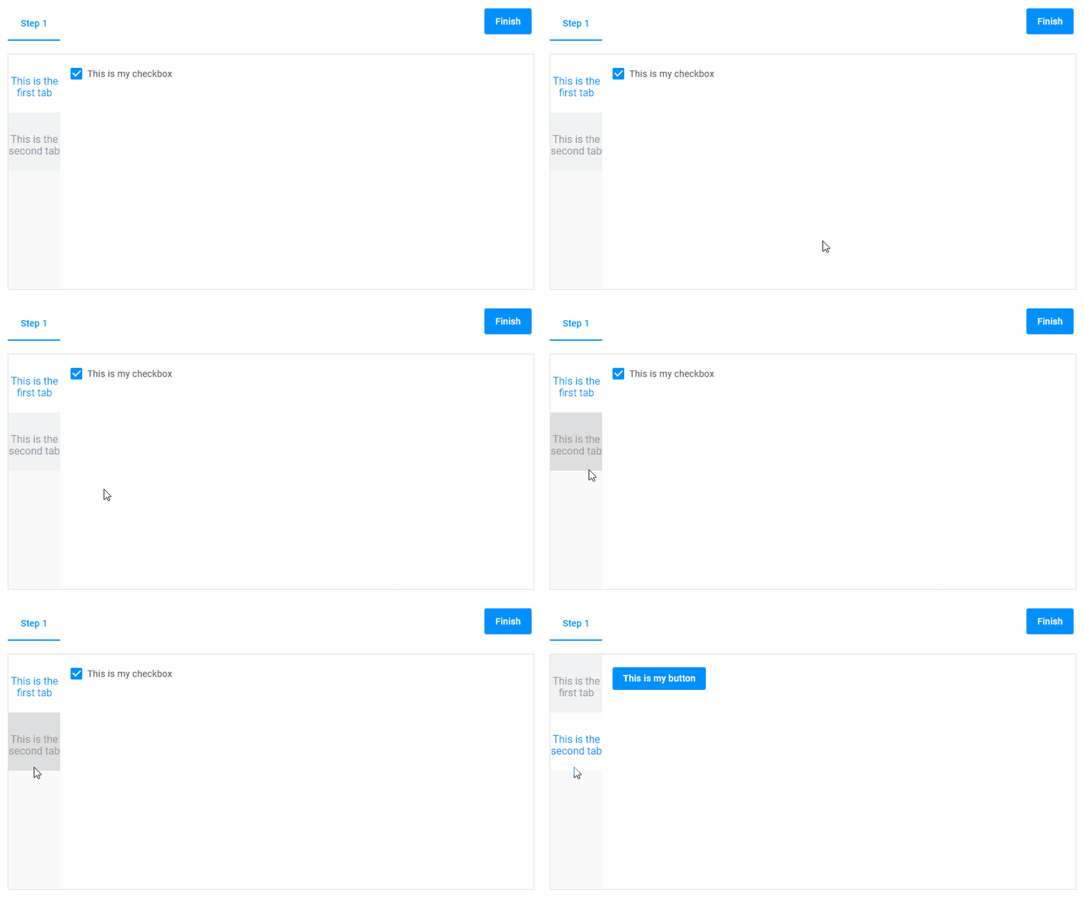
In this example, you add two widgets to a group - a checkbox and a button - and arrange them in vertically oriented tabs.
{
  "name": "my-group",
  "type": "group",
  "params": {
    "type": "vtab",
    "tabs": [
      {
        "title": "This is the first tab",
        "widgets": [
          {
            "name": "my-checkbox",
            "type": "checkbox",
            "params": {
              "prompt": "This is my checkbox.",
              "value": false
            }
          }
        ]
      },
      {
        "title": "This is the second tab",
        "widgets": [
          {
            "name": "my-button",
            "type": "button",
            "params": {
              "text": "This is my button"
            }
          }
        ]
      }
    ]
  }
}
Horizontal tabs
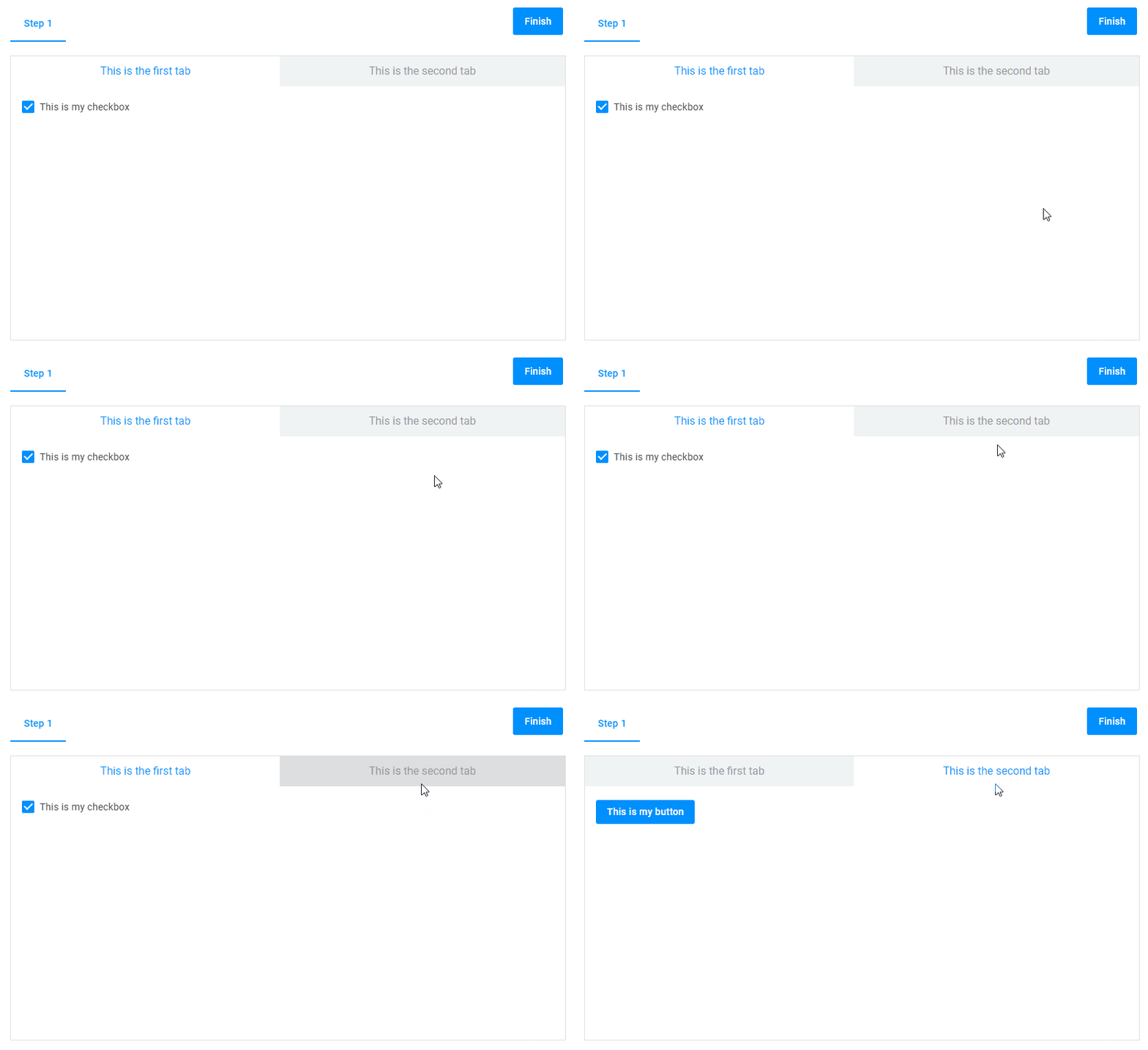
In this example, we add the same widgets to a group, but arrange them in horizontally oriented tabs.
{
  "name": "my-group",
  "type": "group",
  "params": {
    "type": "htab",
    "tabs": [
      {
        "title": "This is the first tab",
        "widgets": [
          {
            "name": "my-checkbox",
            "type": "checkbox",
            "params": {
              "prompt": "This is my checkbox.",
              "value": false
            }
          }
        ]
      },
      {
        "title": "This is the second tab",
        "widgets": [
          {
            "name": "my-button",
            "type": "button",
            "params": {
              "text": "This is my button"
            }
          }
        ]
      }
    ]
  }
}
Collapsible tabs
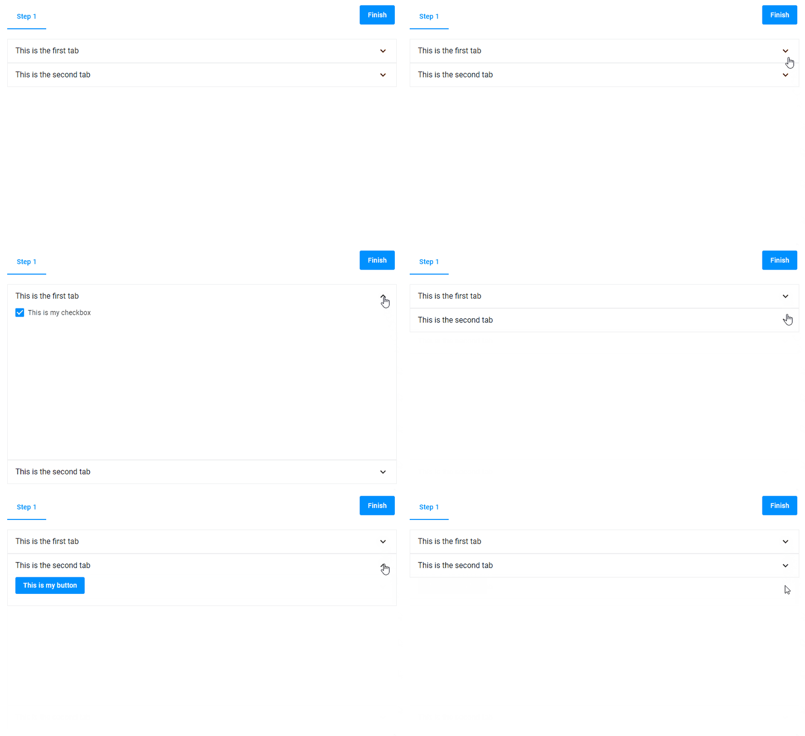
To save space on the panel, you can make the tabs collapsible. In this case, a group appears as an accordion element. Only the active tab is expanded, and all others are automatically collapsed.
{
  "name": "my-group",
  "type": "group",
  "params": {
    "type": "collapsible",
    "tabs": [
      {
        "title": "This is the first tab",
        "widgets": [
          {
            "name": "my-checkbox",
            "type": "checkbox",
            "params": {
              "prompt": "This is my checkbox.",
              "value": false
            }
          }
        ]
      },
      {
        "title": "This is the second tab",
        "widgets": [
          {
            "name": "my-button",
            "type": "button",
            "params": {
              "text": "This is my button"
            }
          }
        ]
      }
    ]
  }
}
Non-collapsible tabs
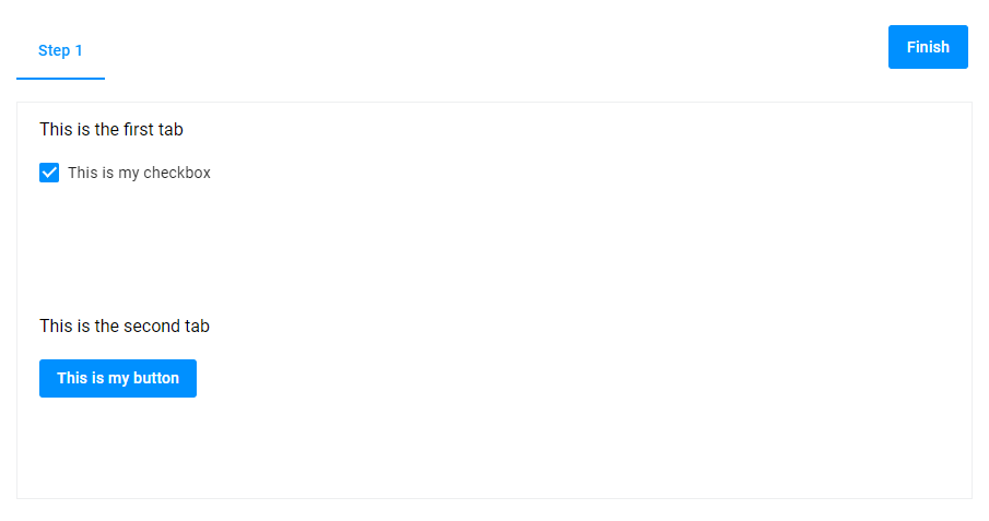
If you just want to place open tabs one under the other - use the noncollapsible type.
{
  "name": "my-group",
  "type": "group",
  "params": {
    "type": "noncollapsible",
    "tabs": [
      {
        "title": "This is the first tab",
        "widgets": [
          {
            "name": "my-checkbox",
            "title": "Tab 1",
            "type": "checkbox",
            "params": {
              "prompt": "This is my checkbox.",
              "value": false
            }
          }
        ]
      },
      {
        "title": "This is the second tab",
        "widgets": [
          {
            "name": "my-button",
            "type": "button",
            "title": "Tab 2",
            "params": {
              "text": "This is my button"
            }
          }
        ]
      }
    ]
  }
}
Nested groups
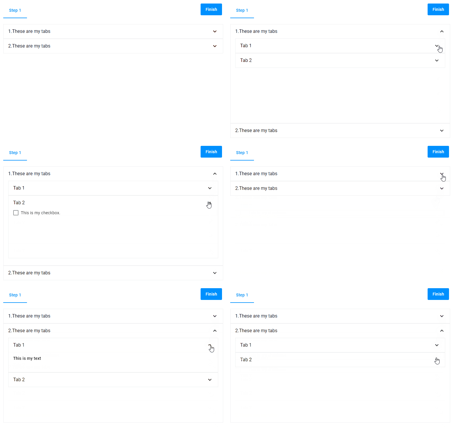
The group widget also allows you to add other groups to its tab the same way as other widgets.
{
  "name": "my-group",
  "type": "group",
  "params": {
    "type": "collapsible",
    "tabs": [
      {
        "title": "1. These are my tabs",
        "widgets": [
          {
            "name": "my-widgets",
            "type": "group",
            "params": {
              "type": "collapsible",
              "tabs": [
                {
                  "title": "Tab 1",
                  "widgets": [
                    {
                      "name": "mt-text",
                      "type": "static-text",
                      "params": {
                        "text": "This is my text"
                      }
                    }
                  ]
                },
                {
                  "title": "Tab 2",
                  "widgets": [
                    {
                      "name": "my-checkbox",
                      "type": "checkbox",
                      "params": {
                        "prompt": "This is my checkbox."
                      }
                    }
                  ]
                }
              ]
            }
          }
        ]
      },
      {
        "title": "2. These are my tabs",
        "widgets": [
          {
            "name": "my-widgets",
            "type": "group",
            "params": {
              "type": "collapsible",
              "tabs": [
                {
                  "title": "Tab 1",
                  "widgets": [
                    {
                      "name": "mt-text",
                      "type": "static-text",
                      "params": {
                        "text": "This is my text"
                      }
                    }
                  ]
                },
                {
                  "title": "Tab 2",
                  "widgets": [
                    {
                      "name": "mt-checkbox",
                      "type": "checkbox",
                      "params": {
                        "prompt": "This is my checkbox."
                      }
                    }
                  ]
                }
              ]
            }
          }
        ]
      }
    ]
  }
}
Open tab
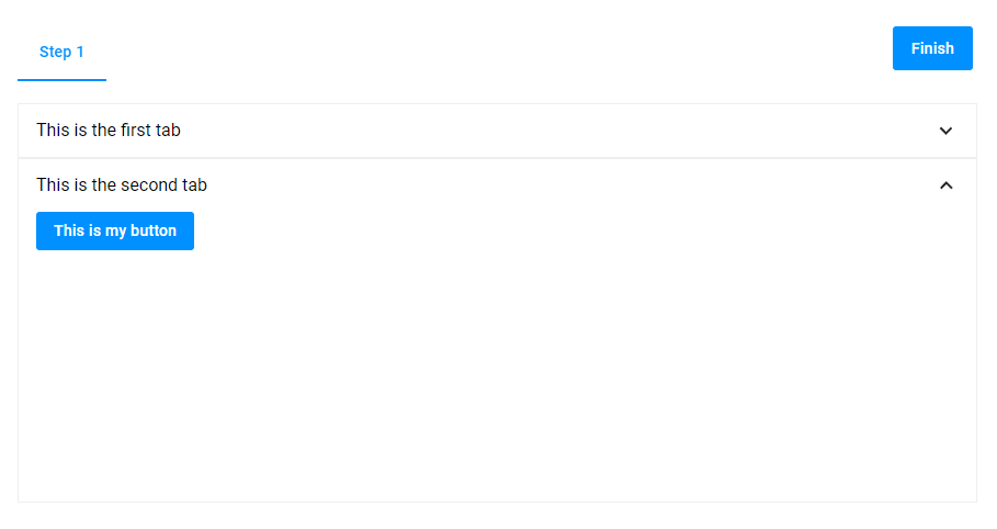
The opened property opens the corresponding tab when the user navigates to the step with the group.
{
  "name": "my-group",
  "type": "group",
  "params": {
    "type": "collapsible",
    "tabs": [
      {
        "title": "This is the first tab",
        "widgets": [
          {
            "name": "my-checkbox",
            "type": "checkbox",
            "params": {
              "prompt": "This is my checkbox",
              "value": false
            }
          }
        ]
      },
      {
        "title": "This is the second tab",
        "opened": true,
        "widgets": [
          {
            "name": "my-button",
            "type": "button",
            "params": {
              "text": "This is my button"
            }
          }
        ]
      }
    ]
  }
}
Titles
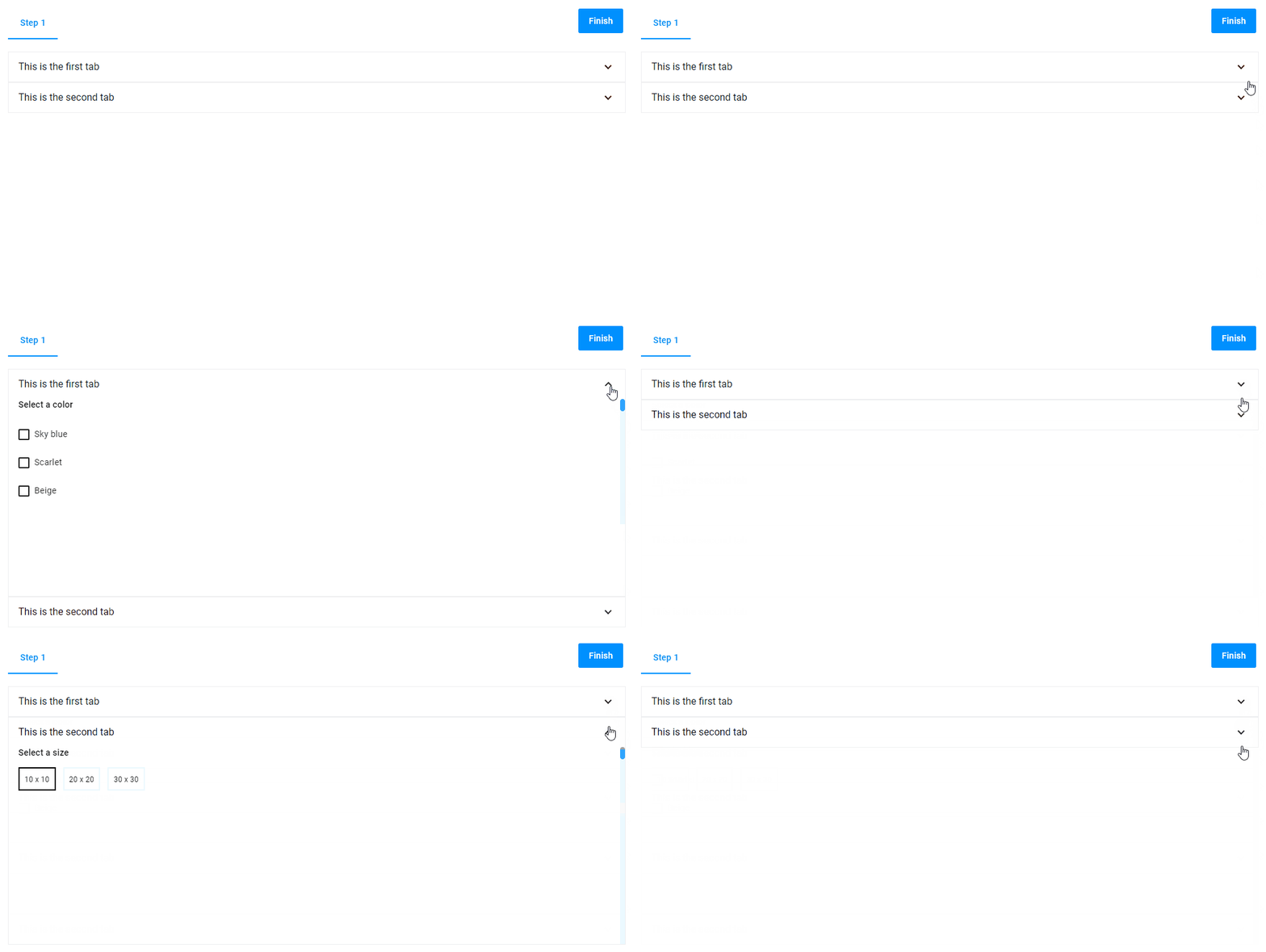
You can add a title inside tabs. To do so, define a title inside a widget. In this example, the phrases This is the first tab and This is the second tab are the titles inside the widgets.
{
  "name": "my-group",
  "type": "group",
  "params": {
    "type": "collapsible",
    "tabs": [
      {
        "title": "This is the first tab",
        "widgets": [
          {
            "name": "my-option",
            "type": "option",
            "title": "Select a color",
            "params": {
              "type": "checkbox",
              "values": [
                {
                  "title": "Sky blue"
                },
                {
                  "title": "Scarlet"
                },
                {
                  "title": "Beige"
                }
              ]
            }
          }
        ]
      },
      {
        "title": "This is the second tab",
        "widgets": [
          {
            "name": "my-option",
            "type": "option",
            "title": "Select a size",
            "params": {
              "type": "radio",
              "subType": "compact",
              "values": [
                {
                  "title": "10 x 10"
                },
                {
                  "title": "20 x 20"
                },
                {
                  "title": "30 x 30"
                }
              ]
            }
          }
        ]
      }
    ]
  }
}
Icons
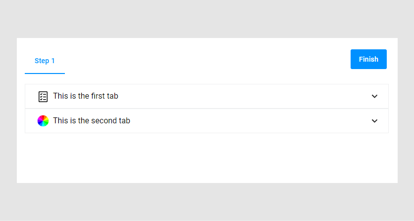
The icon property allows you to define an icon for a tab. The icons available by default, are listed in the Tabs table.
{
  "name": "my-group",
  "type": "group",
  "params": {
    "type": "collapsible",
    "tabs": [
      {
        "title": "This is the first tab",
        "icon": "custom-icons:approve",
        "widgets": [
          {
            "name": "my-checkbox",
            "type": "checkbox",
            "params": {
              "prompt": "This is my checkbox",
              "value": false
            }
          }
        ]
      },
      {
        "title": "This is the second tab",
        "icon": "custom-icons:coloricon",
        "widgets": [
          {
            "name": "my-button",
            "type": "button",
            "params": {
              "text": "This is my button"
            }
          }
        ]
      }
    ]
  }
}
Params
| Name | Type | Description | Default meaning |
|---|---|---|---|
type | "vtab"|"htab"|"collapsible"|"noncollapsible" | defines the appearance of tabs | "htab" |
tabs | array of Tabs | defines widget containers | undefined |
unifySelection | boolean | if true, maintains a single selection across multiple widgets; usually, this is used when you have multiple galleries in the same group | false |
Tabs
| Name | Type | Description | Default meaning |
|---|---|---|---|
title | string | name of a title | empty string |
id | number | internal tab ID | undefined |
icon | "custom-icons:preloader" | "custom-icons:icon-cross"| "custom-icons:coloricon"| "custom-icons:front"| "custom-icons:greeting"| "custom-icons:envelope"| "custom-icons:approve" |        | undefined |
opened | boolean | opens a tab when initialized | false |
widgets | array | widgets to be grouped | empty array |