

PIM options
This widget allows a customer to select values of product options.
{
    "name": "product-options",
    "type": "pim-options",
    "params": {...}
}
Displaying options
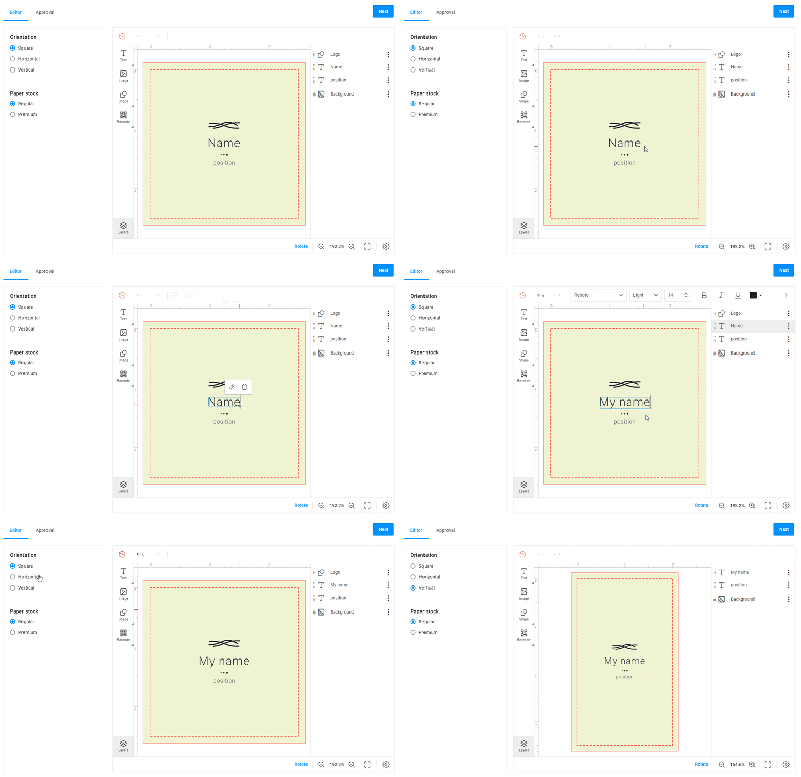
To display options in a workflow, you need to get them using the pim-ajax widget.
In this example, options are in the tool panel.
{
    "type": "pim-options",
    "name": "pim-options",
    "params": {
        "options": "{{ $['pim-ajax'].options }}",
    }
}
Option types
You can define how your option will appear in the user interface. For this, use the modifiers array.
In the modifiers array, you can change the name of an option and its visual type. The option name and option type, which are defined here, have higher priority than from a product configured in your Customer's Canvas account.
Customer's Canvas supports the following option types: radio, drop-down, chips, color-grid, color-list, image-grid, and image-list.
Let's see each type in detail.
Radio
The radio type is a default type for options. You don't need to add the modifiers array to your widget.

{
    "type": "pim-options",
    "name": "pim-options",
    "params": {
        "options": "{{ $['pim-ajax'].options }}"
    }
}
Chips
The chips type displays option value in rectangles.

{
    "type": "pim-options",
    "name": "pim-options",
    "params": {
        "options": "{{ $['pim-ajax'].options }}",
        "modifiers": [
            {
                "name": "Format",
                "type": "chips"
            }
        ]
    }
}
Drop-down
The drop-down type displays option values in a drop-down list.

{
    "type": "pim-options",
    "name": "pim-options",
    "params": {
        "options": "{{ $['pim-ajax'].options }}",
        "modifiers": [
            {
                "name": "Style",
                "type": "drop-down"
            }
        ]
    }
}
Colors
Options can display colors; the values will be colored rectangles.
-
The
color-gridtype. This type displays option values horizontally. {"type": "pim-options","name": "pim-options","params": {"options": "{{ $['pim-ajax'].options }}","modifiers": [{"name": "Choose your color:","type": "color-grid"}]}}
 -
The
color-listproperty. This property displays option values as colored rectangles vertically. {"type": "pim-options","name": "pim-options","params": {"options": "{{ $['pim-ajax'].options }}","modifiers": [{"name": "Choose your color:","type": "color-list"}]}}
When you have defined option values as color-list or color-grid, you will need to define a color for these values. To do so, read the Creating products article.
Images
Option values can display photos, these will be rectangles with photos inside. Let's see what properties allow you to embed a photo in an option value.
-
The
image-gridproperty. This property displays option values vertically.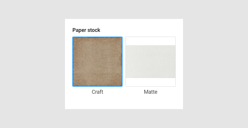 {"type": "pim-options","name": "pim-options","params": {"options": "{{ $['pim-ajax'].options }}","modifiers": [{"name": "Paper stock","type": "image-grid"}]}}
 -
The
image-listproperty. This property displays option value horizontally.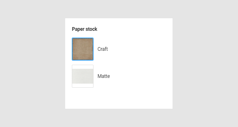 {"type": "pim-options","name": "pim-options","params": {"options": "{{ $['pim-ajax'].options }}","modifiers": [{"name": "Paper stock","type": "image-list"}]}}
When you have defined option values as image list or image grid, add photos to these values. To learn how to do this, read the Creating products article.
Preselected value
When a page loads, an option value may be preselected. For this, add the preselectedValue param to an option.
{
    "type": "pim-options",
    "name": "pim-options",
    "params": {
        "options": "{{ $['pim-ajax'].options }}",
        "modifiers": [
            {
                "name": "Paper stock",
                "type": "radio",
                "preselectedValue": [
                    "3.5\" x 2\" (Landscape)",
                    "2\" x 3.5\" (Portrait)"
                ]
            }
        ]
    }
}
Visible
By default, an option with the only one value is invisible but is used in an option filter.
If you need to make it visible, add the visible param to an option.
{
    "type": "pim-options",
    "name": "pim-options",
    "params": {
        "options": "{{ $['pim-ajax'].options }}",
        "modifiers": [
            {
                "name": "Style",
                "type": "chips",
                "visible": true
            }
        ]
    }
}
onChange
The onChange function will be executed when you select another option value.
{
    "type": "pim-options",
    "name": "pim-options",
    "params": {
        "options": "{{ $['pim-ajax'].options }}",
        "modifiers": [
            {
                "name": "Color",
                "type": "chips",
                "onChange": "{{#function console.log('Value changed')}}"
            }
        ]
    }
}
Config
In the config param, you can show or hide the option value in the header and add a custom tooltip icon.
{
    "type": "pim-options",
    "name": "pim-options",
    "params": {
        "options": "{{ $['pim-ajax'].options }}",
        "modifiers": [
            {
                "name": "Color",
                "type": "chips",
                "config": {
                    "showValueInTitle": true,
                    "tooltipIcon": "my-icon.svg"
                }
            }
        ]
    }
}
Summary
The $['pim-options'].summary getter returns a human-readable report on selected options and values. If needed, you can output them to the console.
Params
| Name | Type | Description |
|---|---|---|
options | ProductInformationOption[] | Contain options and values |
onReady | function | Function[] | A function or array of functions that will be executed when all options are loaded on the page |
onChange | function | Function[] | A function or array of functions that will be executed when you select another option value |
modifiers | array of modifiers | Optional. Defines option types |
Modifiers
| Name | Type | Description |
|---|---|---|
name | string | Compares the option name in a workflow file with the option name from your tenant |
type | string | Defines the option type, one of radio | drop-down | chips | color-grid | color-list | image-list | image-grid |
preselectedValue | string | Defines the preselected option value |
visible | boolean | Defines visibility of the option |
config | object Config | Defines additional appearance settings |
Config
| Name | Type | Description |
|---|---|---|
showValueInTitle | boolean | Displays selected option in header |
tooltipIcon | Defines a custom tooltip icon |