

Input text
This widget displays a field for the text input.
{
    "name": "my-input-text",
    "type": "input-text",
    "params": {...}
}
Hint inside a field
This hint explains to customers where they can input some data. It works by the placeholder property.
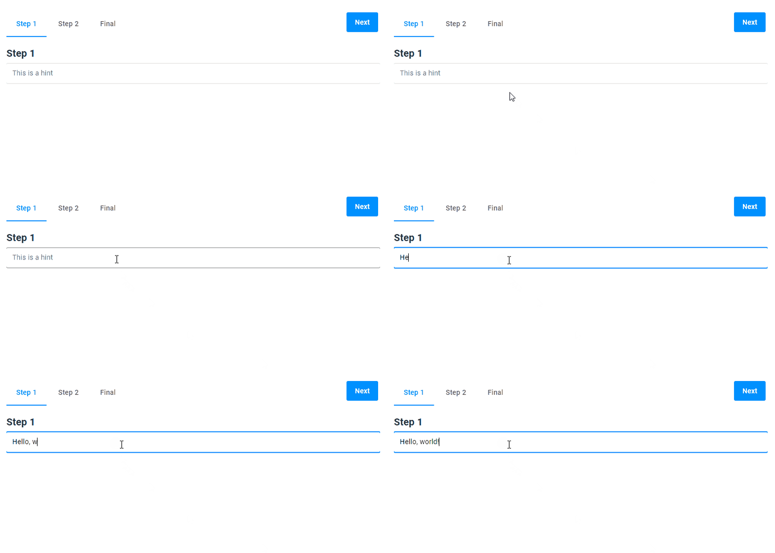
{
  "name": "my-input-text",
  "type": "input-text",
  "params": {
    "placeholder": "This is a hint"
  }
}
Hint over a field
The label property allows you to create a hint over the input field.
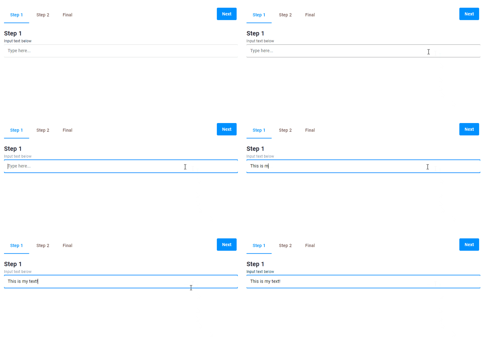
{
  "name": "my-input-text",
  "type": "input-text",
  "params": {
    "placeholder": "Type here...",
    "label": "Input your text below"
  }
}
Hint under a field
The supportText property shows the hint under the input field.
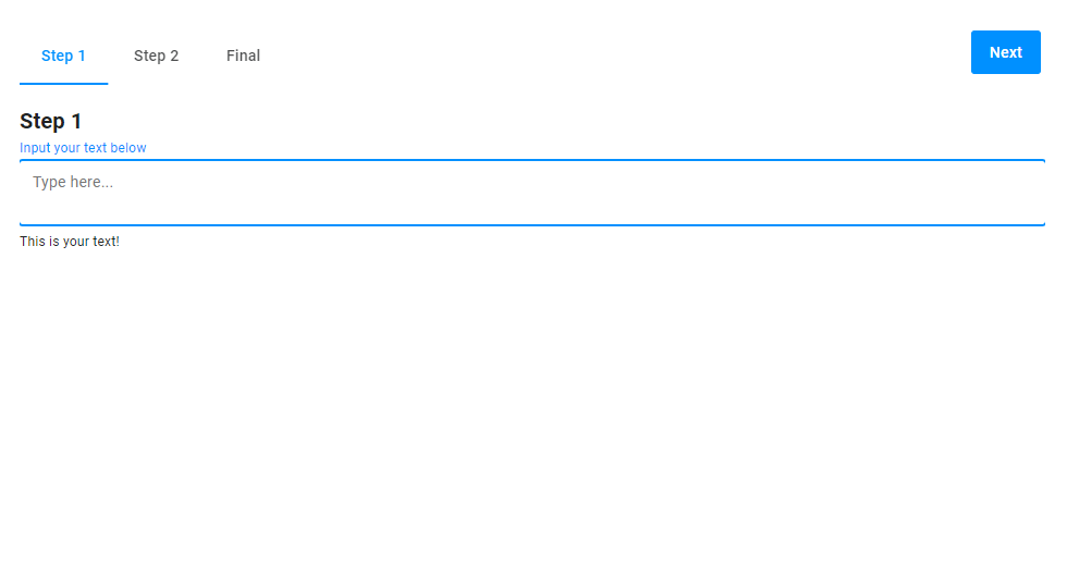
{
  "name": "my-input-text",
  "type": "input-text",
  "params": {
    "placeholder": "Type here...",
    "label": "Input your text below",
    "type": "text",
    "isTextArea": true,
    "supportText":"This is your text!"
  }
}
Type of input value
You can manage what data type the entered value should correspond to. To do this, add the type property.
The values can be:
textfor letters and numbers.numberonly for numbers.
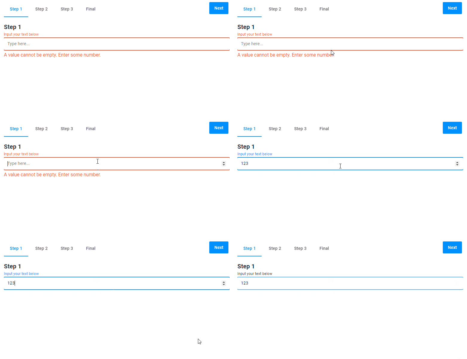
{
  "name": "my-input-text",
  "type": "input-text",
  "params": {
    "placeholder": "Type here...",
    "label": "Input your text below",
    "type": "number"
  }
}
Input by using arrows
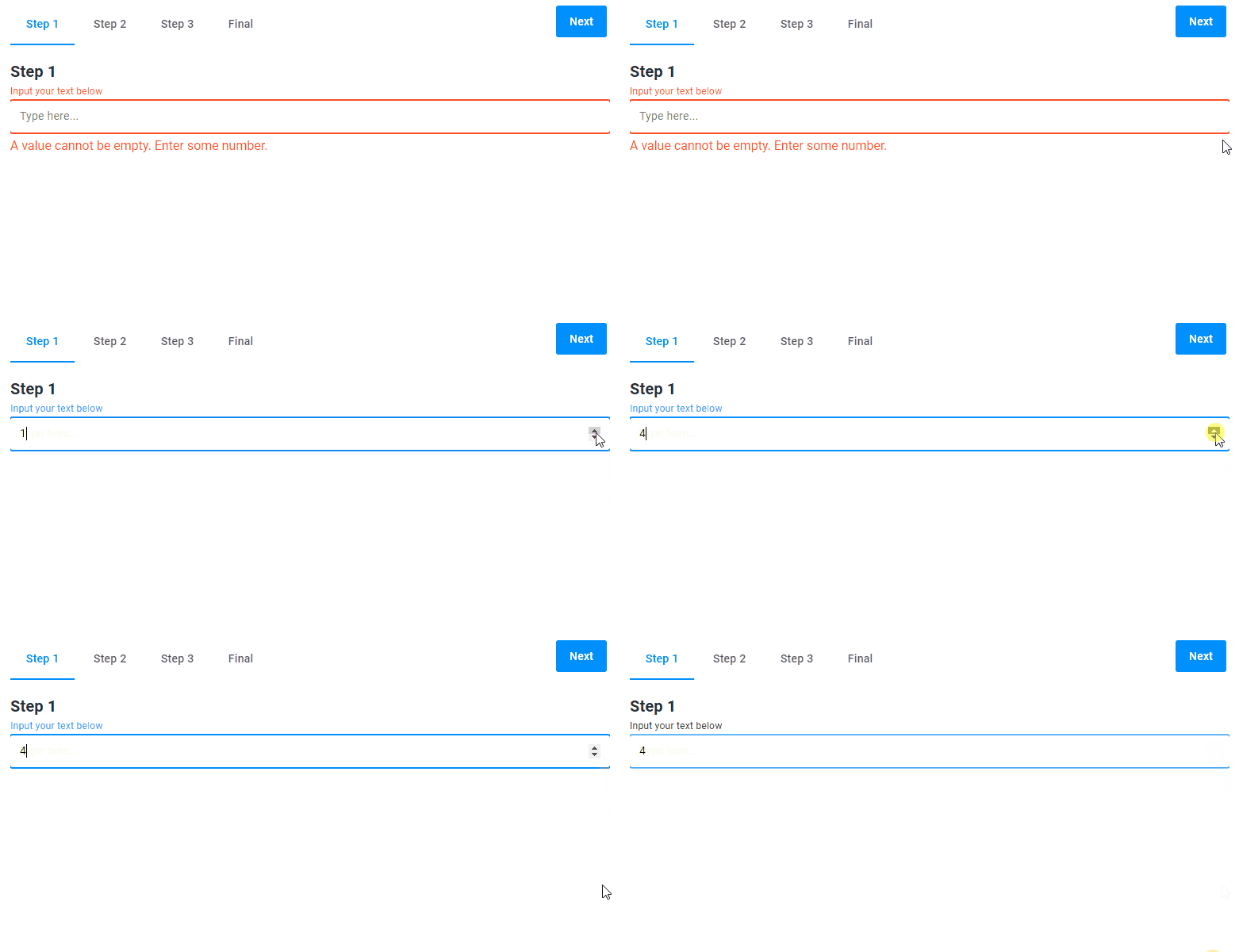
You can click the arrows in the right part of the field or press the Up and Down keys on your keyboard to input a number.
{
  "name": "my-input-text",
  "type": "input-text",
  "params": {
    "placeholder": "Type here...",
    "label": "Input your text below",
    "type": "number"
  }
}
Limits for numbers
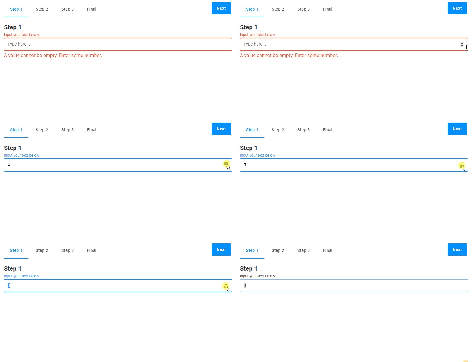
For numbers, you can limit the input value by the min and max properties. In the following example, you can only input the numbers from 3 to 6.
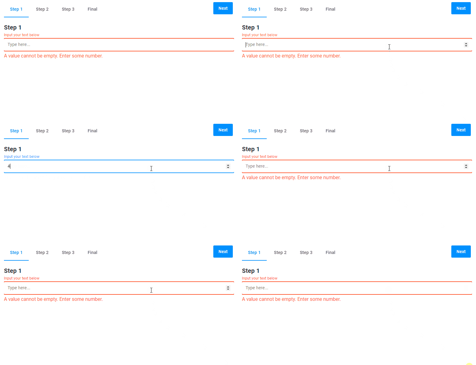
When this widget appears, its initial value will be the minimal value, and the user will not be able to enter a value greater than the maximal value.
{
  "name": "my-input-text",
  "type": "input-text",
  "params": {
    "placeholder": "Type here...",
    "label": "Input your text below",
    "type": "number",
    "min": 3,
    "max": 6
  }
}
Limits for letters
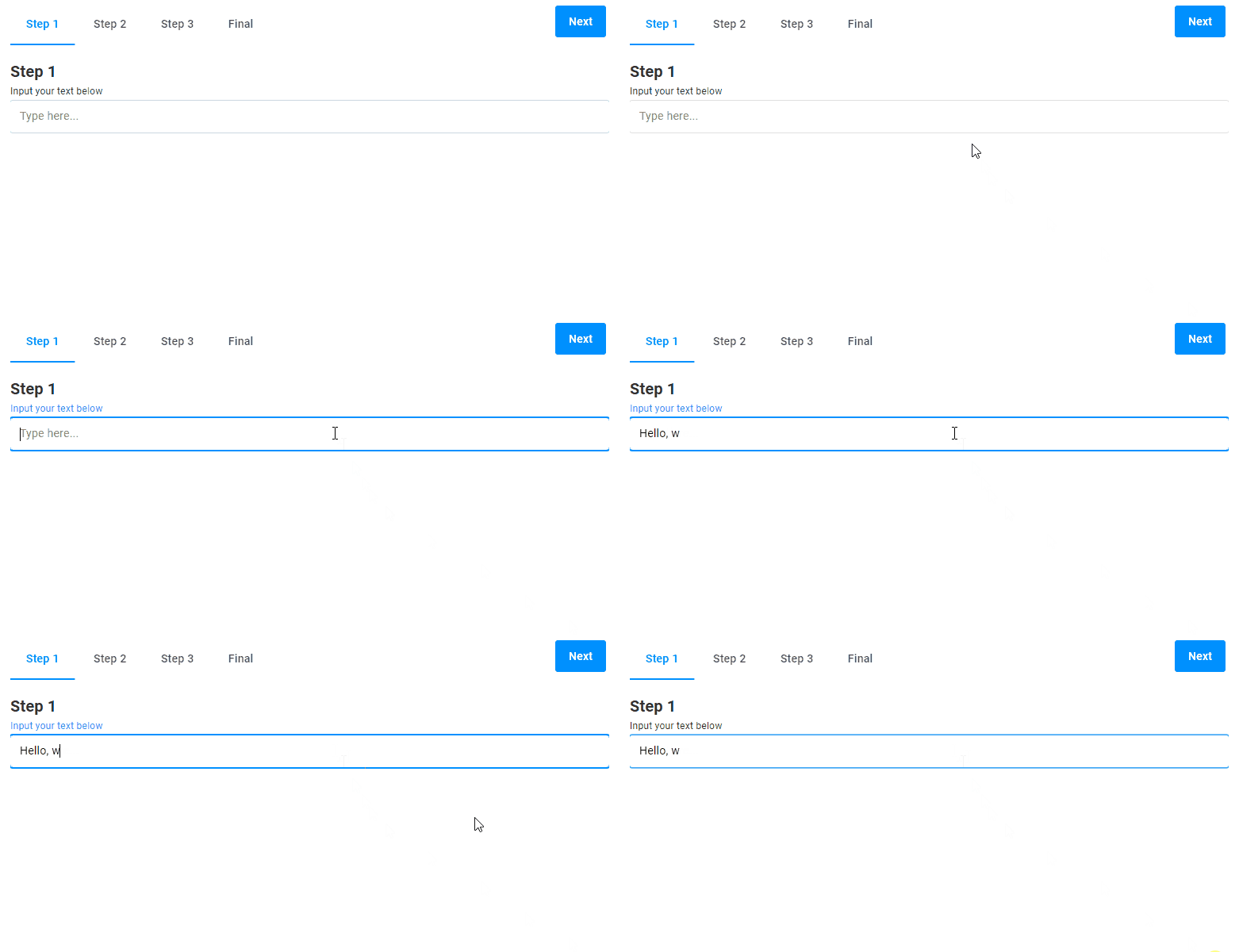
For text, you can limit the quantity of letters by the maxLength property.
{
  "name": "my-input-text",
  "type": "input-text",
  "params": {
    "placeholder": "Type here...",
    "label": "Input your text below",
    "type": "text",
    "maxLength": 8
  }
}
Initial value
By default, this widget appears with an empty text. However, you can specify the default value to be displayed.
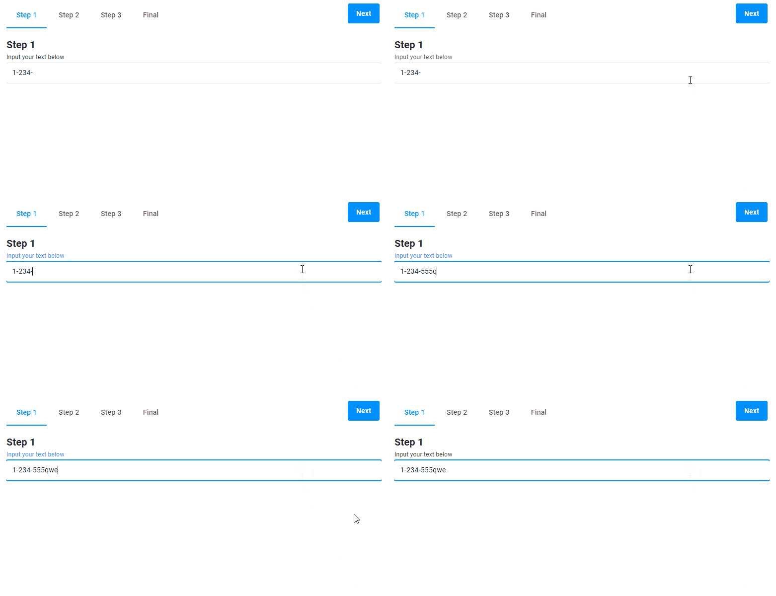
{
  "name": "my-input-text",
  "type": "input-text",
  "params": {
    "placeholder": "Type here...",
    "label": "Input your text below",
    "type": "text",
    "defaultValue":"1-234-"
  }
}
Field size
This widget may appear not only as a single-line field, but also as a text area. You can use the isTextArea property to enable this appearance and the rows property to define the widget height.
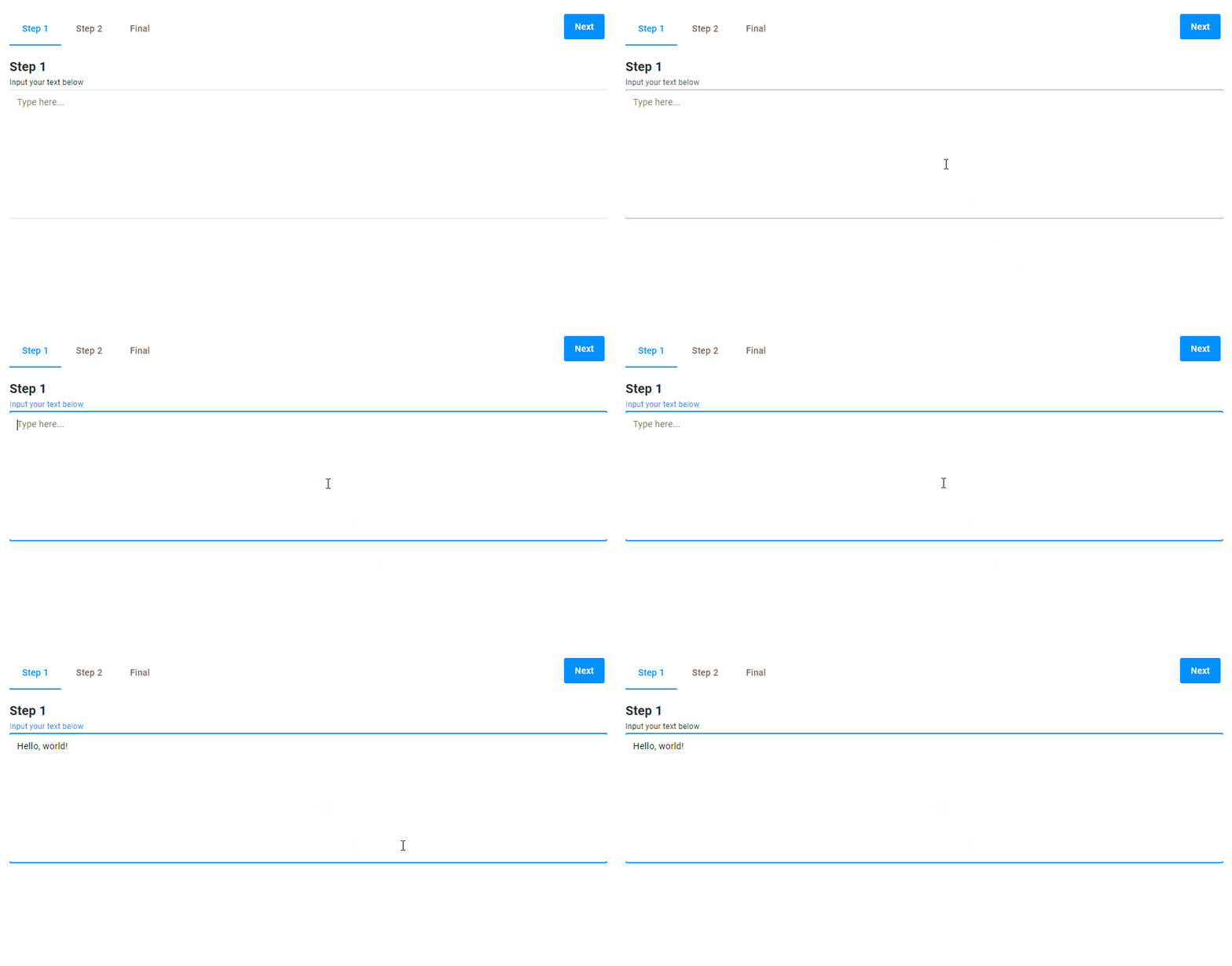
{
  "name": "my-input-text",
  "type": "input-text",
  "params": {
    "placeholder": "Type here...",
    "label": "Input your text below",
    "type": "text",
    "isTextArea": true,
    "rows": 10
  }
}
Regular expressions
To set an input mask, use the pattern property with a regular expression.
In the following example, we use a regular expression to make the user to input an email address. Note that if the input does not meet the pattern, the corresponding message appears under the field.
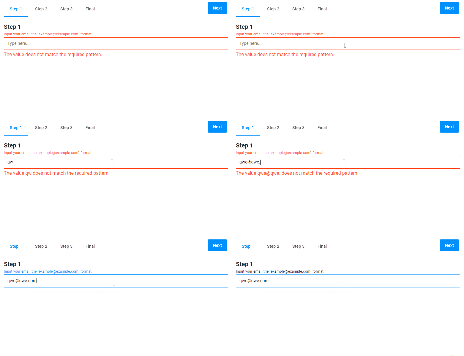
{
  "name": "my-input-text",
  "type": "input-text",
  "params": {
    "placeholder": "Type here...",
    "pattern": "^\\S+@\\S+\\.\\S+$",
    "label": "Input your email the `example@example.com` format",
    "type": "text"
  }
}
Referring to a value
You can refer to the entered value by using the "{{$['my-input']._}}" expression. Read the Dynamic expressions article, to learn more about the usage of Java Script in widgets.
In the following example, the checkbox widget displays the value of the input-text widget.
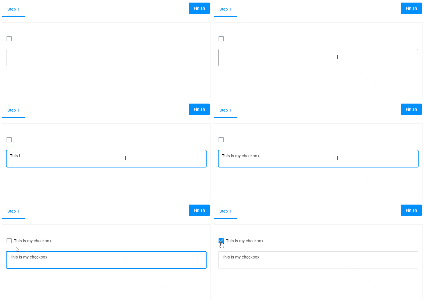
{
  "name": "my-checkbox",
  "type": "checkbox",
  "params": {
    "prompt": "{{$['my-input']._}}",
    "value": false
  }
},
{
  "name": "my-input",
  "type": "input-text",
  "params": {
    "isTextArea": true
  }
}
onChange
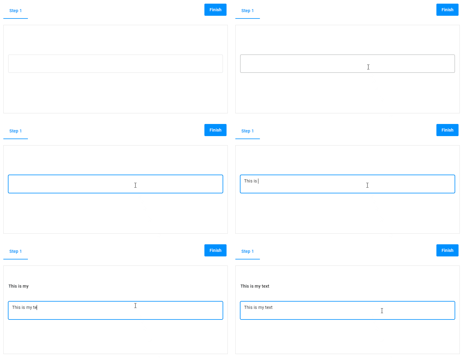
Use the onChange object to trigger some actions when a customer changes the text.
In the following example, we set the value of input-text to the static-text widget as soon as the customer adds or deletes a character in the input field.
{
  "name": "static",
  "type": "static-text",
  "params": {
    "text": ""
  }
},
{
  "name": "input",
  "type": "input-text",
  "params": {
    "isTextArea": true,
    "onChange": ["{{#function $['static'].text = $['input']._}}"]
  }
}
Params
| Name | Type | Description | Default value |
|---|---|---|---|
placeholder | string | hint inside the field | empty string |
label | string | hint over the field | empty string |
supportText | string | hint under the field | empty string |
type | "text" | "number" | input value format | "text" |
defaultValue | string | text written in a field | empty string |
min | number | minimum allowed value for numbers | -999999 |
max | number | maximum allowed value for numbers | 999999 |
maxLength | number | maximum allowed length for text | undefined |
isTextArea | boolean | if true, appears as a multiline text area | false |
rows | number | for text areas, defines the widget height | 2 |
pattern | string | defines regular expressions | ".+" |
onChange | Function | Function[] | handler of the event of changing the widget value | undefined |