

Option
This widget shows an options menu. Usually, it shows the options of a product: color, size, and so on. You can use this widget only in workflows based on the Product Specification approach.
{
  "type": "option",
  "name": "my-options",
  "title": "Select the option",
  "params": {
    "values": [ ... ]
  }
}
This widget represents options in the following visual forms:
radioimagecolorlistcheckbox
Radio, color, and image types have a subType: detailed or compact.
Radio
The following type of options shows radio buttons and allows a customer to select only one value.
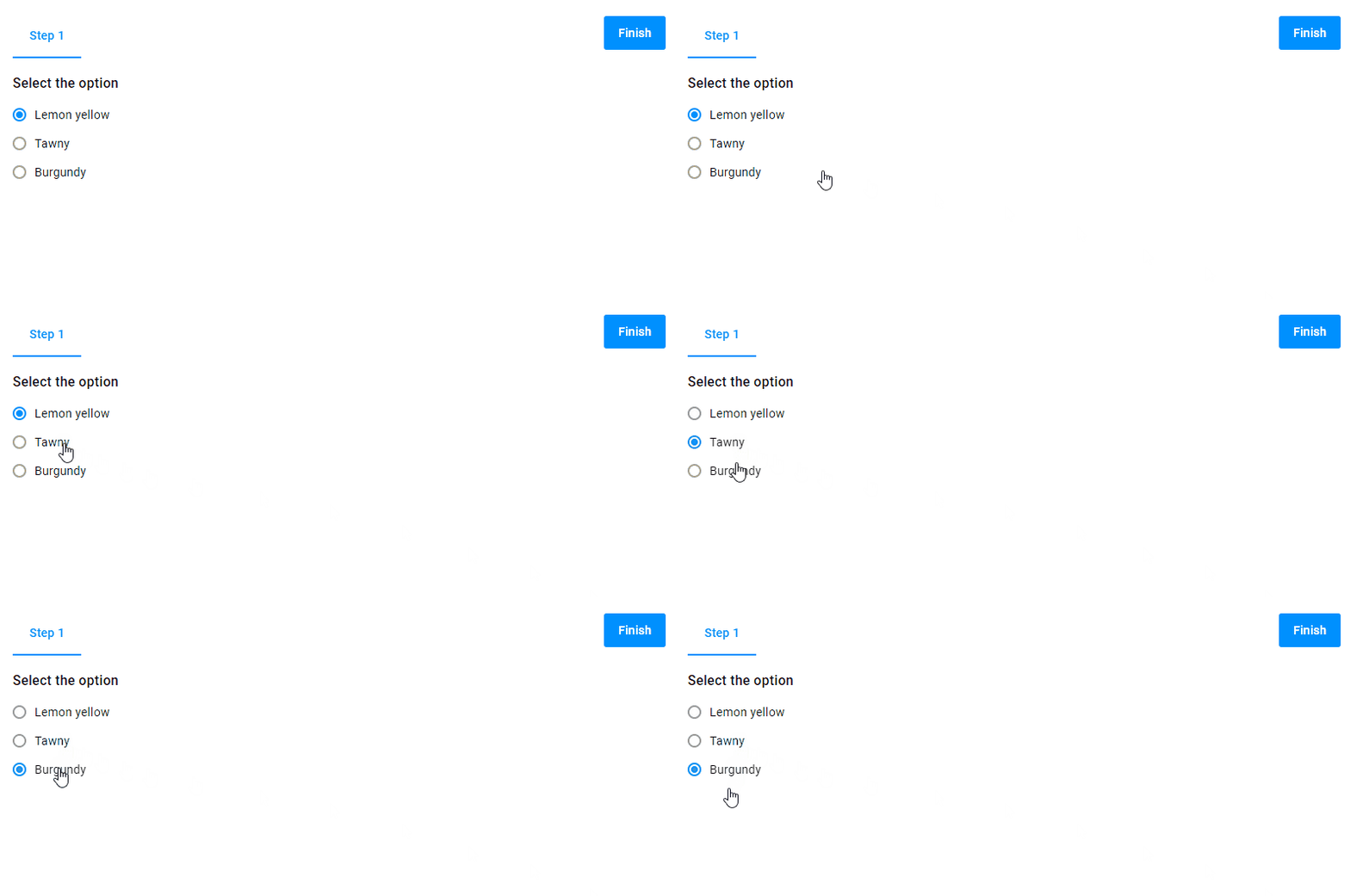
{
  "name": "my-options",
  "type": "option",
  "title": "Select the option",
  "params": {
    "type": "radio",
    "subType":"detailed",
    "values": [
      {
        "title": "Lemon yellow"
      },
      {
        "title": "Tawny"
      },
      {
        "title": "Burgundy"
      }
    ]
  }
}
The compact subtype creates square buttons.
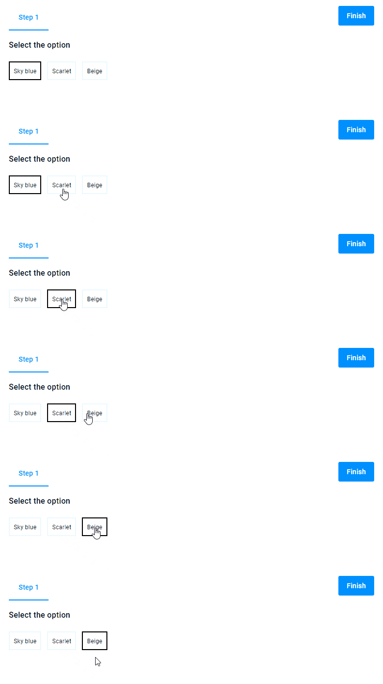
{
  "type": "option",
  "name": "my-options",
  "title": "Select the option",
  "params": {
    "type": "radio",
    "subType": "compact",
    "values": [
      {
        "title": "Sky blue"
      },
      {
        "title": "Scarlet"
      },
      {
        "title": "Beige"
      }
    ]
  }
}
Color
This type allows you to create options with color swatches.
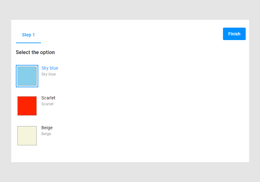
{
  "type": "option",
  "name": "my-options",
  "title": "Select the option",
  "params": {
    "type": "color",
    "values": [
      {
        "title": "Sky blue",
        "color": "#87CEEB"
      },
      {
        "title": "Scarlet",
        "color": "#FF2400"
      },
      {
        "title": "Beige",
        "color": "#F5F5DC"
      }
    ]
  }
}
To create round buttons, use the compact subtype.
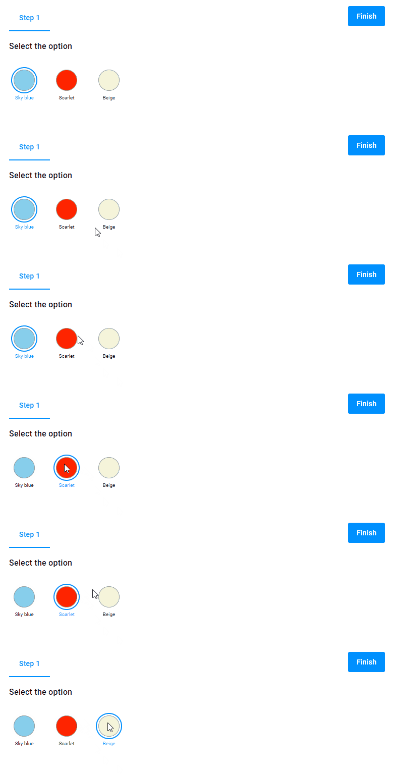
{
  "type": "option",
  "name": "my-options",
  "title": "Select the option",
  "params": {
    "type": "color",
    "subType": "compact",
    "values": [
      {
        "title": "Sky blue",
        "color": "#87CEEB"
      },
      {
        "title": "Scarlet",
        "color": "#FF2400"
      },
      {
        "title": "Beige",
        "color": "#F5F5DC"
      }
    ]
  }
}
List
Let's see options in a drop-down list.
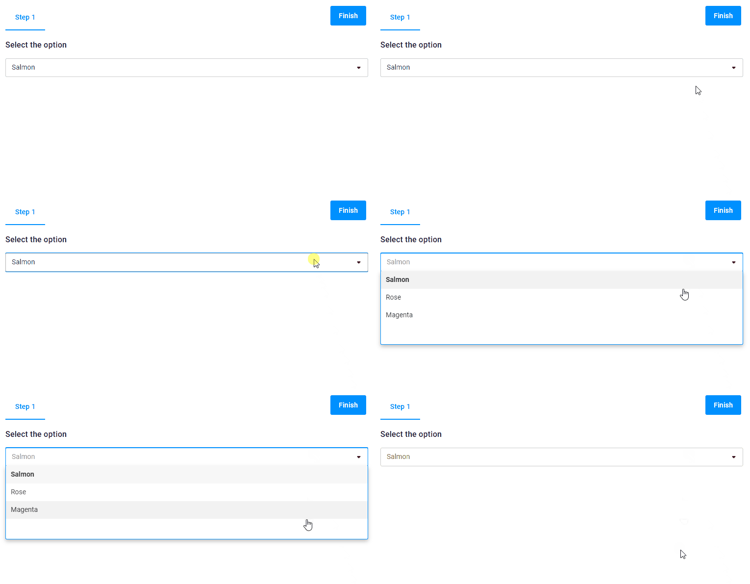
{
  "type": "option",
  "name": "my-options",
  "title": "Select the option",
  "params": {
    "type": "list",
    "values": [
      {
        "title": "Salmon"
      },
      {
        "title": "Rose"
      },
      {
        "title": "Magenta"
      }
    ]
  }
}
Checkbox
Using the checkbox type, you create a list of checkboxes.
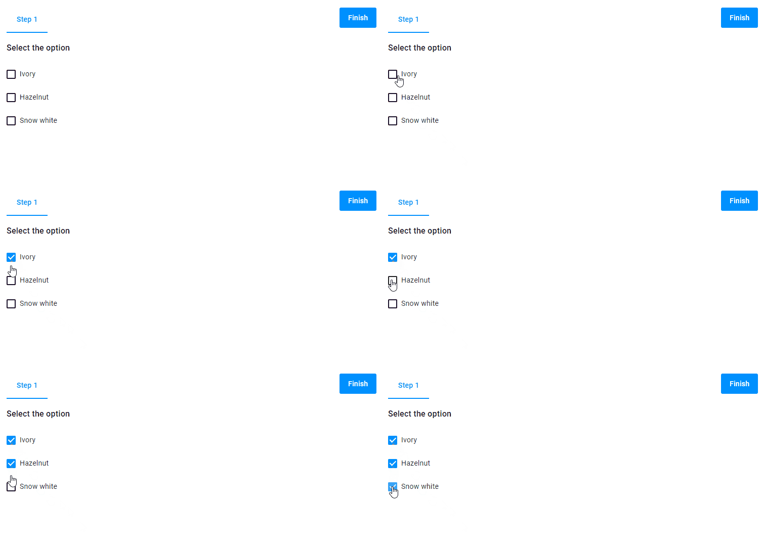
{
  "type": "option",
  "name": "my-options",
  "title": "Select the option",
  "params": {
    "type": "checkbox",
    "values": [
      {
        "title": "Ivory"
      },
      {
        "title": "Hazelnut"
      },
      {
        "title": "Snow white"
      }
    ]
  }
}
Image
You can use a URL that links to an image to add this image to an option.
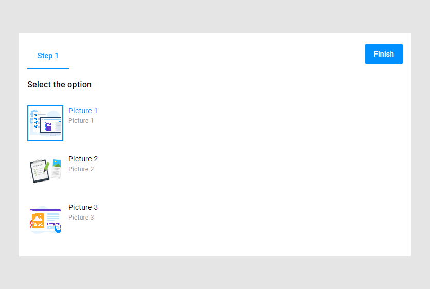
{
  "type": "option",
  "name": "my-options",
  "title": "Select the option",
  "params": {
    "type": "image",
    "values": [
      {
        "title": "Picture 1",
        "imageUrl": "https://customerscanvas.com/media/1746b818-0f68-4dde-a987-66411353964a/4-rQKA/CustomersCanvas/images/plus/feature-receive/04-preflight.png"
      },
      {
        "title": "Picture 2",
        "imageUrl": "https://customerscanvas.com/Aurigma/Theme3/img/preflight/turn-well-designed-files-into-well-printed-products.svg"
      },
      {
        "title": "Picture 3",
        "imageUrl": "https://customerscanvas.com/media/a0fa676c-a692-41ea-a785-e827c5ff4ee3/09Huhw/CustomersCanvas/images/main/services/01-turnkey-storefront.png"
      }
    ]
  }
}
To create round frames for images, use the compact subtype.
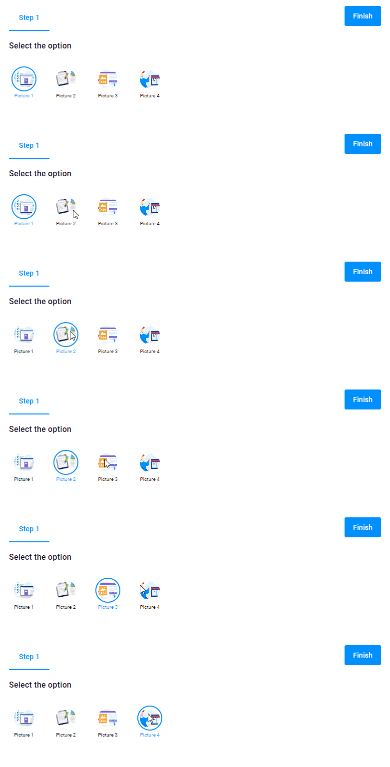
{
  "type": "option",
  "name": "my-options",
  "title": "Select the option",
  "params": {
    "type": "image",
    "subType": "compact",
    "values": [
      {
        "title": "Picture 1",
        "imageUrl": "https://customerscanvas.com/media/1746b818-0f68-4dde-a987-66411353964a/4-rQKA/CustomersCanvas/images/plus/feature-receive/04-preflight.png"
      },
      {
        "title": "Picture 2",
        "imageUrl": "https://customerscanvas.com/Aurigma/Theme3/img/preflight/turn-well-designed-files-into-well-printed-products.svg"
      },
      {
        "title": "Picture 3",
        "imageUrl": "https://customerscanvas.com/media/a0fa676c-a692-41ea-a785-e827c5ff4ee3/09Huhw/CustomersCanvas/images/main/services/01-turnkey-storefront.png"
      },
      {
        "title": "Picture 4",
        "imageUrl": "https://customerscanvas.com/media/857153f3-ffd7-45e0-8b7d-c8adc17f24f0/uR_NLg/CustomersCanvas/images/main/cc-main-02-company-size.png"
      }
    ]
  }
}
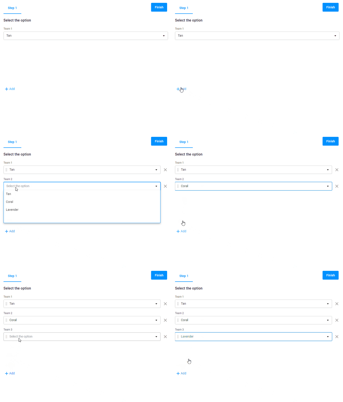
Multilist
This type allows you to add new option values.
{
  "type": "option",
  "name": "my-options",
  "title": "Select the option",
  "params": {
    "type": "multilist",
    "values": [
      {
        "title": "Tan"
      },
      {
        "title": "Coral"
      },
      {
        "title": "Lavender"
      }
    ]
  }
}
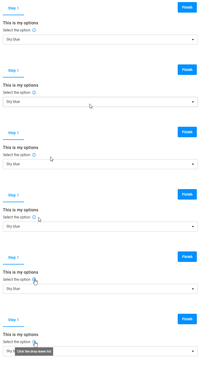
Hints
Using the description and prompt properties, you can define hints for an option.
{
  "type": "option",
  "name": "my-options",
  "title": "This is my options",
  "description":"Click the drop-down list",
  "prompt":"Select the option",
  "params": {
    "type": "list",
    "values": [
      {
        "title": "Sky blue",
        "color": "#87CEEB"
      },
      {
        "title": "Scarlet",
        "color": "#FF2400"
      },
      {
        "title": "Beige",
        "color": "#F5F5DC"
      }
    ]
  }
}
Props
The props properties specify extra settings for the options.
Let's consider some of them.
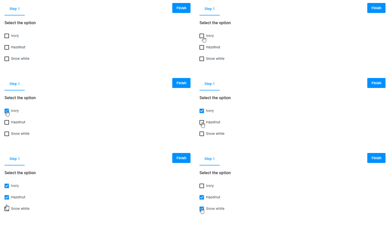
Limitation of options
For example, there are three checkbox options in the widget, and a customer is allowed to select only two of them. You can implement this by using the maxCount properties.
{
  "type": "option",
  "name": "my-options",
  "title": "Select the option",
  "params": {
    "type": "checkbox",
    "props": {
      "maxCount": 2
    },
    "values": [
      {
        "title": "Ivory"
      },
      {
        "title": "Hazelnut"
      },
      {
        "title": "Snow white"
      }
    ]
  }
}
Disabled options
You can make one of the options unavailable for selecting. To do so, add the disabled properties to this option.

{
  "type": "option",
  "name": "my-options",
  "title": "Select the option",
  "params": {
    "type": "checkbox",
    "values": [
      {
        "title": "Ivory"
      },
      {
        "title": "Hazelnut",
        "disabled": true
      },
      {
        "title": "Snow white"
      }
    ]
  }
}
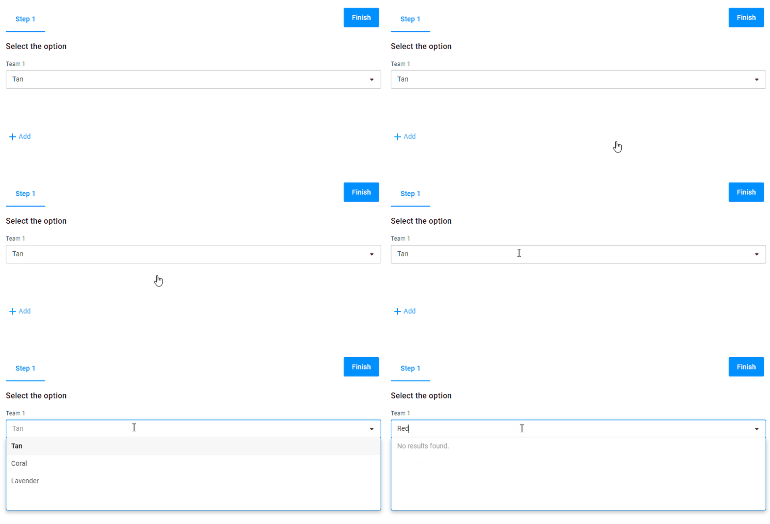
Filter
The enableFilter properties display a filter for searching values in the multilist type.
{
  "type": "option",
  "name": "my-options",
  "title": "Select the option",
  "params": {
    "type": "multilist",
    "props": {
      "enableFilter": true
    },
    "values": [
      {
        "title": "Tan"
      },
      {
        "title": "Coral"
      },
      {
        "title": "Lavender"
      }
    ]
  }
}
Changing button text
You can change the button text in the multilist type by the addNewItemCaption properties.

{
  "type": "option",
  "name": "my-options",
  "title": "Select the option",
  "params": {
    "type": "multilist",
    "props": {
      "enableFilter": true,
      "addNewItemCaption": "Add new teams"
    },
    "values": [
      {
        "title": "Tan"
      },
      {
        "title": "Coral"
      },
      {
        "title": "Lavender"
      }
    ]
  }
}
Importing options
You don't need to write values in a workflow file. When you work with an e-commerce system, you can define values there and refer to them by their title.
Let's look at the following example. There is a T-shirt in a storefront with two options: Printing Options and Size.
Printing Options has two values: Two-sided and One-sided.
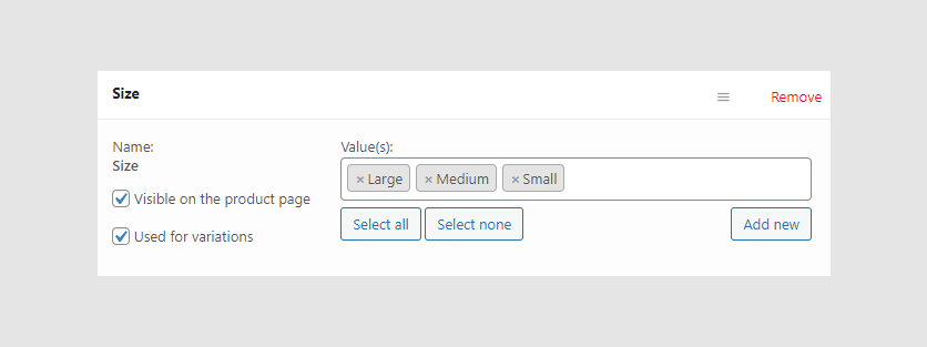
Size has three values: Large, Medium, and Small.
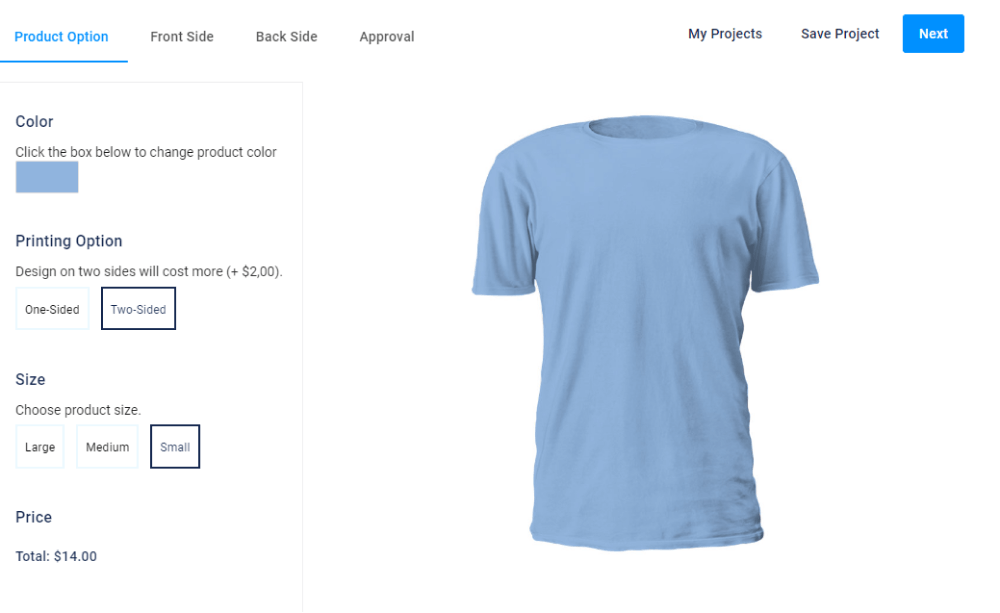
This is how the option widget may look in a workflow file. Note that the title is Size and the values property is empty here.
{
  "id": 103,
  "type": "option",
  "name": "size",
  "title": "Size",
  "prompt": "Choose product size.",
  "params": {
    "type": "radio",
    "subType": "compact",
    "title": "Size",
    "visible": true,
    "values": []
  }
}
You define these option values in a product page in your e-commerce system. Since this option has the same title Size as in your workflow file, the system connects data from the workflow file and these options.
Params
| Name | Type | Description | Default value |
|---|---|---|---|
title | string | title of option | empty string |
type | radio | image | color | checkbox | list | multilist | visual representation of options | radio |
subType | detailed| compact | defines visual representation for radio|image|color | detailed |
props | object | defines extra settings for options | undefined |
values | array of values | defines option variants | undefined |
description | string | an additional description, which appears as a tooltip | undefined |
prompt | string | a hint explaining what a customer is supposed to select | undefined |
Prop
| Name | Type | Description | Default value |
|---|---|---|---|
enableFilter | boolean | creates a filter in the list option type | false |
maxCount | number | limits options variants to select | undefined |
addNewItemCaption | string | defines the button text for the multilist type | add |
Values
| Name | Type | Description | Default value |
|---|---|---|---|
color | string | defines the color of the values for color type in the CSS format | undefined |
disabled | boolean | an option isn't available for selection | false |